Shifting Perceptions
The Wimpole Building – Royal London Asset Management
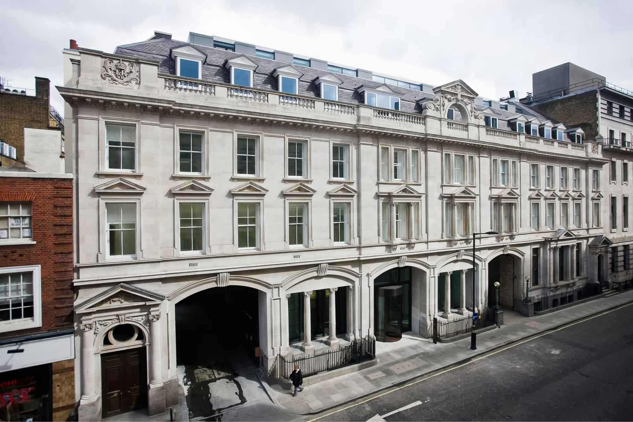
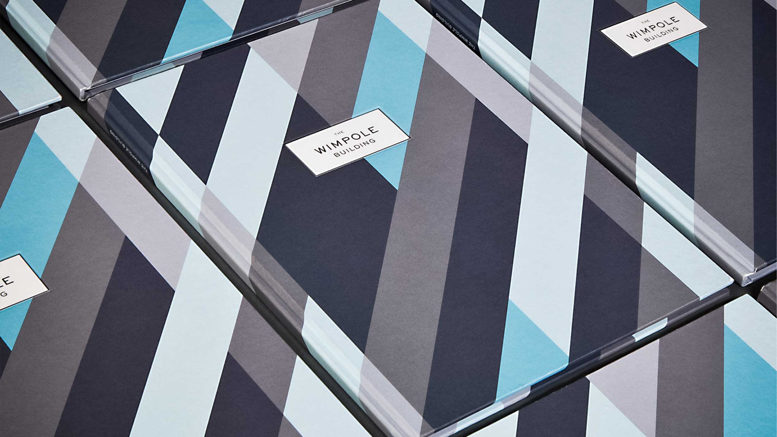
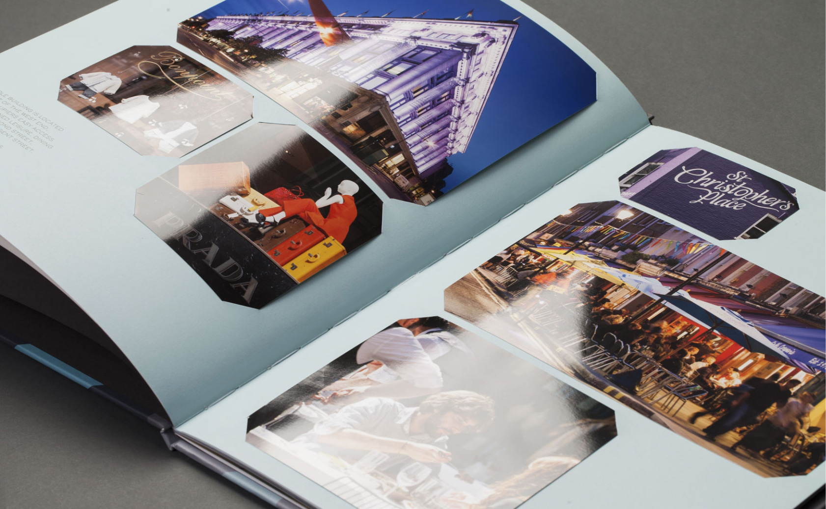
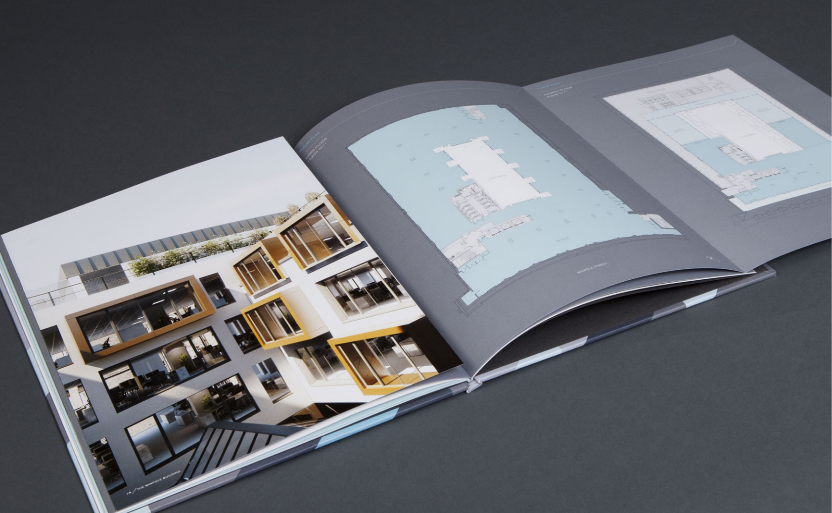
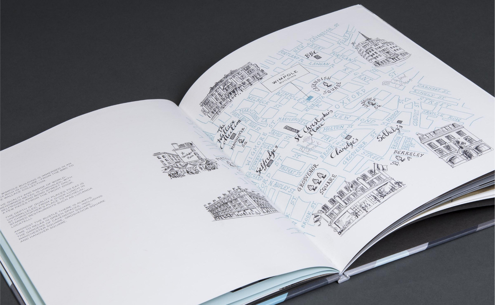
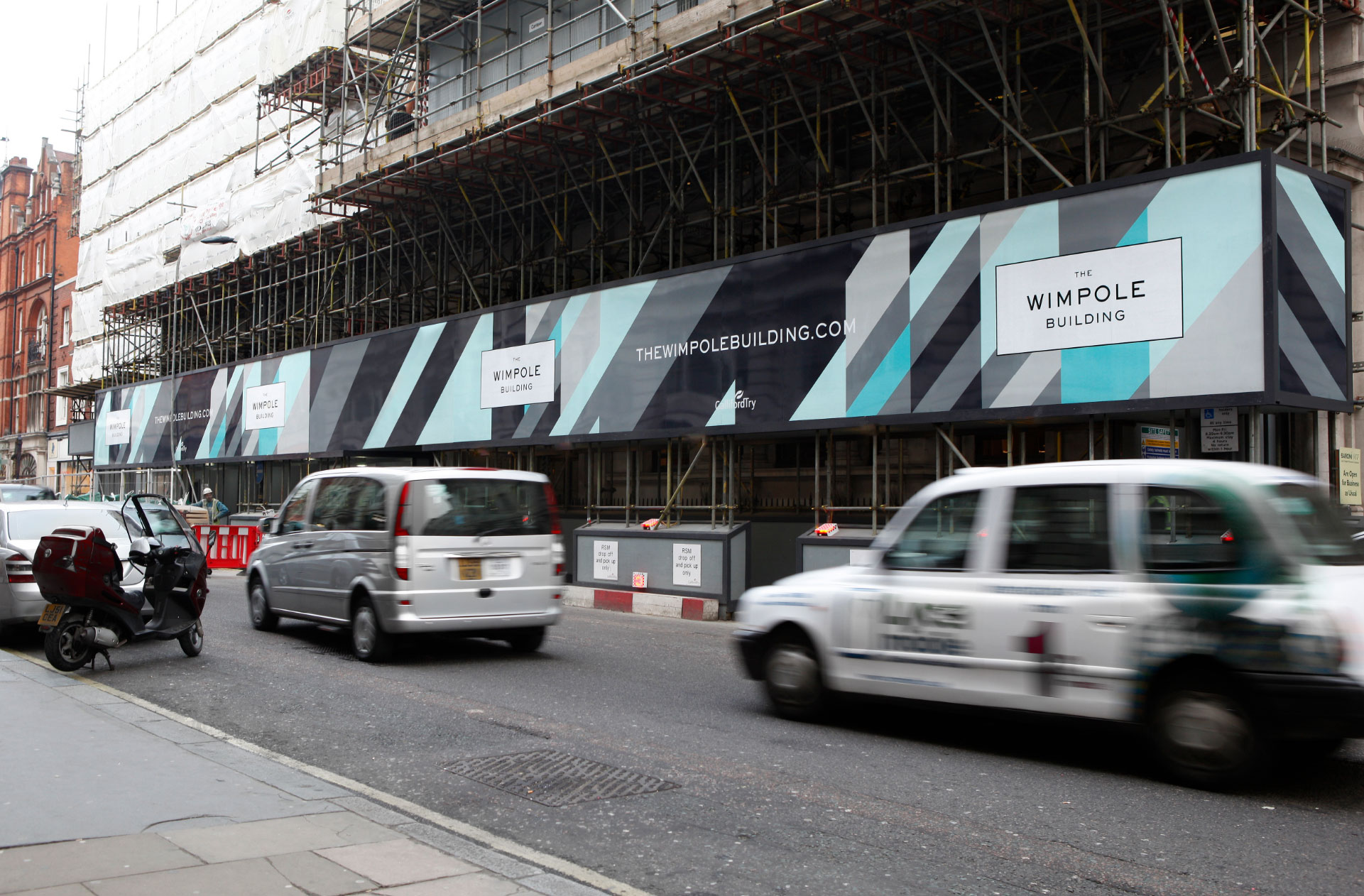
The Wimpole Building represents a significant renovation of CBRE’s former headquarters, aiming to completely transform the public perception of this well-known structure. The main challenge was to overcome the preconceived notions associated with the preserved listed frontage. While the frontage was elaborate and visually appealing, it hindered the leasing of modern office spaces due to the belief that the floors were small and dimly lit.
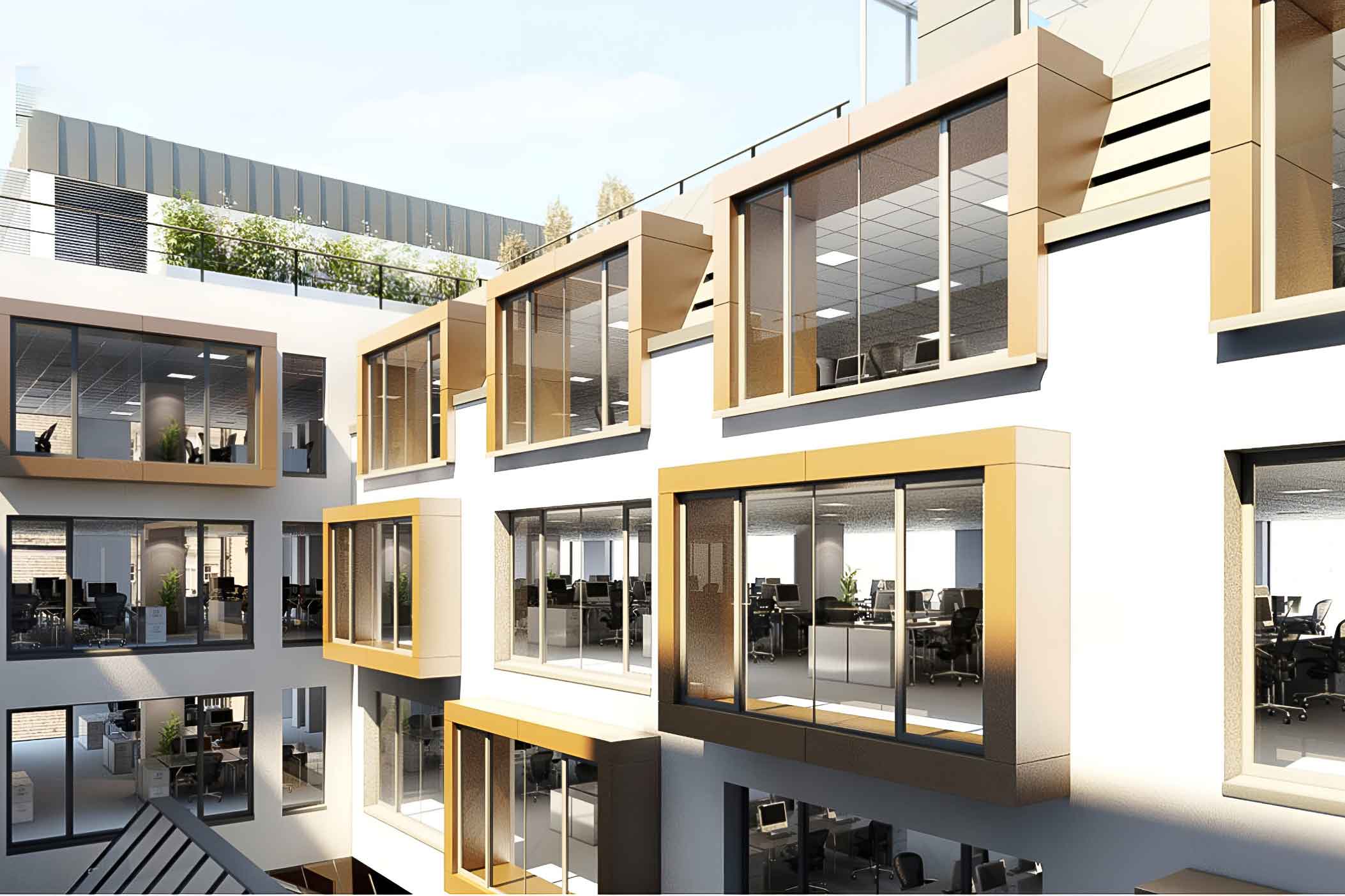
Architecturally, this issue was addressed by a comprehensive redesign of the entire space. A lightwell was incorporated to facilitate more natural daylight, creating a brighter and more inviting atmosphere for the offices. Additionally, the roof was extended with a contemporary metal and glass construction above the traditional slate mansard, effectively expanding the available floor area for lease.
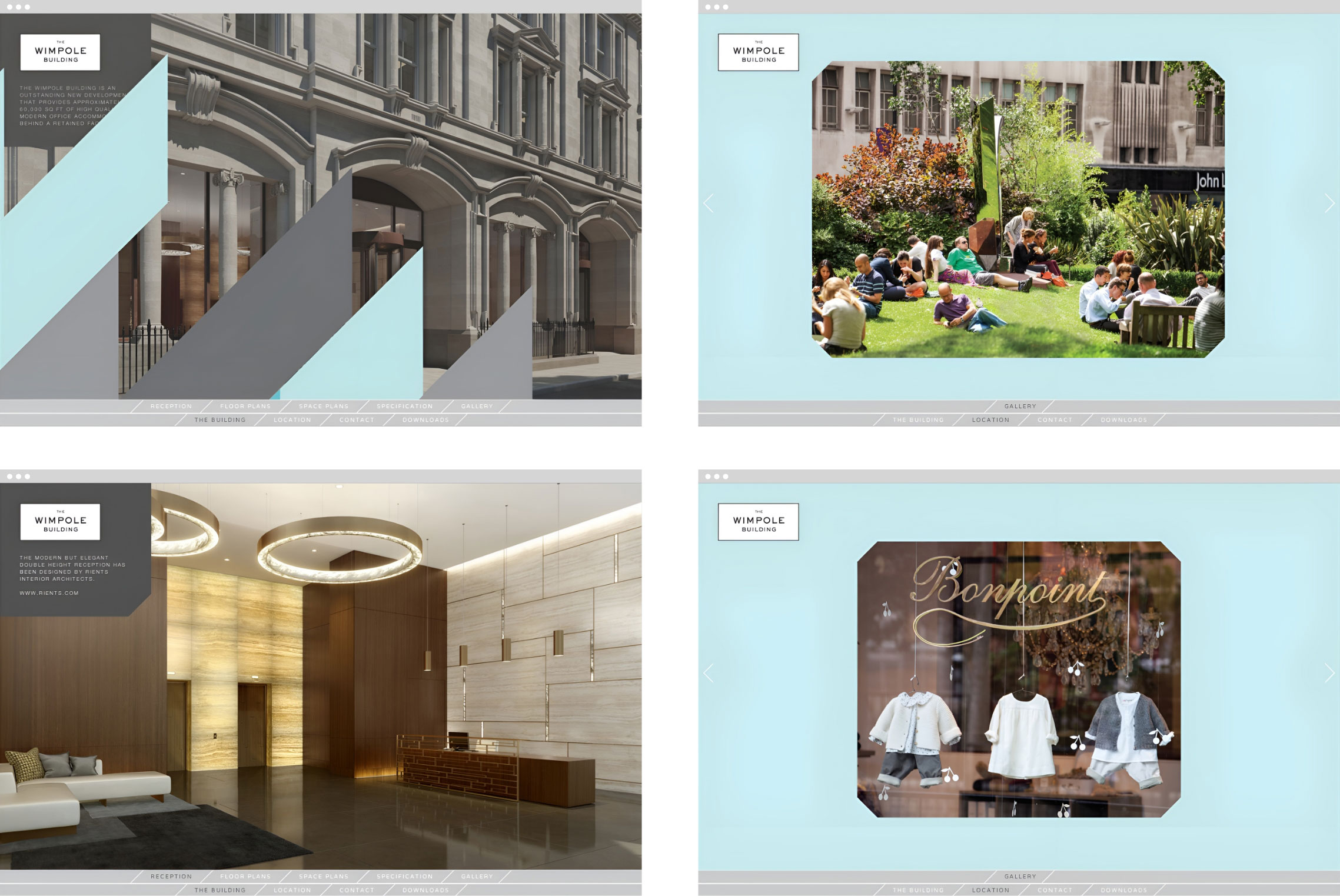
From a strategic perspective, the building’s brand was positioned to align with traditional Mayfair aesthetics, embracing its classic charm. Simultaneously, new and dynamic modern expressions were introduced, exemplified by the animation of light that fills the open floors. This combination of traditional elegance and contemporary vibrancy brought the branding and campaign to life in an engaging way.
art direction / Brand identity / Brand strategy / brochures / website


With what you have produced for us on Wimpole, we have been able to achieve a single HQ let at a premium price point. We are extremely pleased.
Keith Miller – Senior Fund Manager, Royal London Asset Management
Brand building for contemporary womenswear
Deborah Lyons
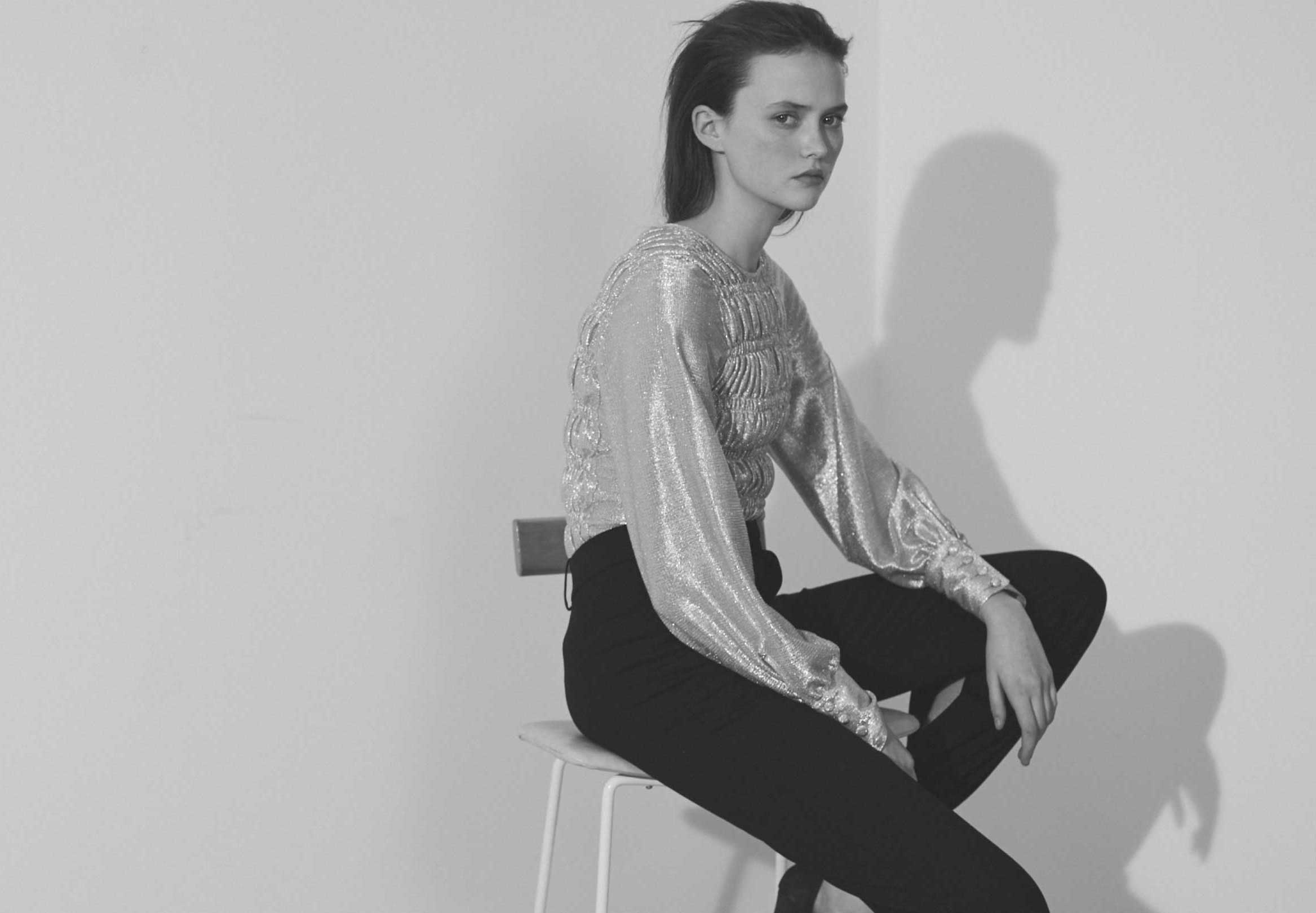
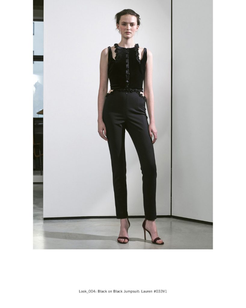
Inspired by the rich history of British tailoring, Deborah Lyons is founded on transitional, timeless, and effortless styling, exclusively made from the best British and European fabrics. The label is known for its strong silhouettes and modern femininity. I was engaged to shape the brand communications to reflect this ethos and position it as a contemporary forward facing brand.
This case study documents five season’s work.
art direction / films / lookbooks / social media materials / website
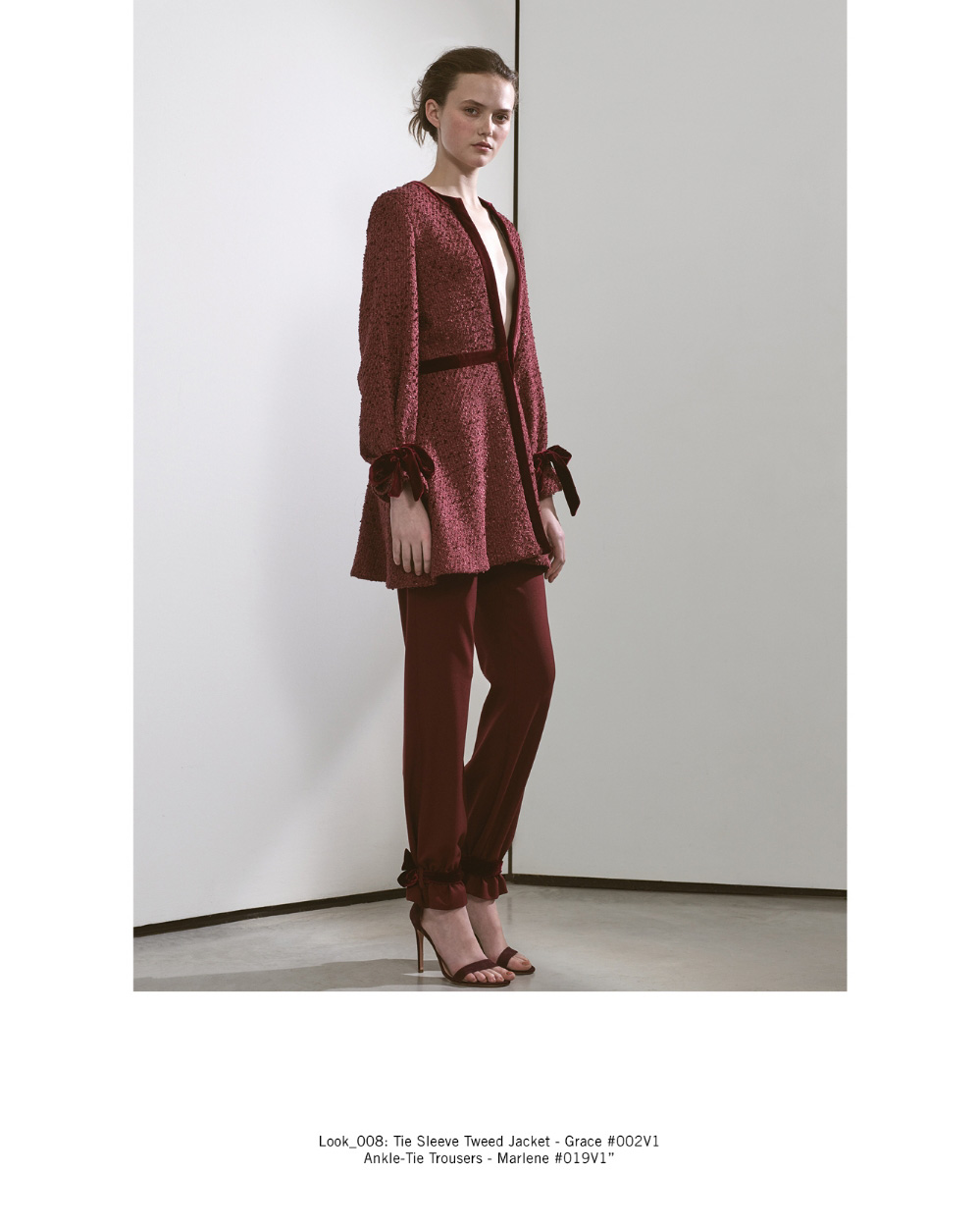
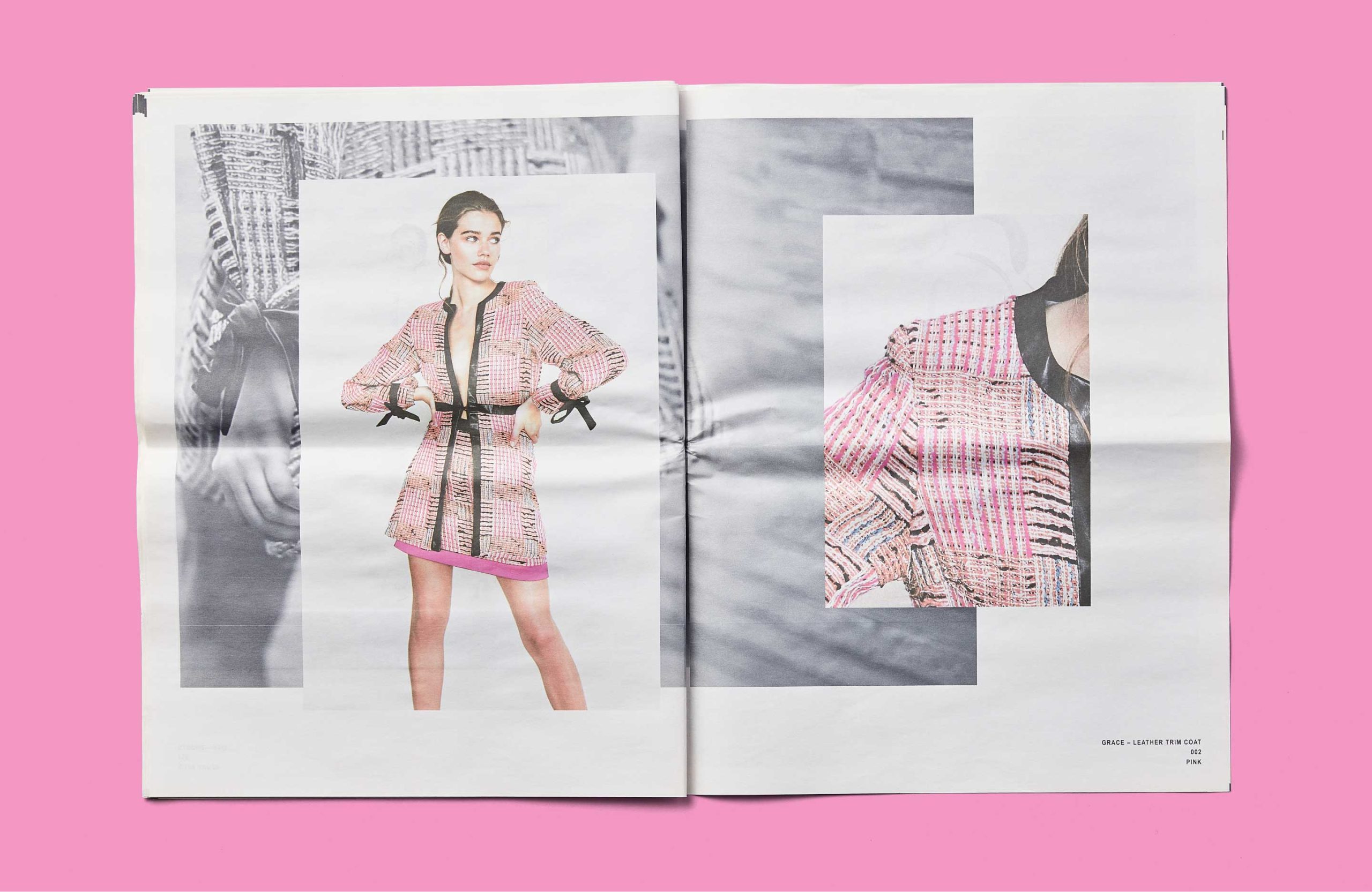
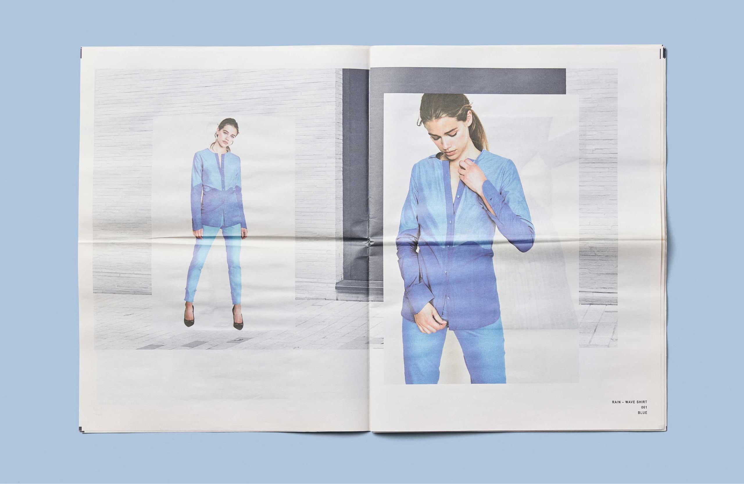
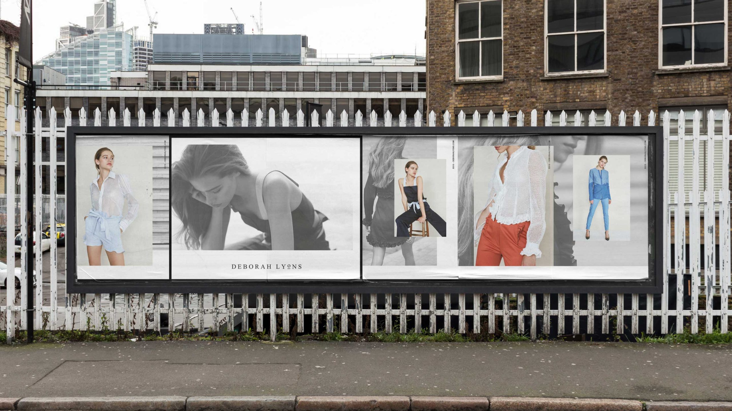
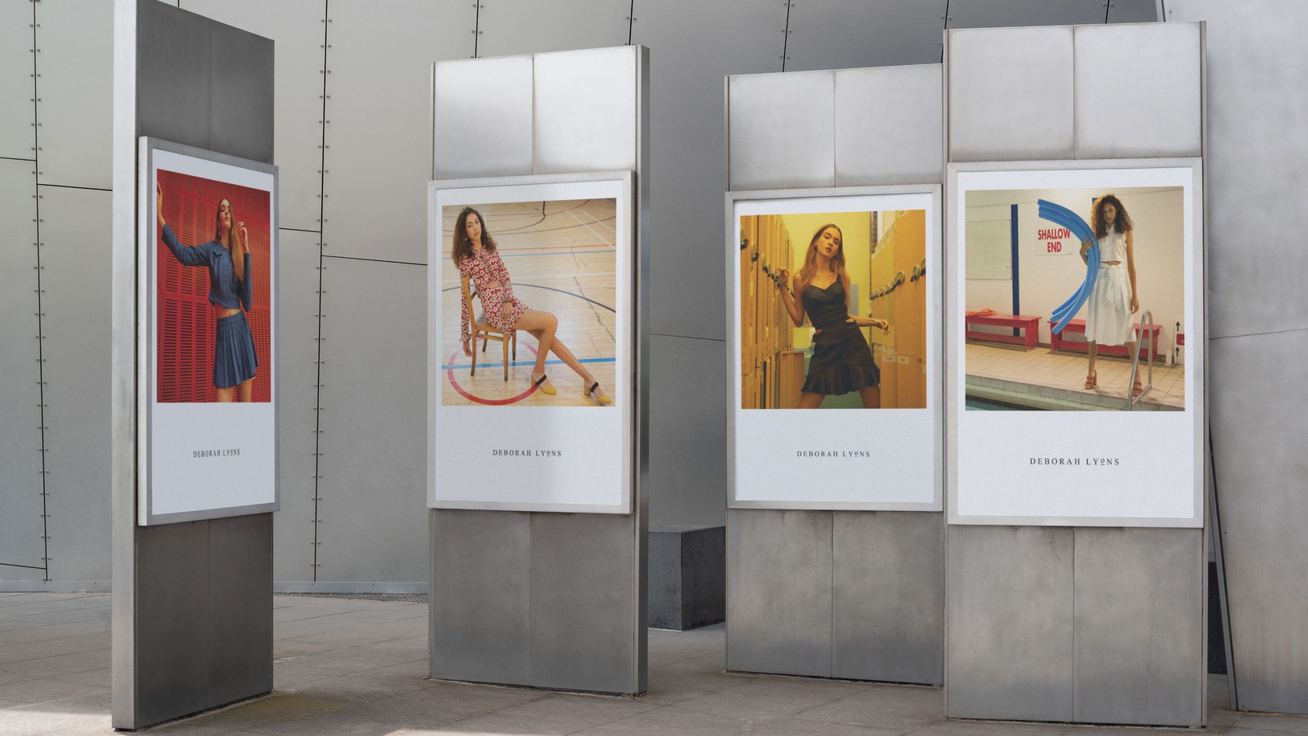
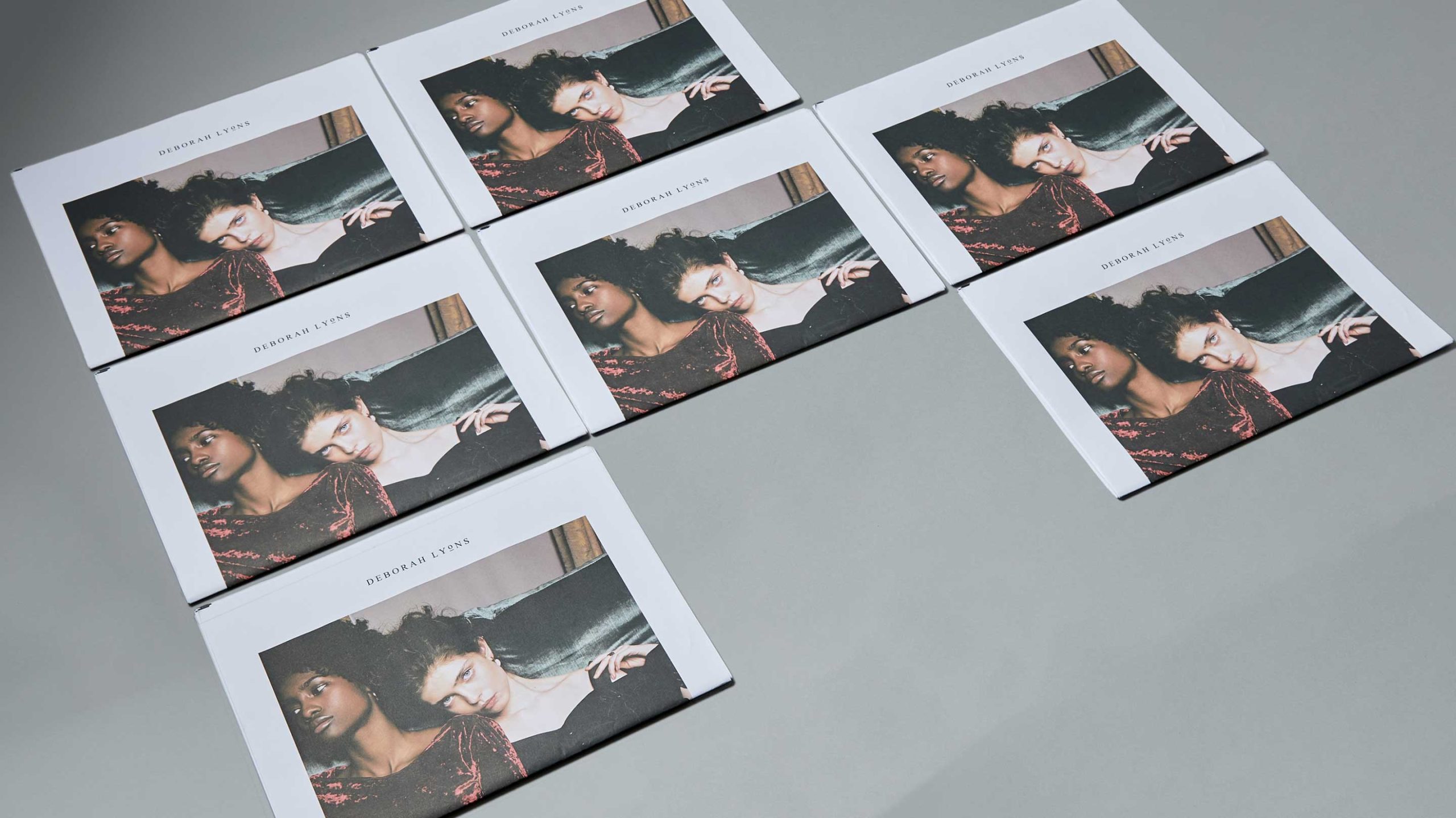
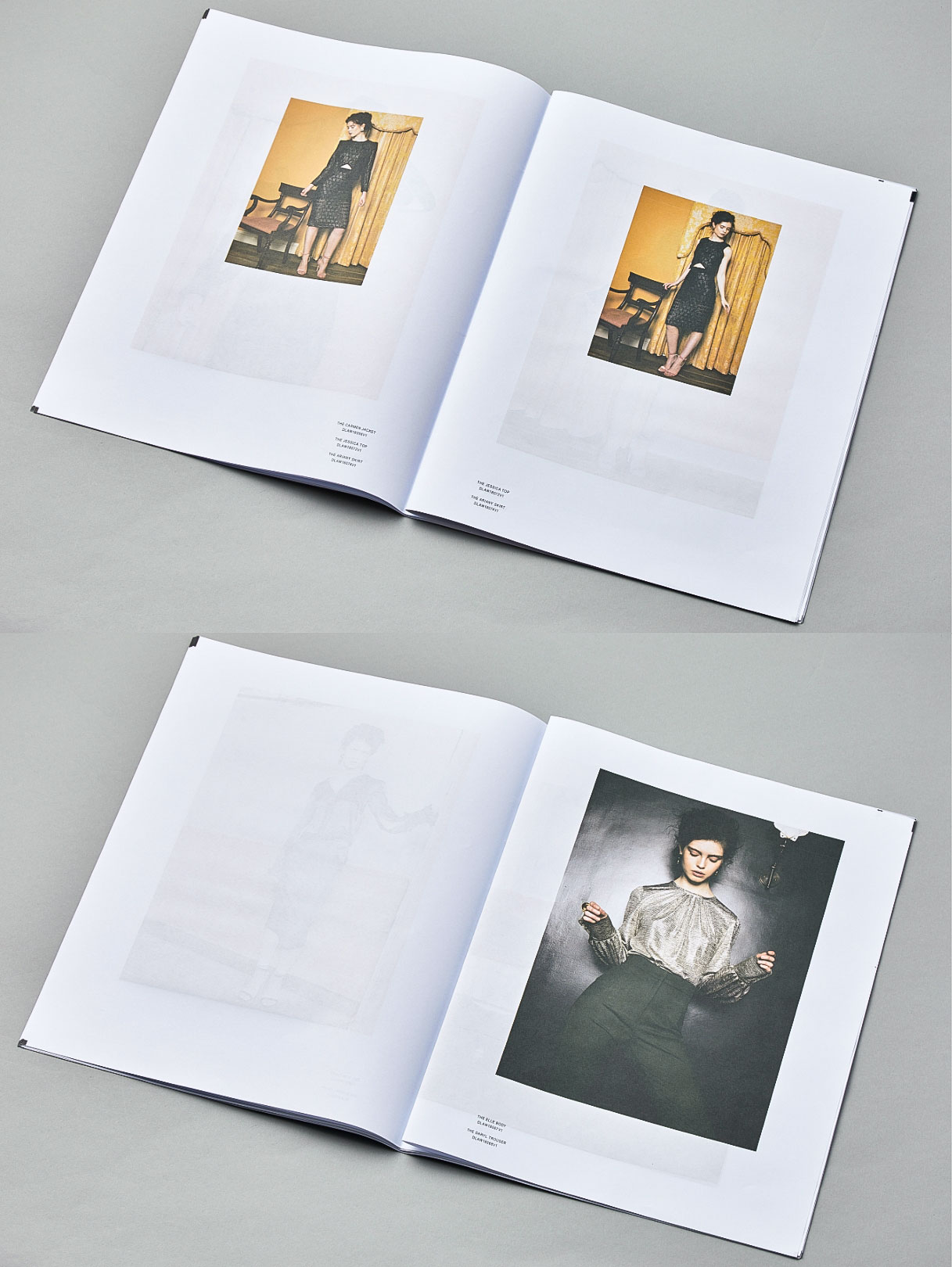
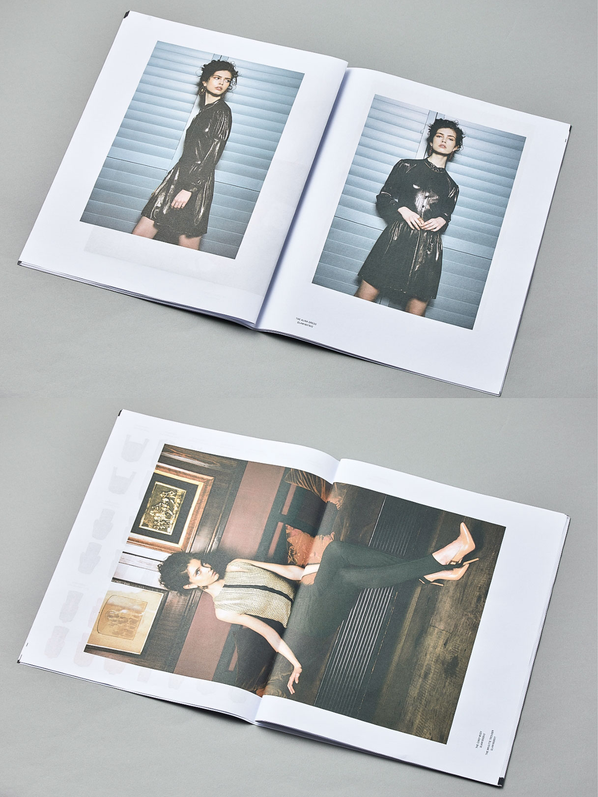

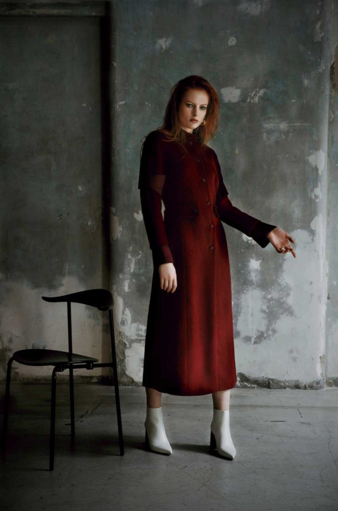
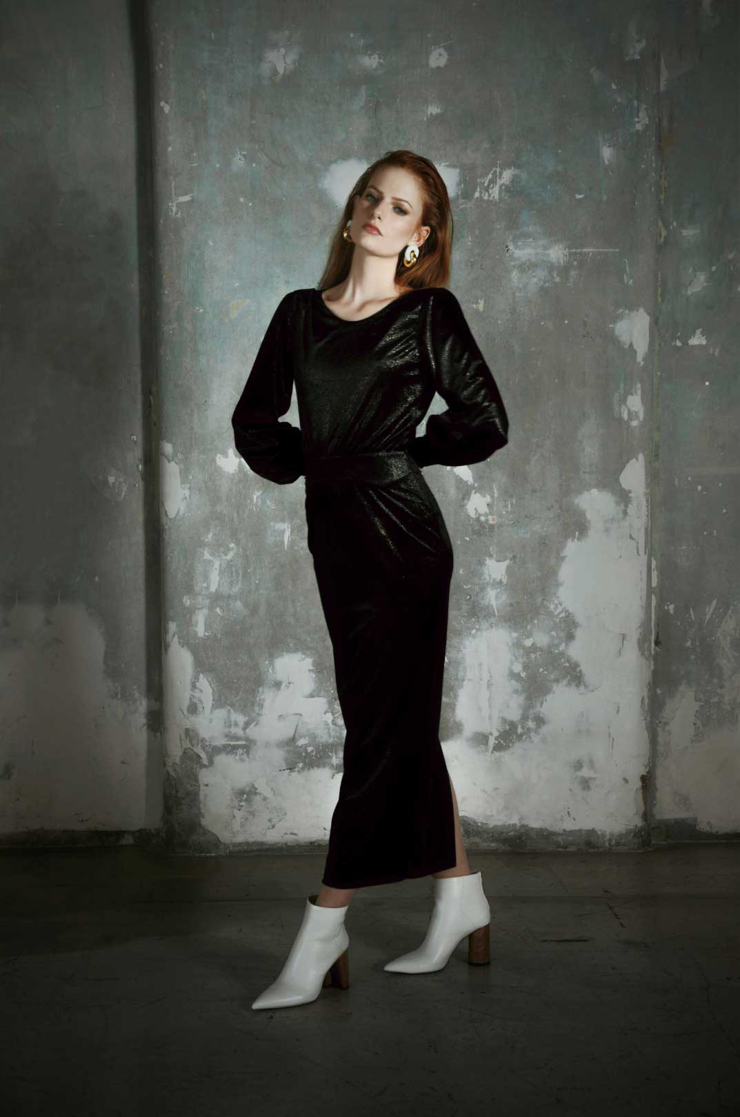
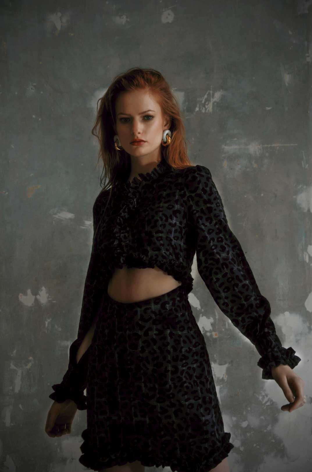
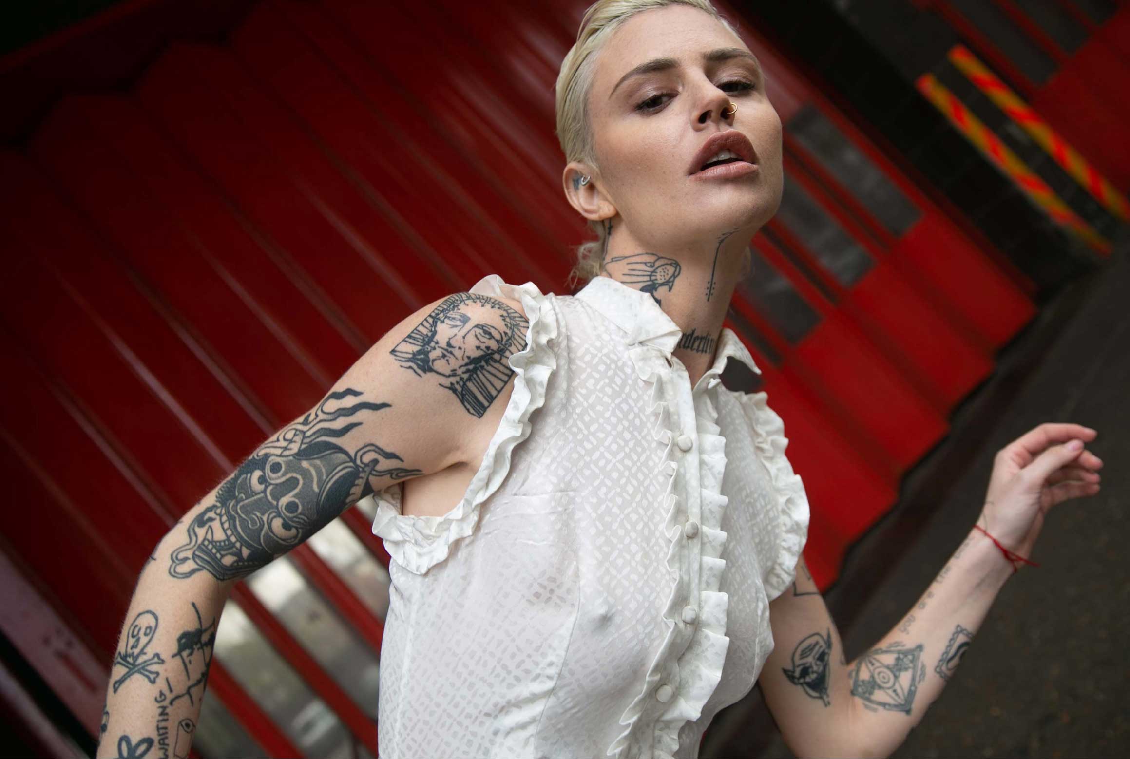
Working with Malcolm was like “finally, someone who gets me and delivers”. With his extensive fashion art direction experience, I was able to relax and focus on my role and then be surprised by what he delivered. Each season was a joy and it didn’t feel like work.
Deborah Lyons – Founder and Designer
Moving from functionality to a realm of aspiration
Business Class – Samsonite
After collaborating with Samsonite for an extended period to enhance and categorise their product range, a new task arose: repositioning their Business Class collection. Past campaigns had been somewhat inelegant, focusing too much on the products and lacking the finesse that matched the quality of their offerings.
To address this, we adopted a strategic approach by incorporating storytelling into the campaigns, allowing the art direction to convey a convincing narrative. We chose the iconic Grand Central Station in L.A. as the backdrop to infuse the visuals with a sense of refined elegance. By conducting all talent and product shots on location, a harmonious composition was achieved and made the most of the stunning fixtures and textures within the space.
Brand positioning / digital templates / Global campaign art direction / on-product application / POS templates / retail experience
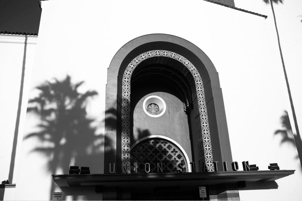
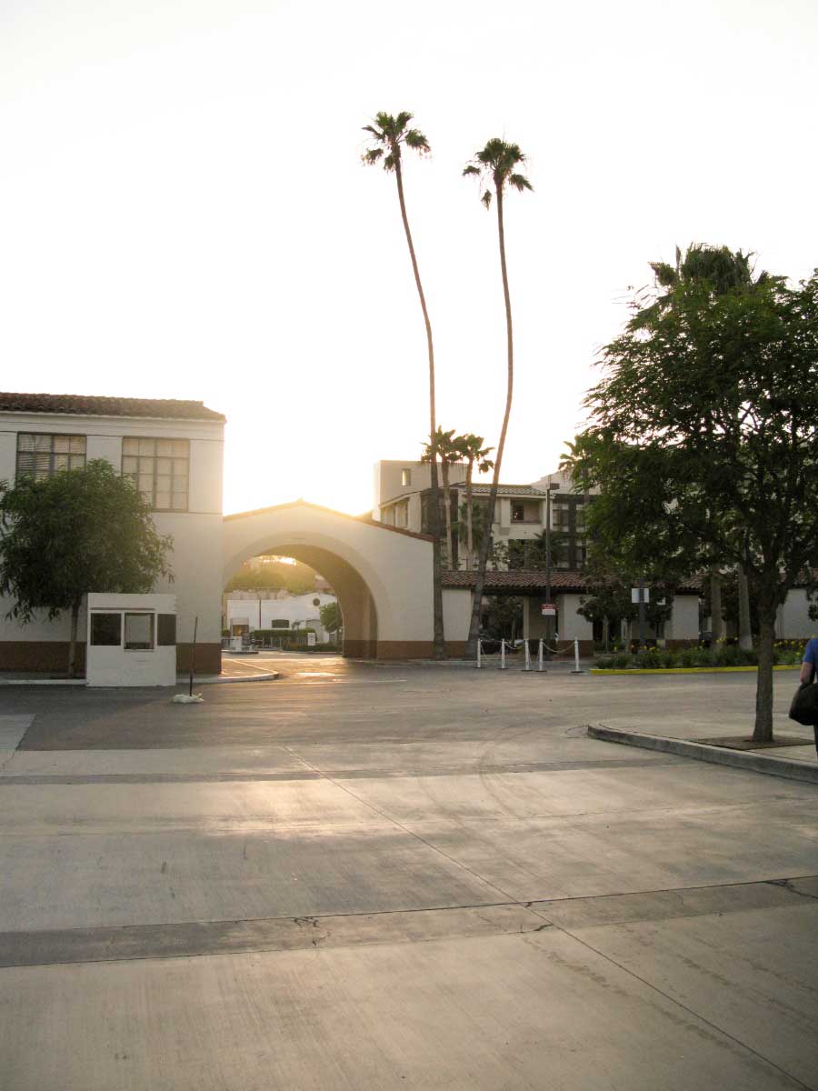
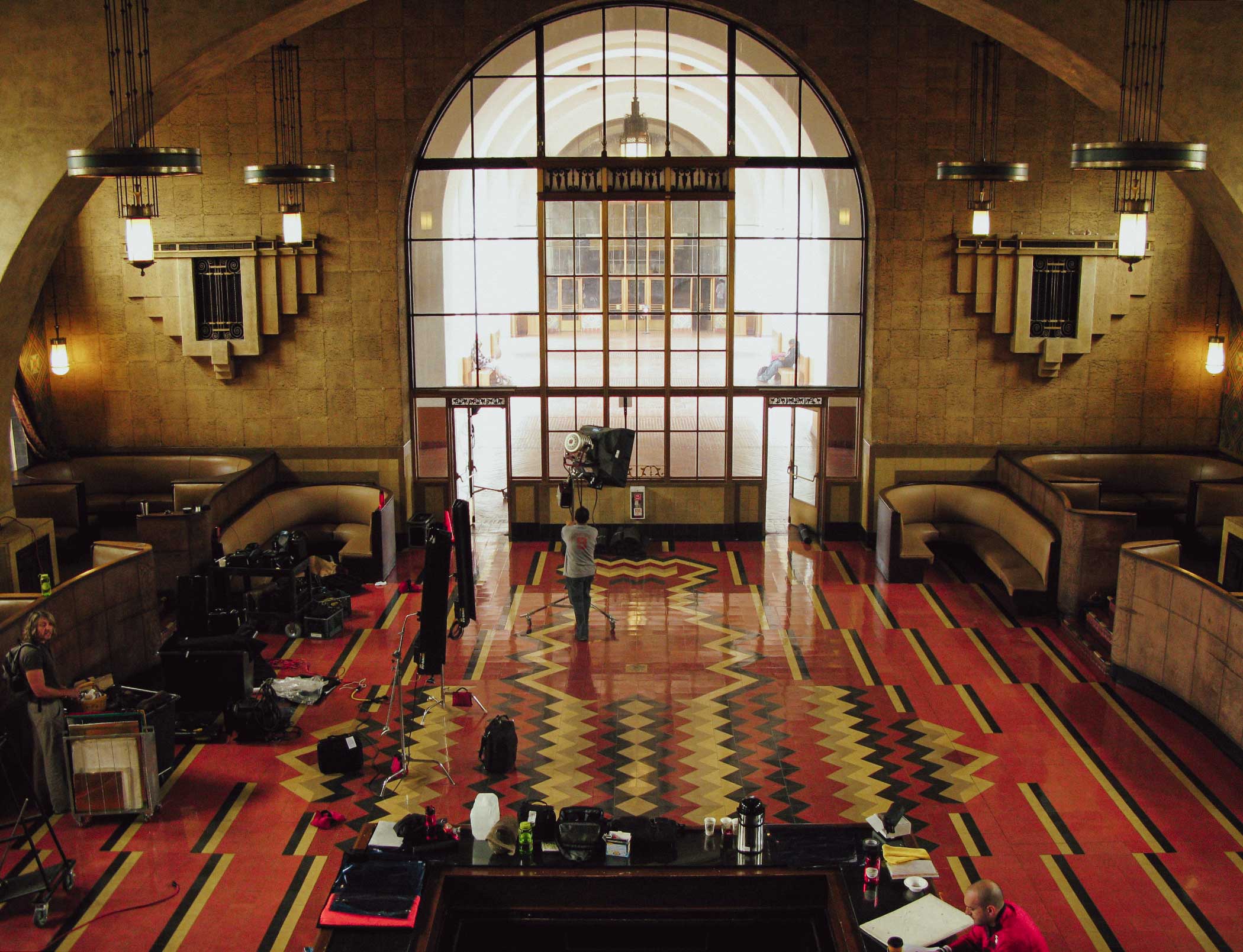

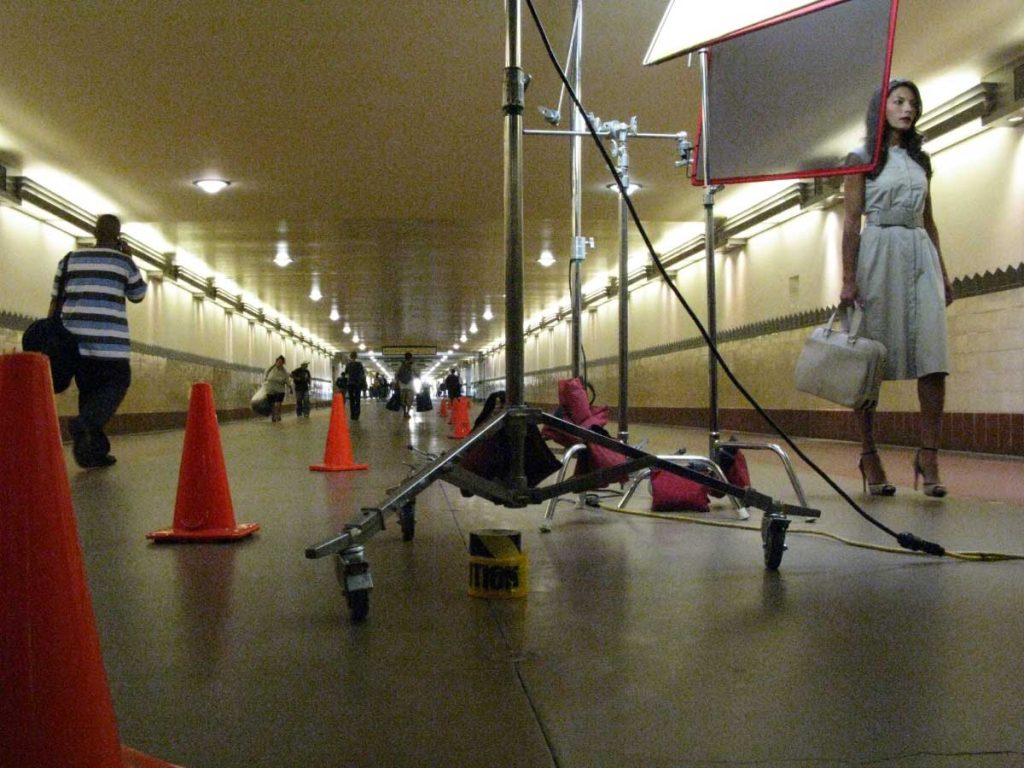
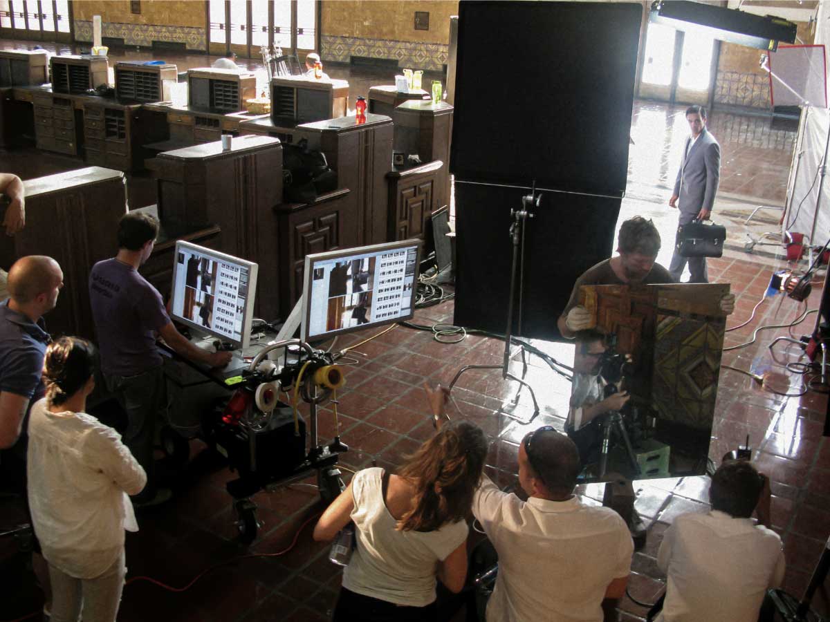
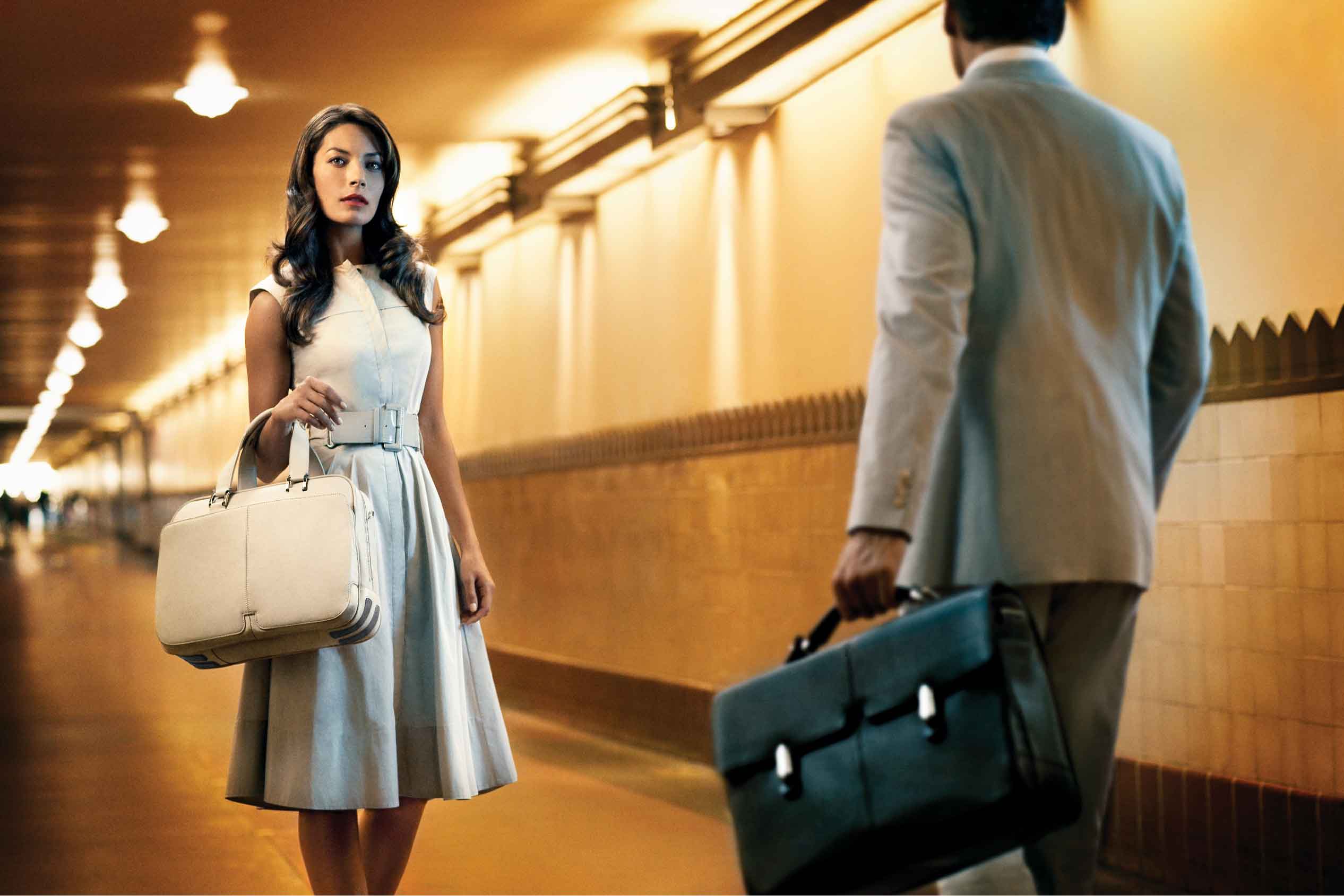
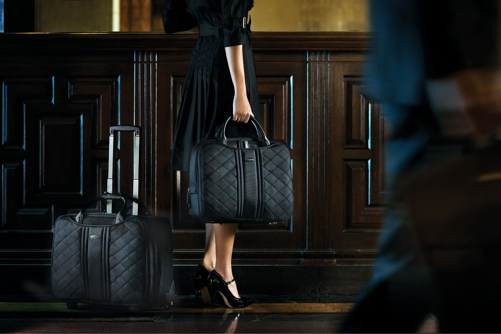
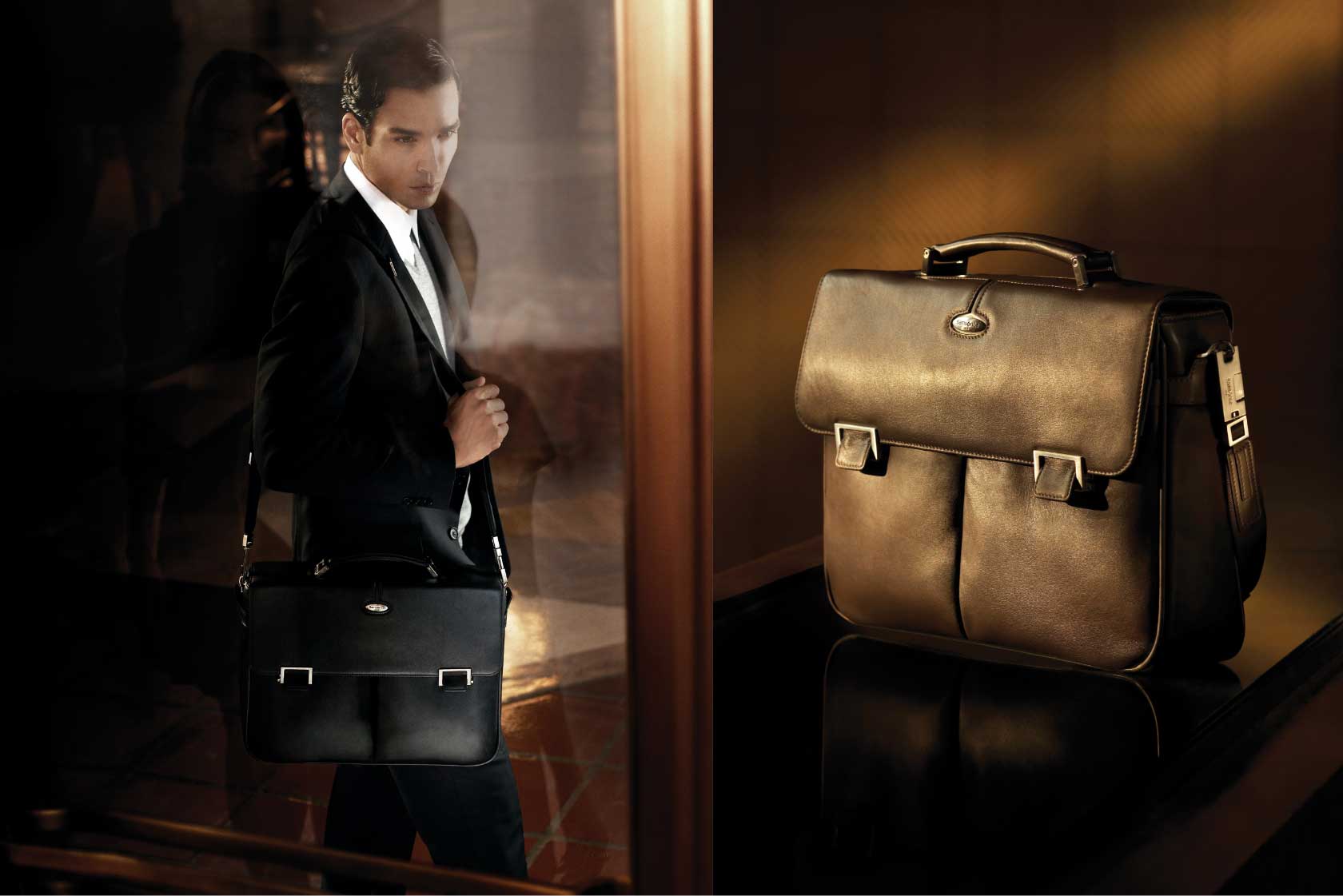
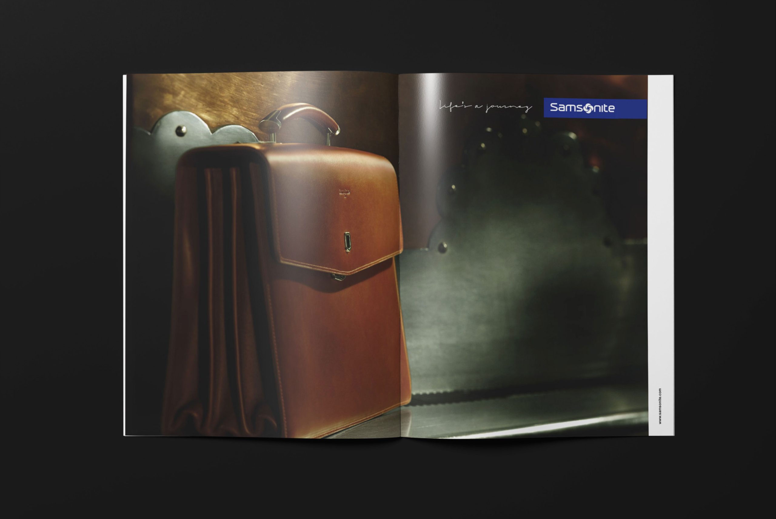
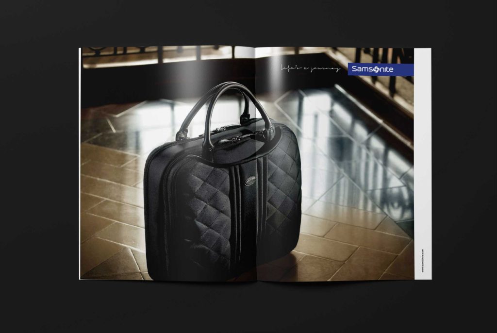
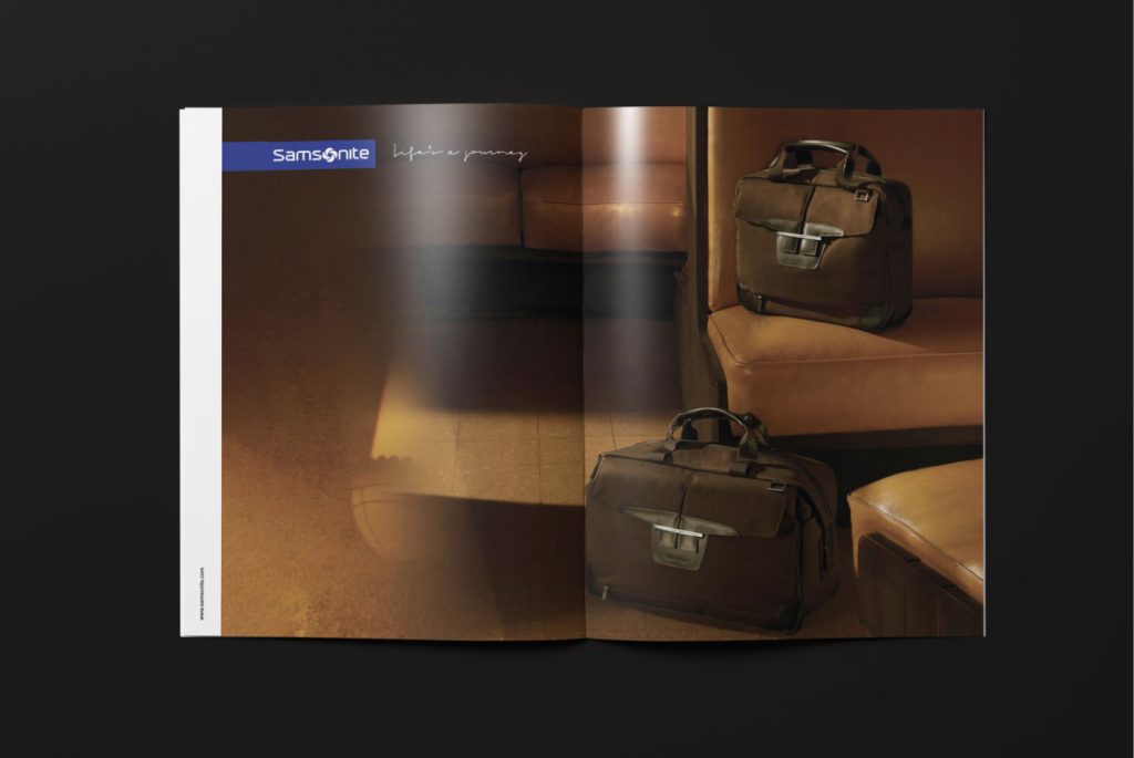


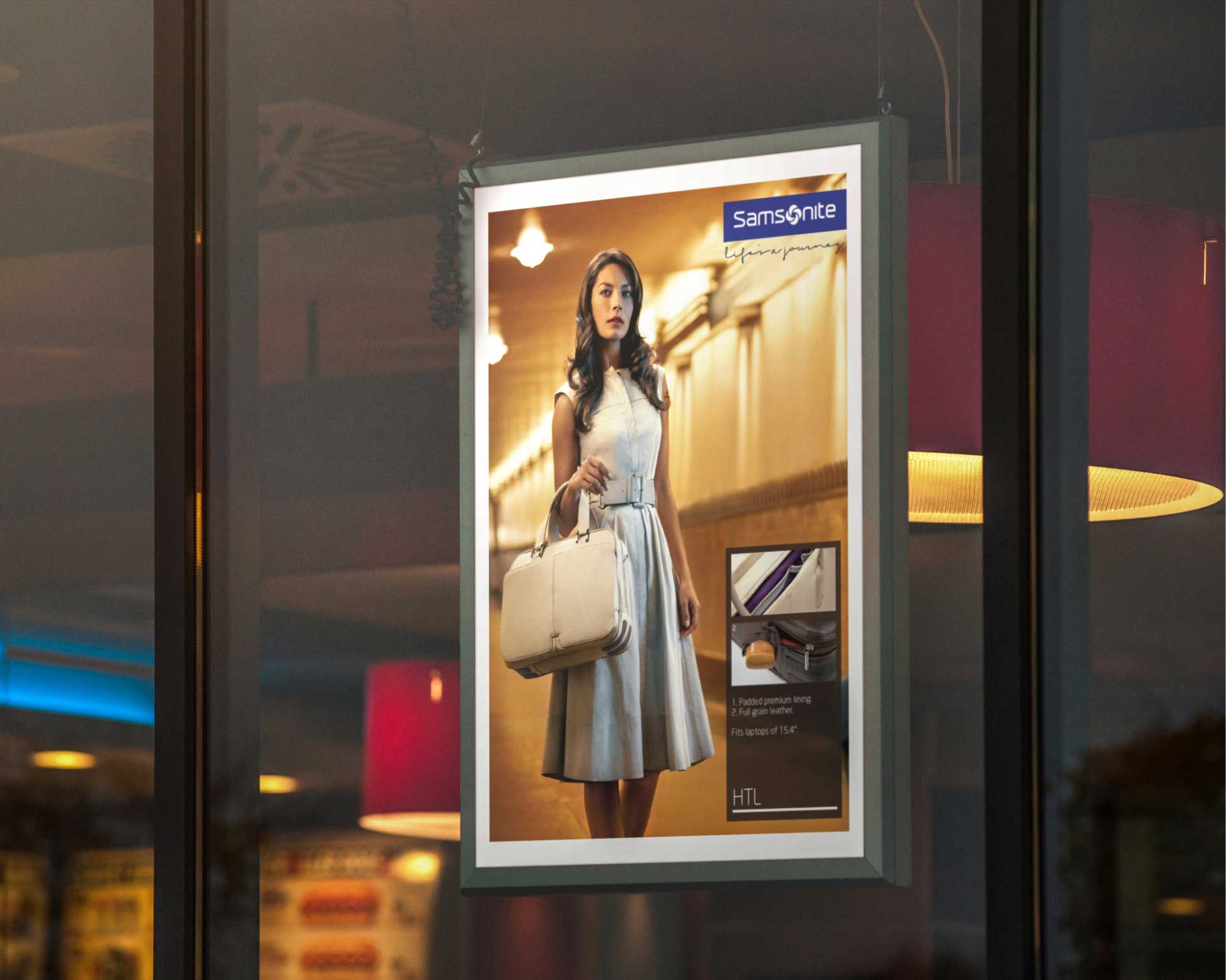
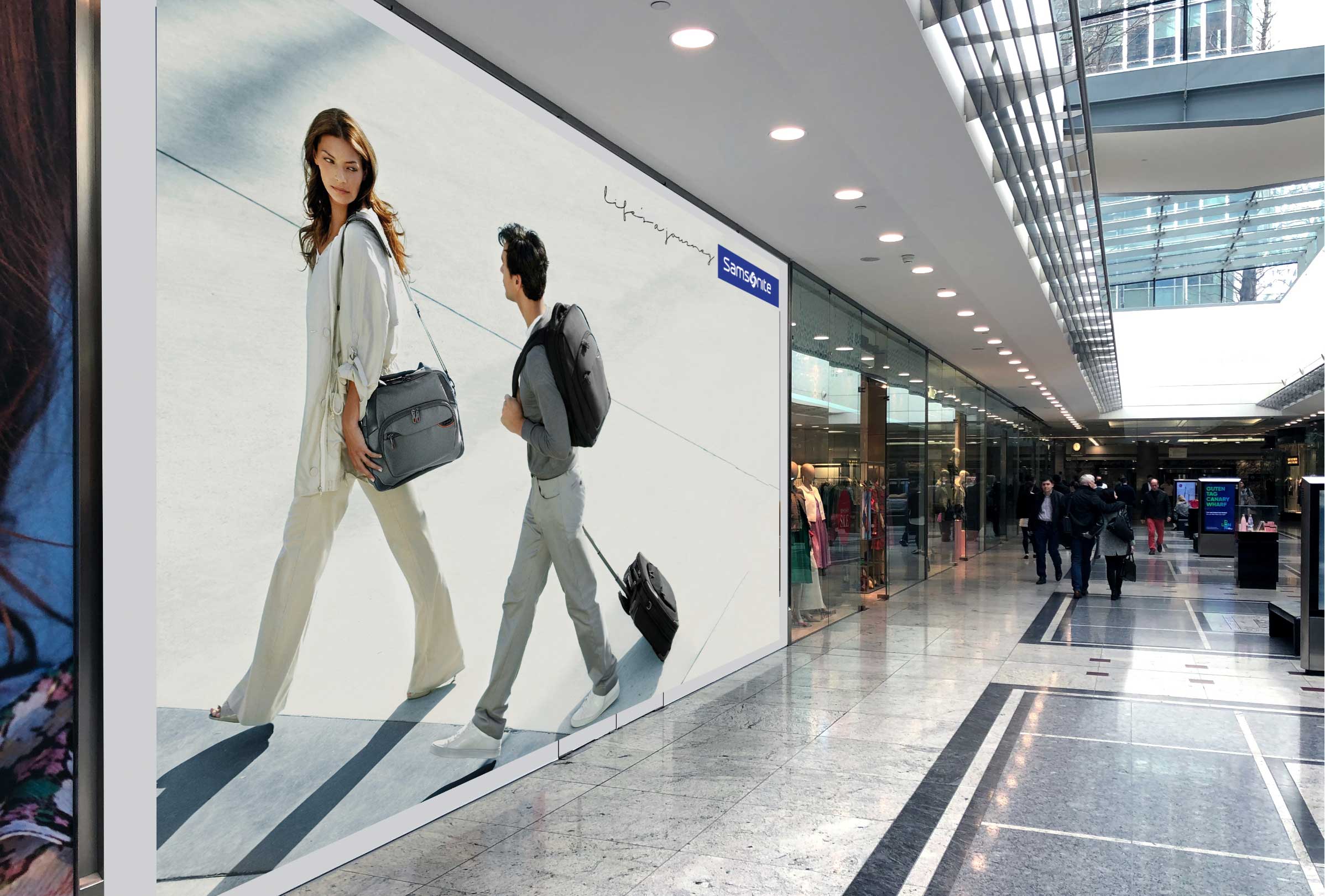
Testimonial – LA was fun, the art direction is the best we have done yet – so thank you!
Richard Brett – Global Vice President marketing communications, Samsonite
Reasserting a Pioneering Attitude
Virgin Atlantic
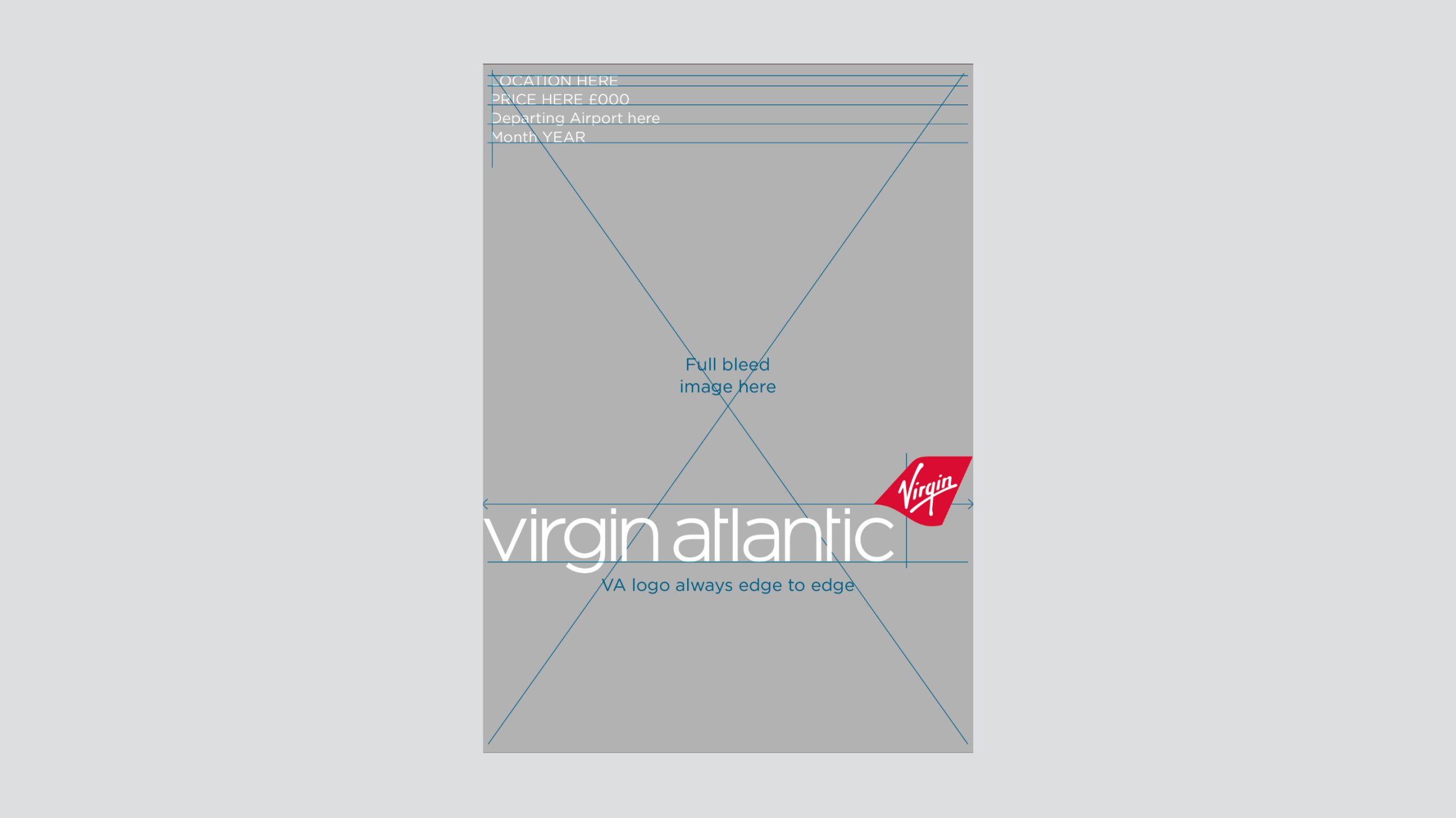
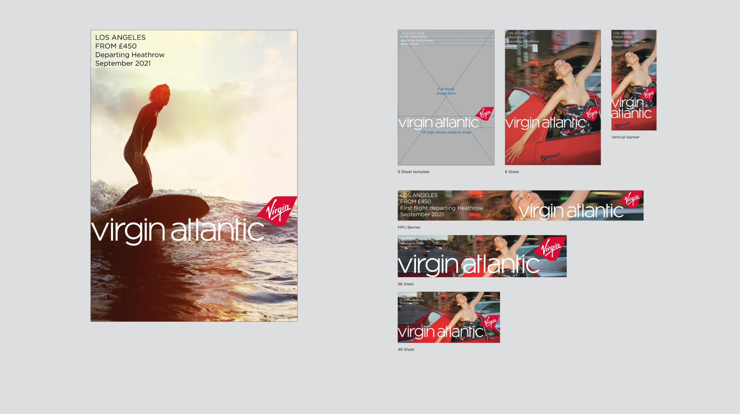
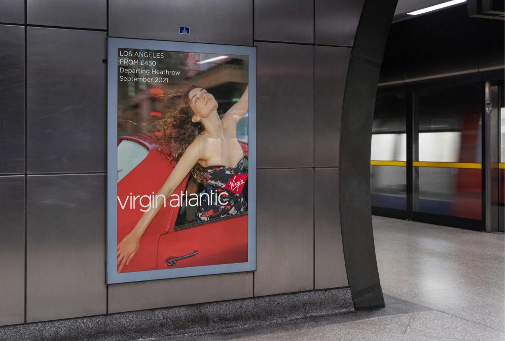
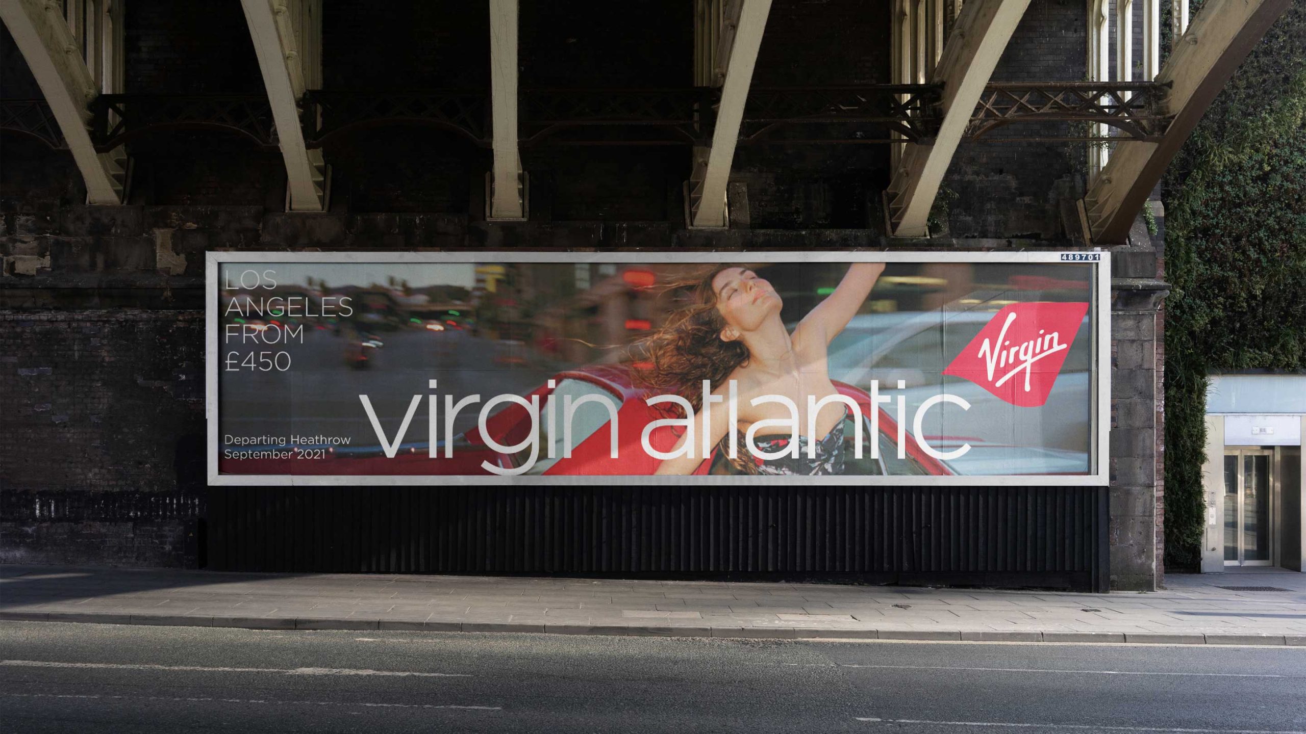
During my consultancy with the London advertising agency, Lucky Generals, I was given the exciting task of devising two fully integrated campaign solutions for Virgin Atlantic. The goal was to cut through the existing marketing confusion and align with their new strategic brand platform, “The Original Pioneers.” This provided a fantastic opportunity to enhance the campaigns’ art direction and leverage the iconic branding.
For the primary brand campaign, I observed that the art direction had grown somewhat predictable and clichéd, which was unexpected for such an adventurous brand. To address this, I decided to centre the campaign around captivating destination imagery that would resonate with customers on an aspirational and emotional level, all while maintaining an authentic approach. By incorporating the branding in a proud and innovative manner, we aimed to create a leading edge for the brand.
As for the sales campaign, the solution seemed evident right in front of me. By transforming the Virgin Atlantic tailfin into a symbol of endorsement and reassurance, placed strategically to overlap the art direction and messaging, thus providing a clear ‘seal of approval’ for the brand’s quality and offerings.
Brand audit / campaign creation / digital brand guidelines / EDMs / OOH UK print and digital advertising campaign templates

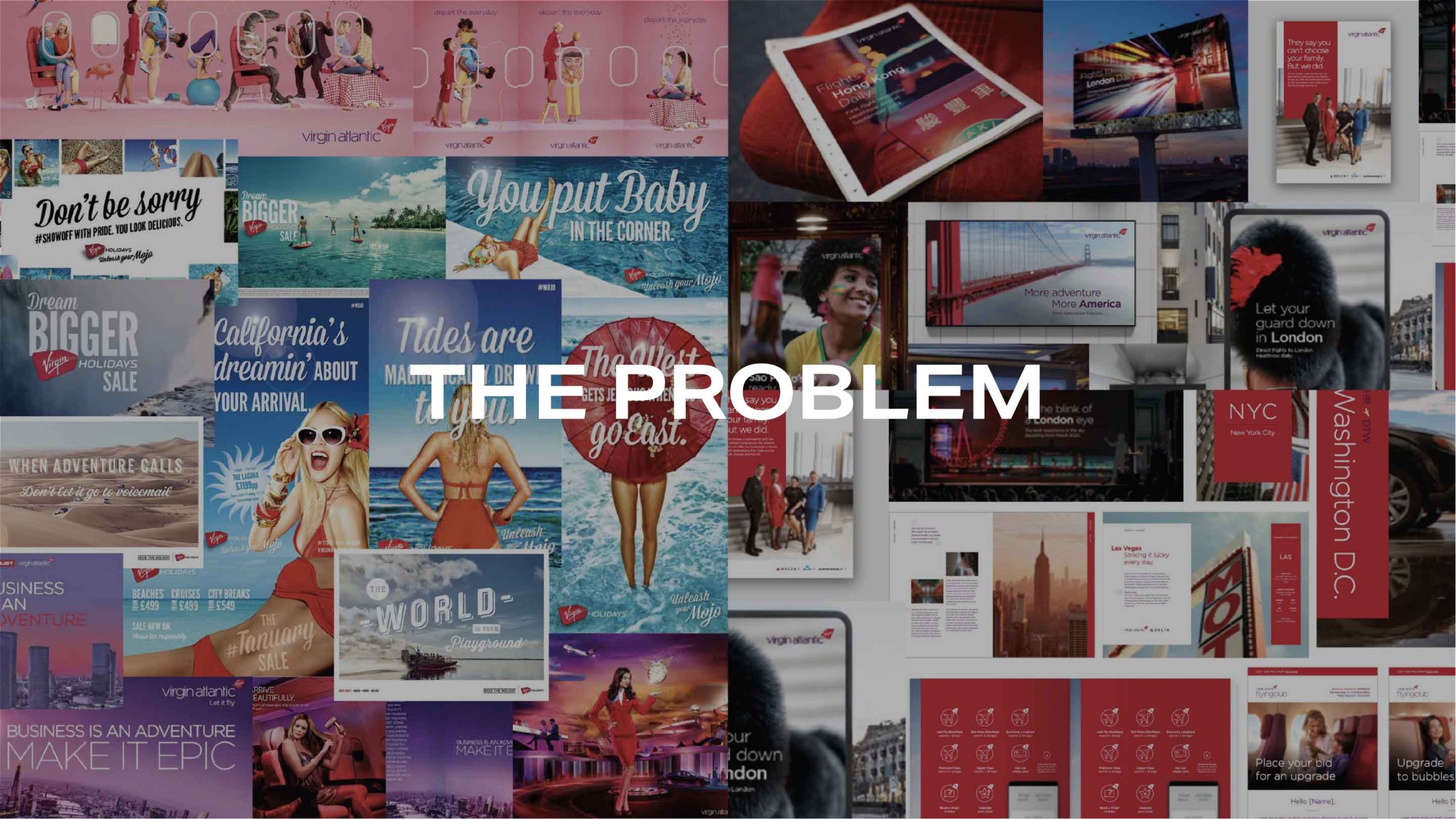
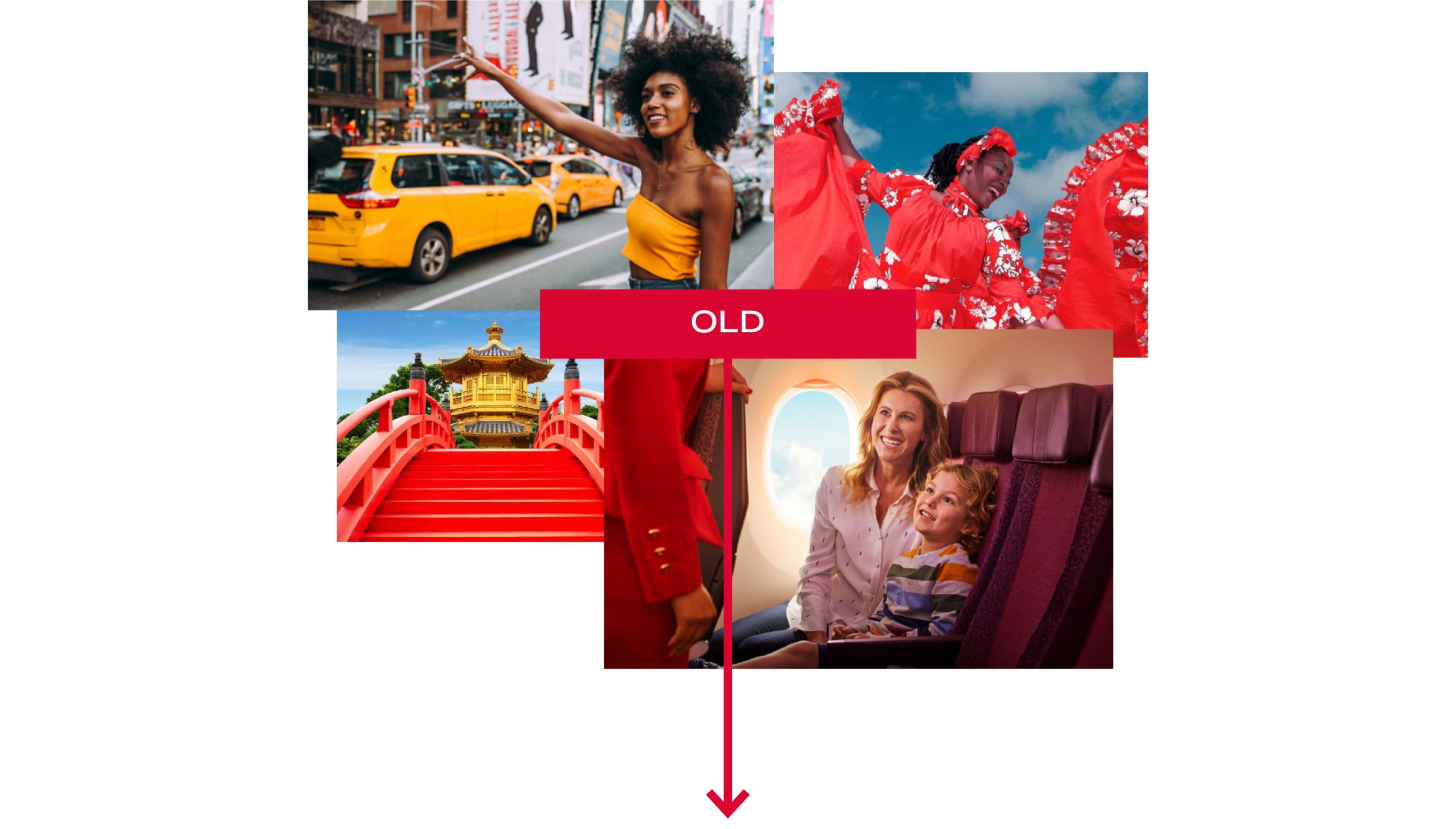
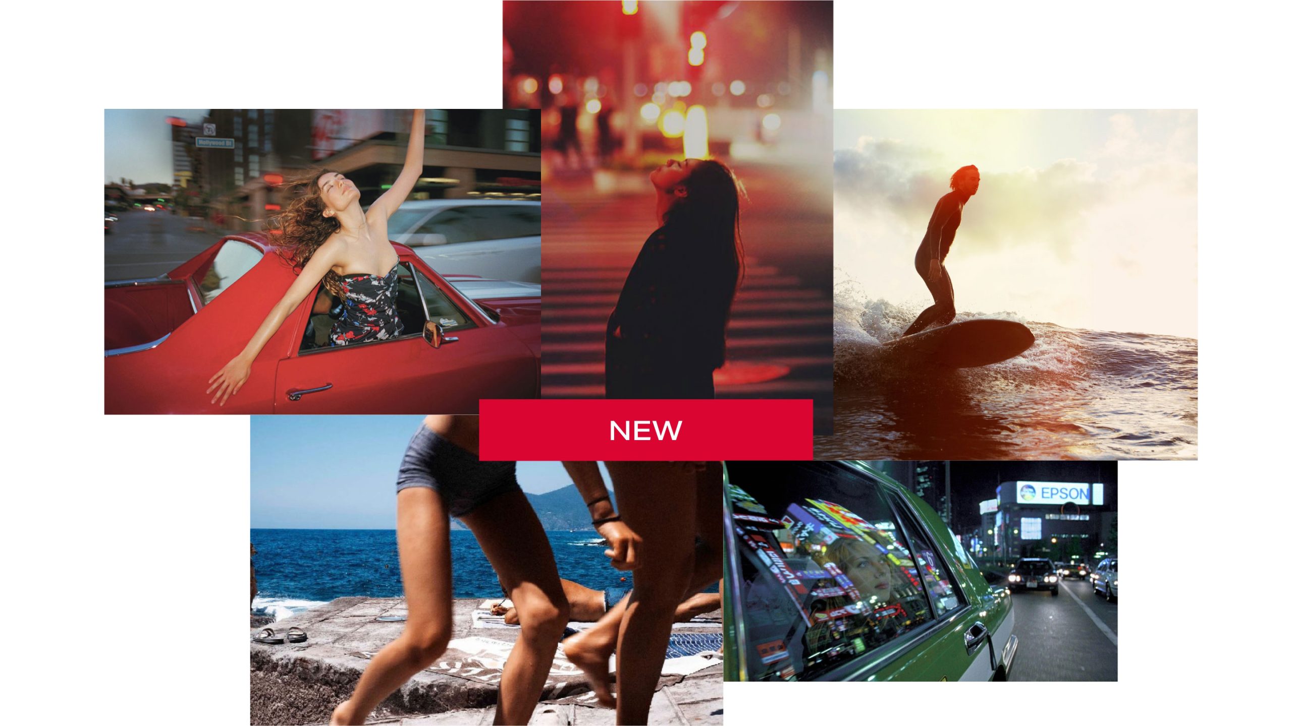

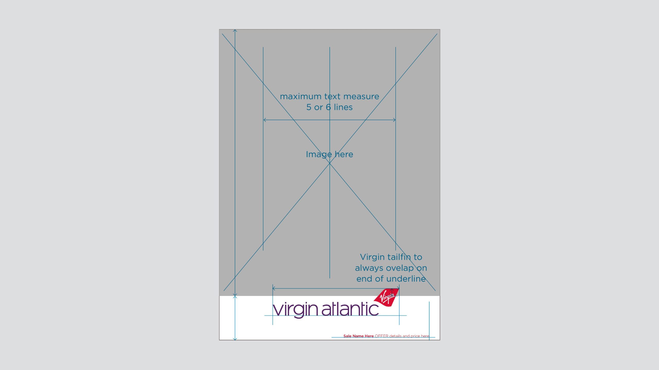
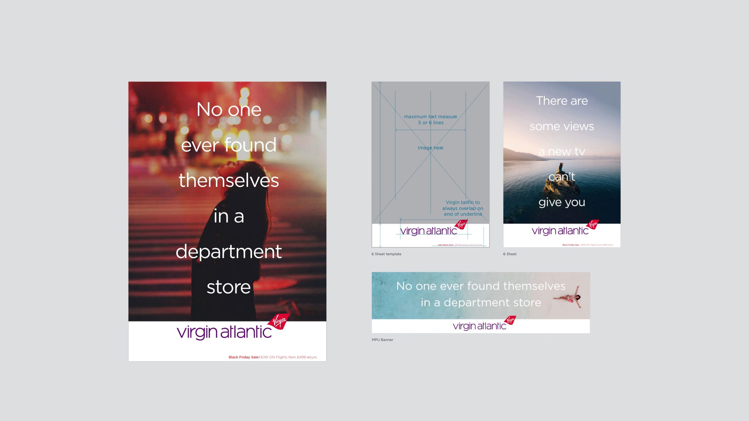
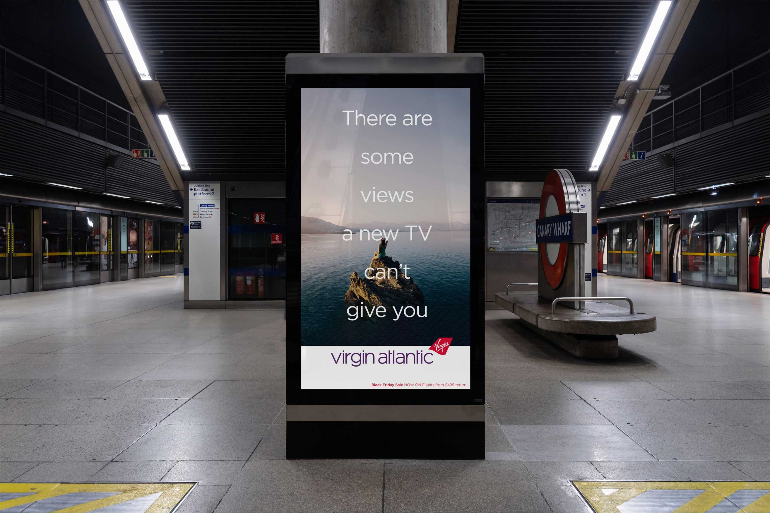
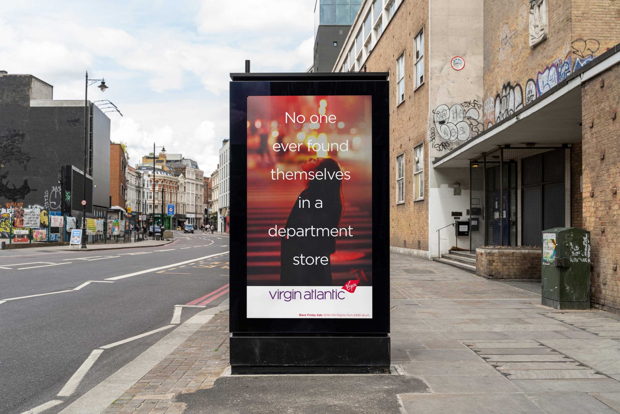
You have recognised the challenge and brought the core brand back to life with confidence and fresh innovation. It looks fucking amazing! Thanks so much for all your hard work.
danny hunt – CREATIVE director, Lucky Generals
Psychological Action Thriller Titles
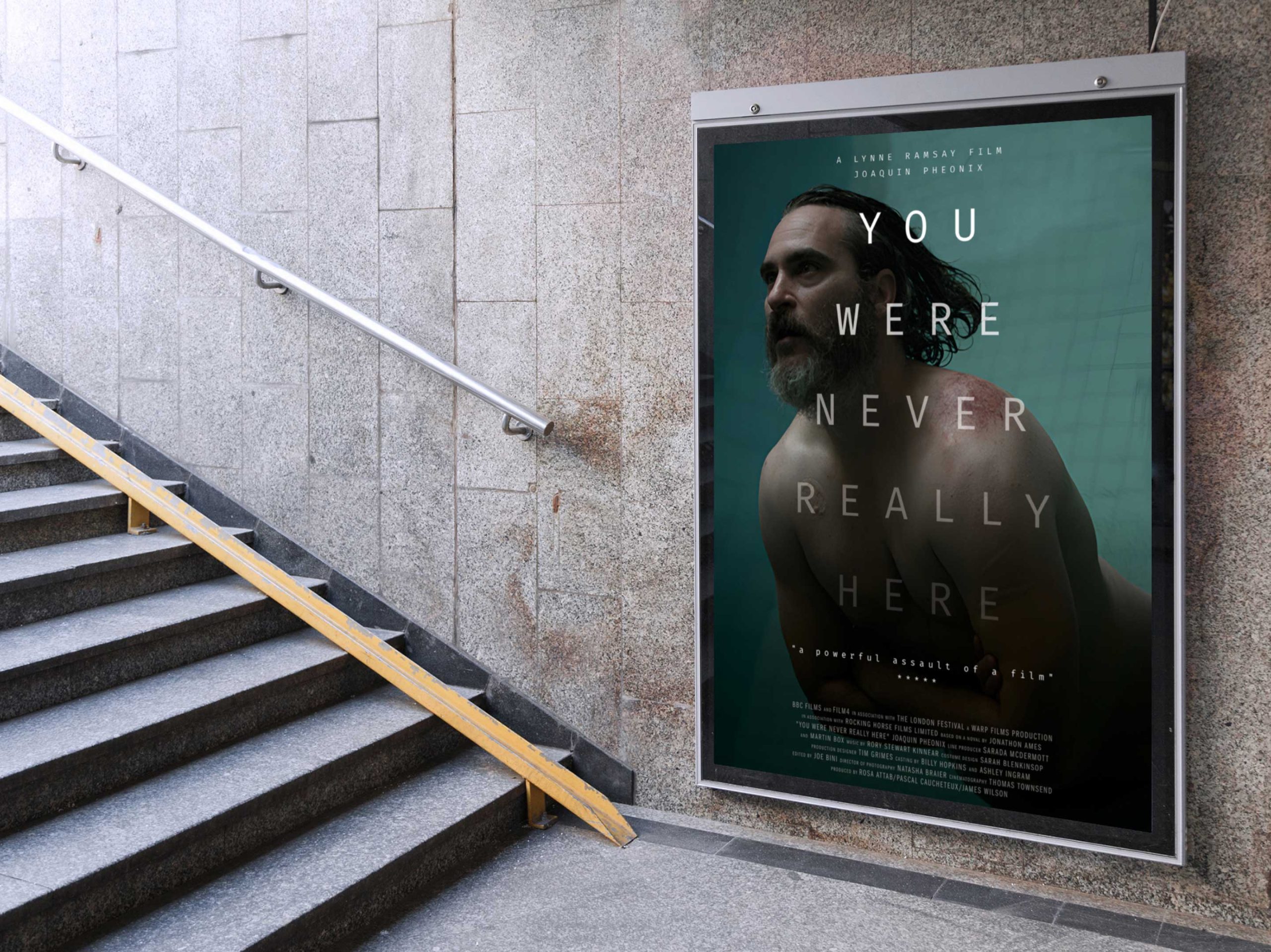
You Were Never Really Here – Lynne Ramsay
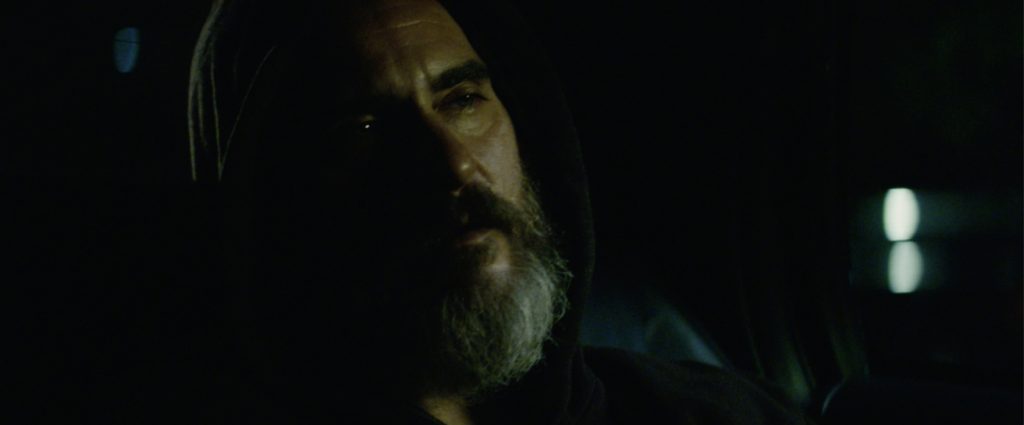
Written and directed by Lynne Ramsay and based on the Jonathan Ames book, You Were Never Really Here is a film staring Joaquin Phoenix as a traumatised mercenary hired to break a human trafficking network. It won awards for Best Screenplay and Best Actor at the Cannes Film Festival.
Having previously collaborated with Lynne on the title design for her debut feature film, Ratcatcher, I was approached once again to contribute to this dark yet visually stunning masterpiece. The film’s essence demanded a sequence that could effectively convey the protagonist’s troubled state of mind.
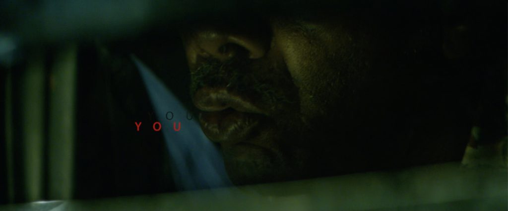
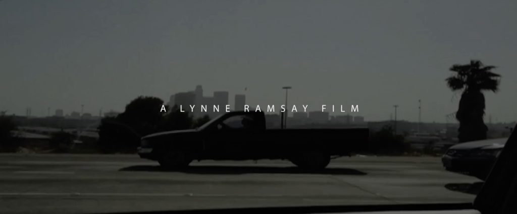
Lynne, always seeking creative surprises, found inspiration in a particular scene where a taxi driver silently mouths the film’s title, blurring the lines between reality and imagination. This served as the ideal backdrop to craft the captivating intro sequence. On the other hand, the end titles were designed to convey a more optimistic and satisfying conclusion to the film’s narrative.
Film title sequences / Festival Posters
Intro film titles
End film titles
Journey beyond the ordinary
Vertu x Bentley
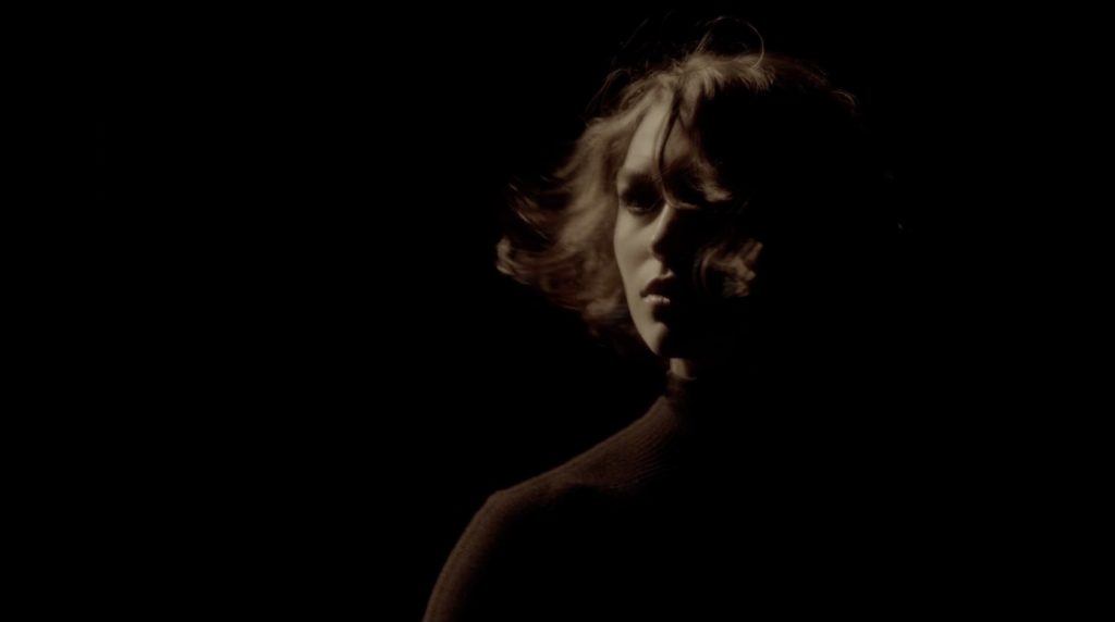
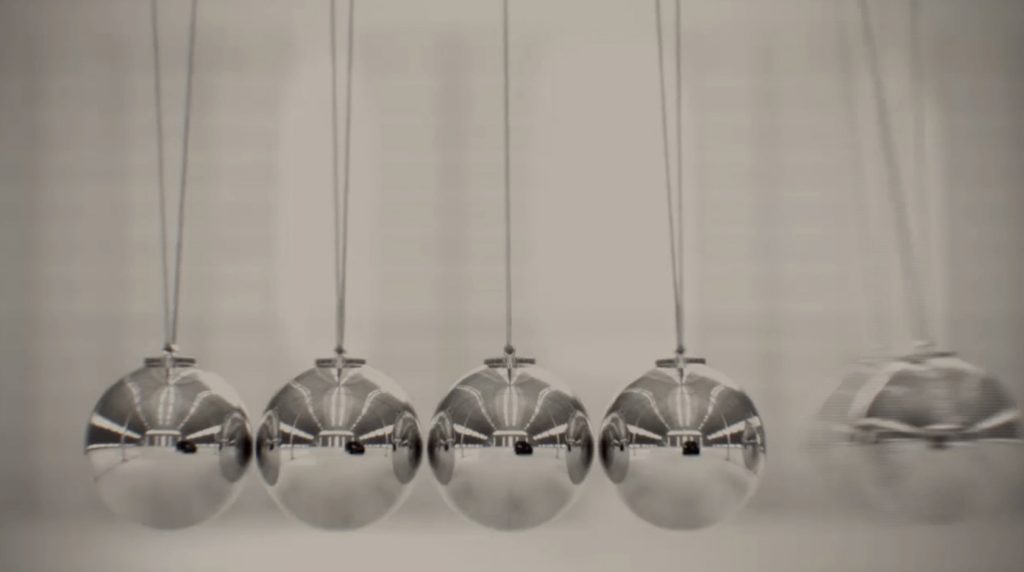
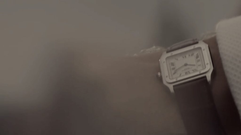
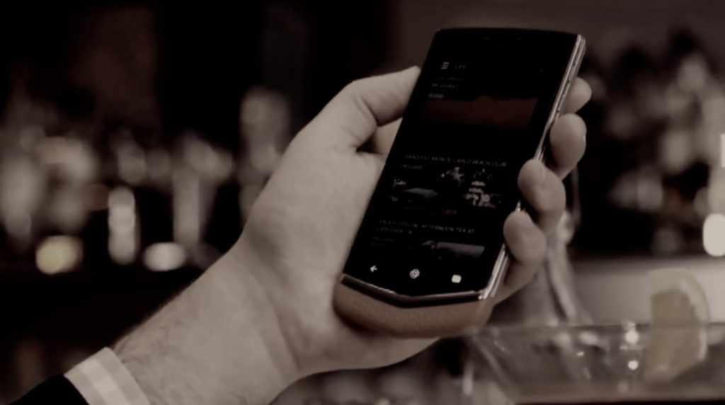
Having already worked for Vertu, they invited me to propose a film concept for the launch of their new Bentley Signature Touch handset. A collaboration with the luxury car brand, where buyers get a choice leather colours and 16 stitching options and a Bentley app, which gives access to exclusive content and events.
Vertu’s vision is the become regarded as the leading luxury mobile phone brand in the world and this film was an opportunity to reach a wider audience than it’s usual customer base.
Objectives for the film were, it needed to connect in an emotional and luxurious way, whilst portraying contemporary elegance and luxury performance materials
‘Journey beyond the ordinary – in a Bentley you arrive, in every sense of the word’. And with Vertu, you gain access to the world’s most exclusive destinations, at the touch of a button. The concept captured moments of arrival. Aesthetically warm, rich and deeply emotive. (All footage is existing.)
Film title sequences / Festival Posters
Camberwell’s Creative Class
Wyndham studios – Fabrica
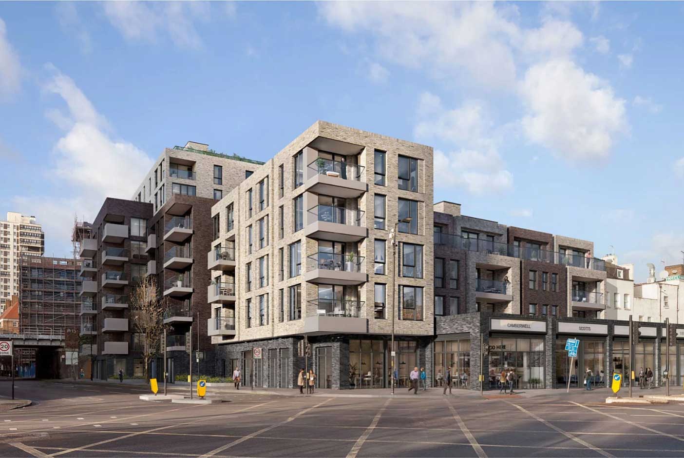
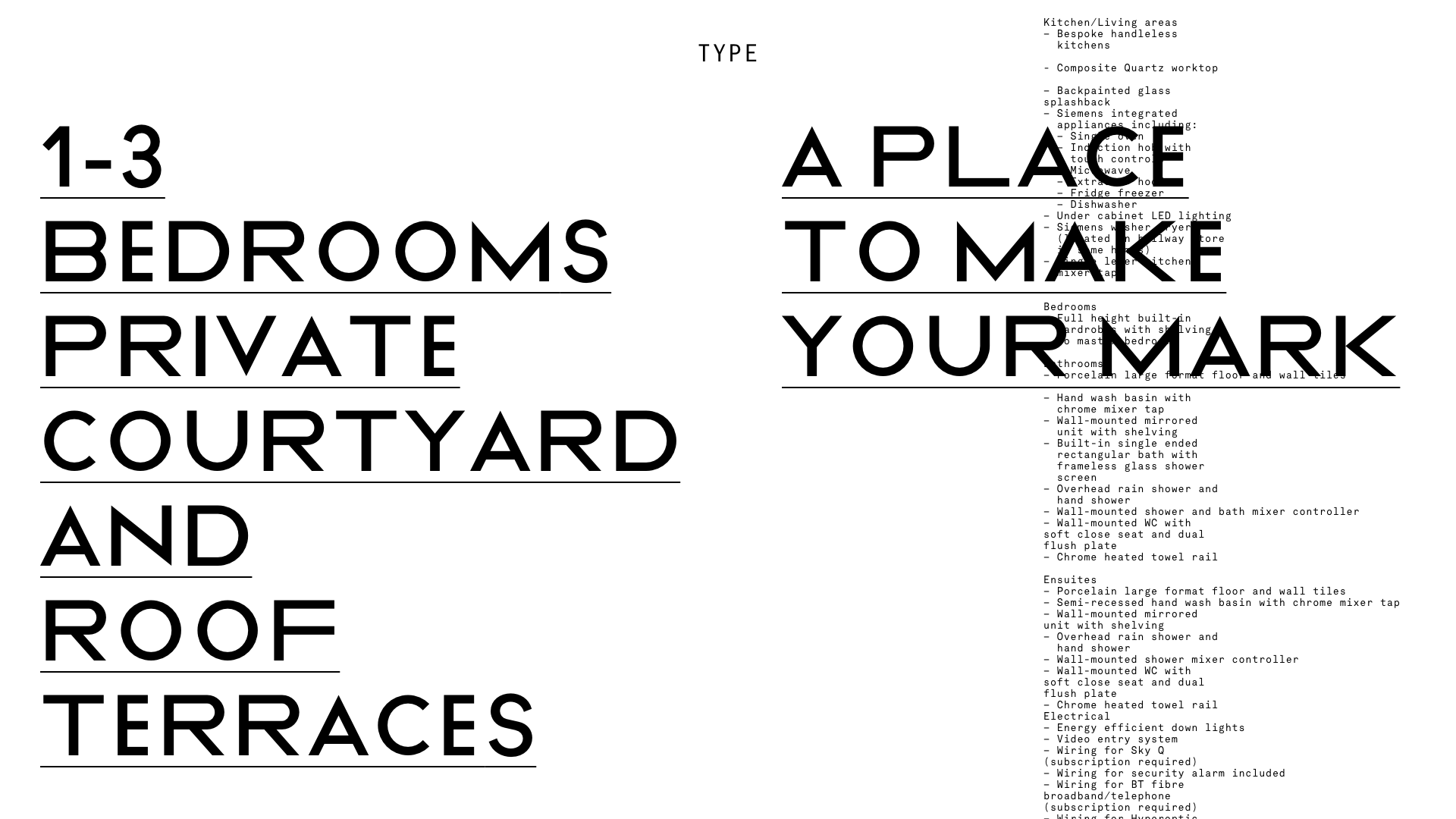
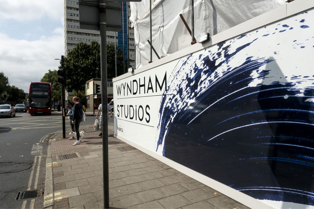
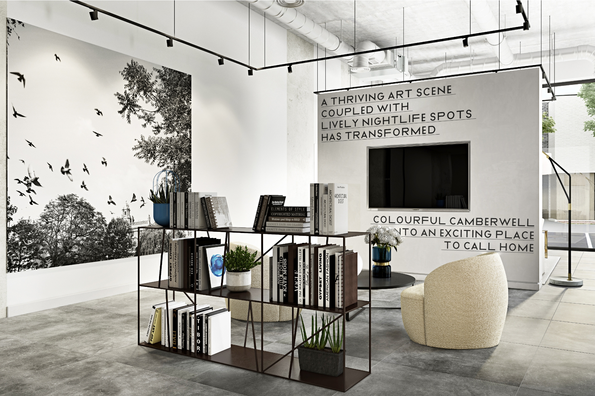
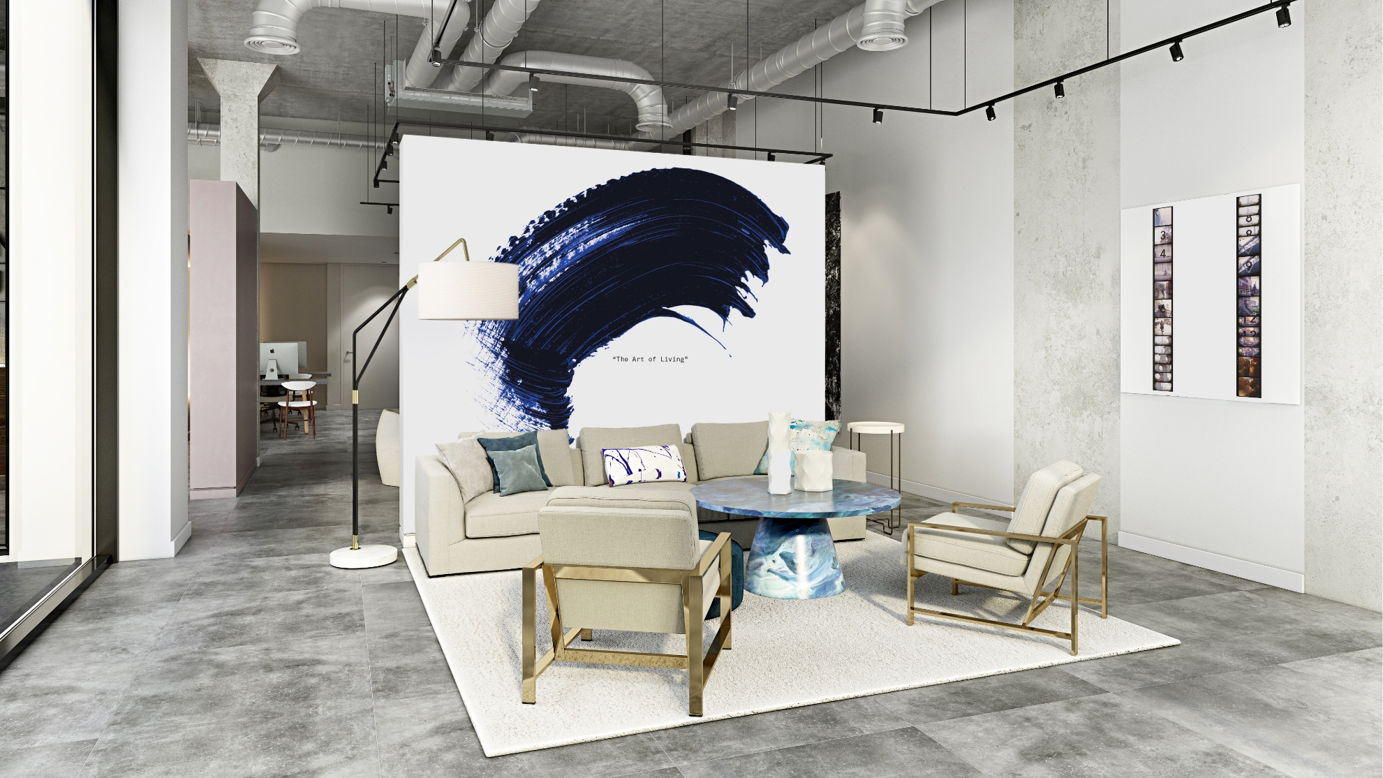
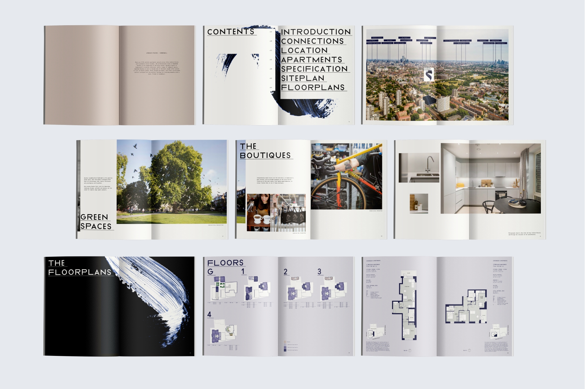
Located in Camberwell, South East London, offers 59 apartments with rooftop terraces and stunning city views. The development was late to market, so needed to distinguish itself from the competition.
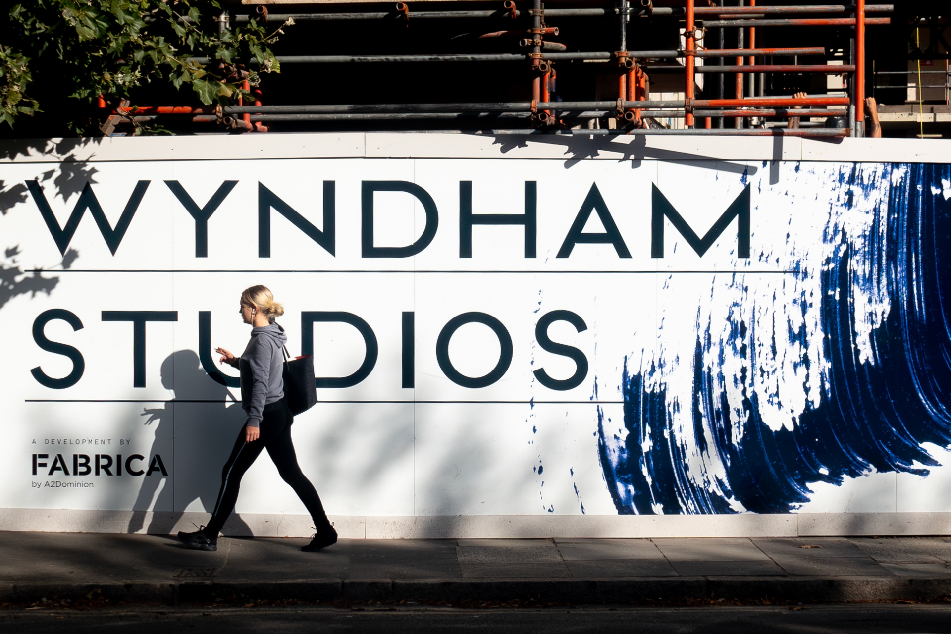
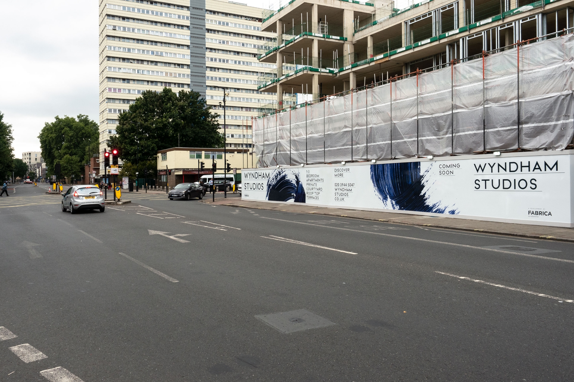
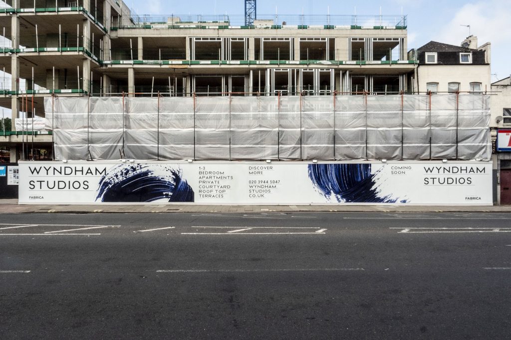
Camberwell is a thriving neighbourhood, celebrated for its dynamic fashion, art, and design scenes. To set itself apart, the development embraced a bold approach, employing striking typography and expressive Yves Klein blue brushmarks across pre and post-completion materials. This genuine brand identity was further accentuated through a captivating ‘digital Super 8’ aesthetic, seamlessly woven into the marketing and social media films, showcasing the essence of this unique community
brand strategy / brand toolkit / brochure / hoarding / marketing film / marketing suite / social media / virtual tour film
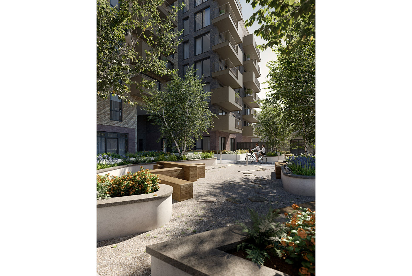
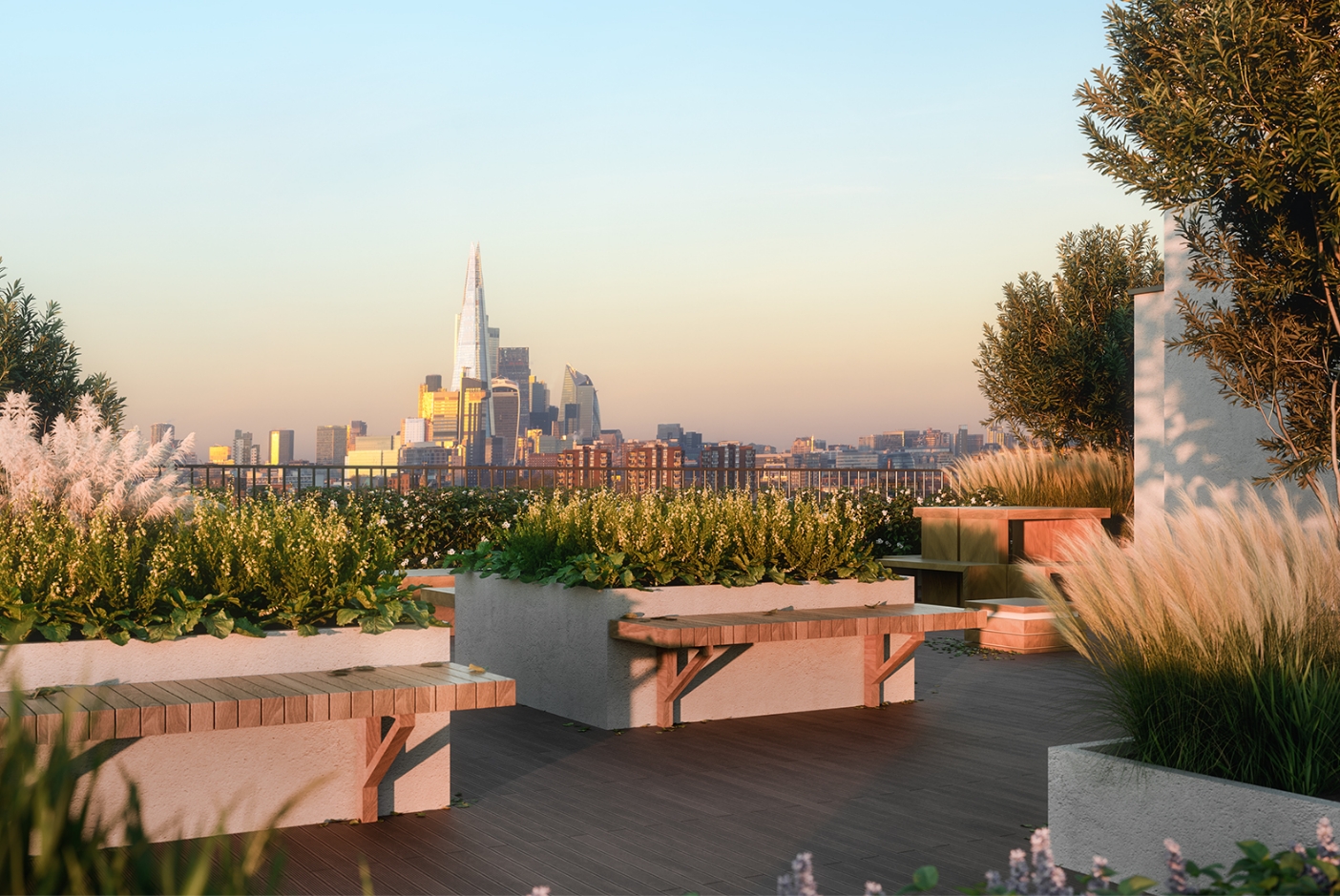

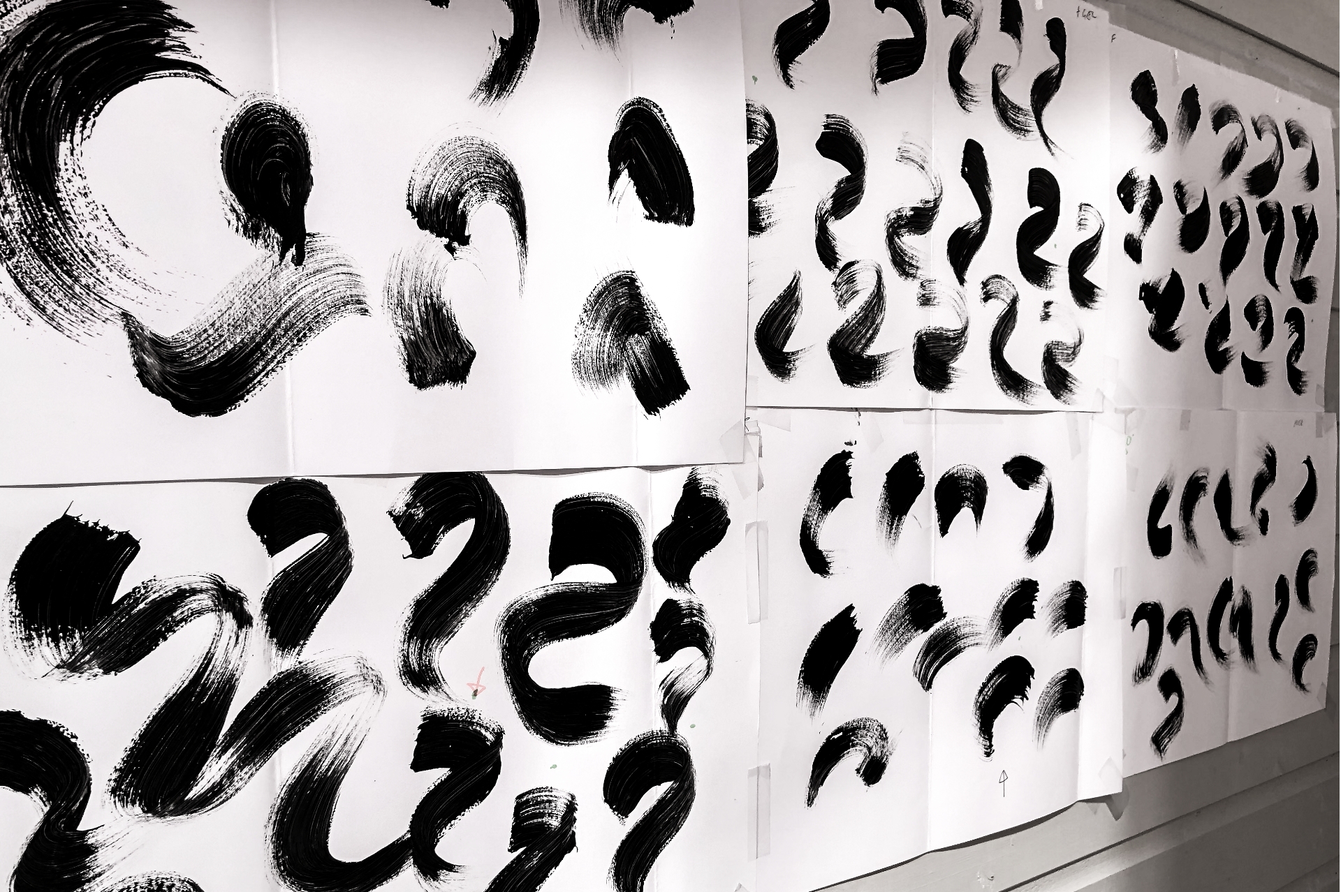
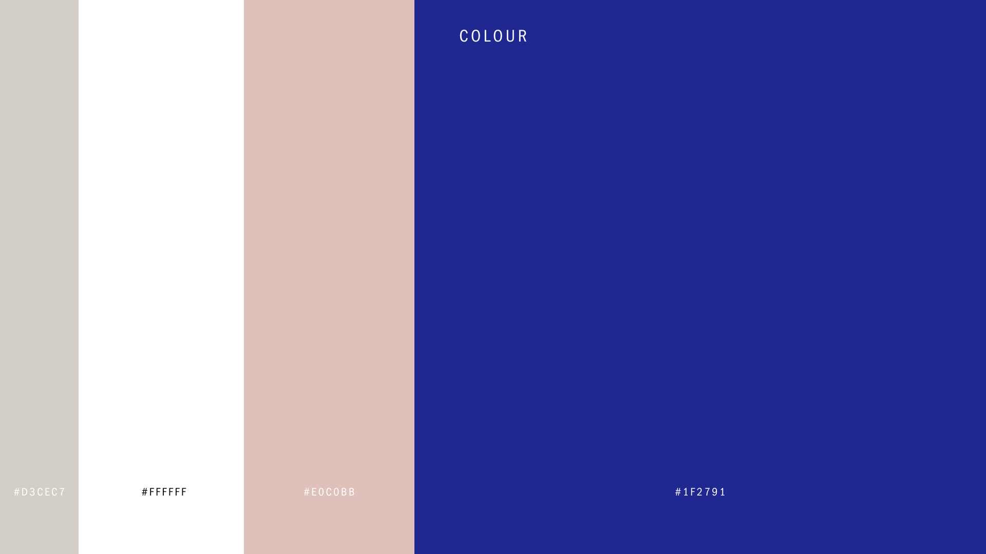


I have to say, everything looks absolutely fantastic! Thank you so much for your amazing design skills.
Sancia Cicciarelli – Head of Marketing
A Natural Return
Elderberry Walk – Cheyne Capital
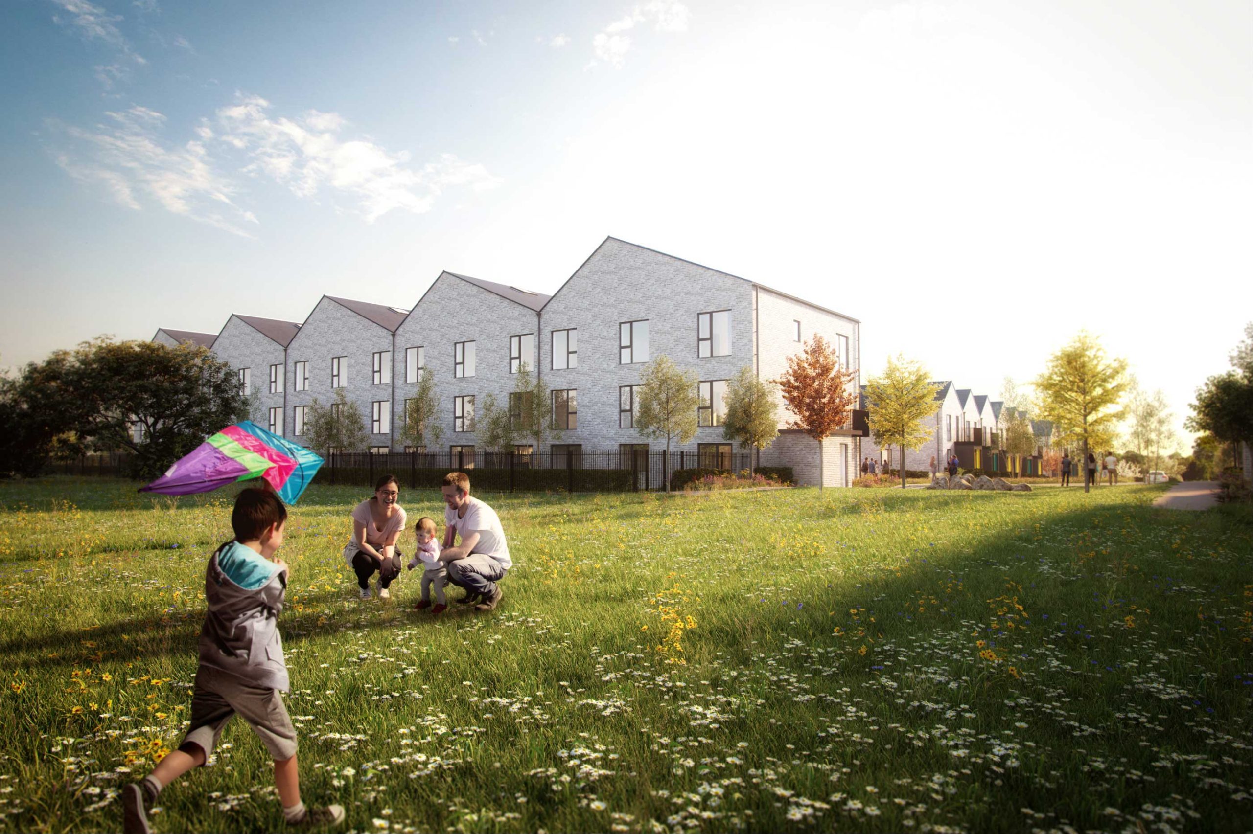
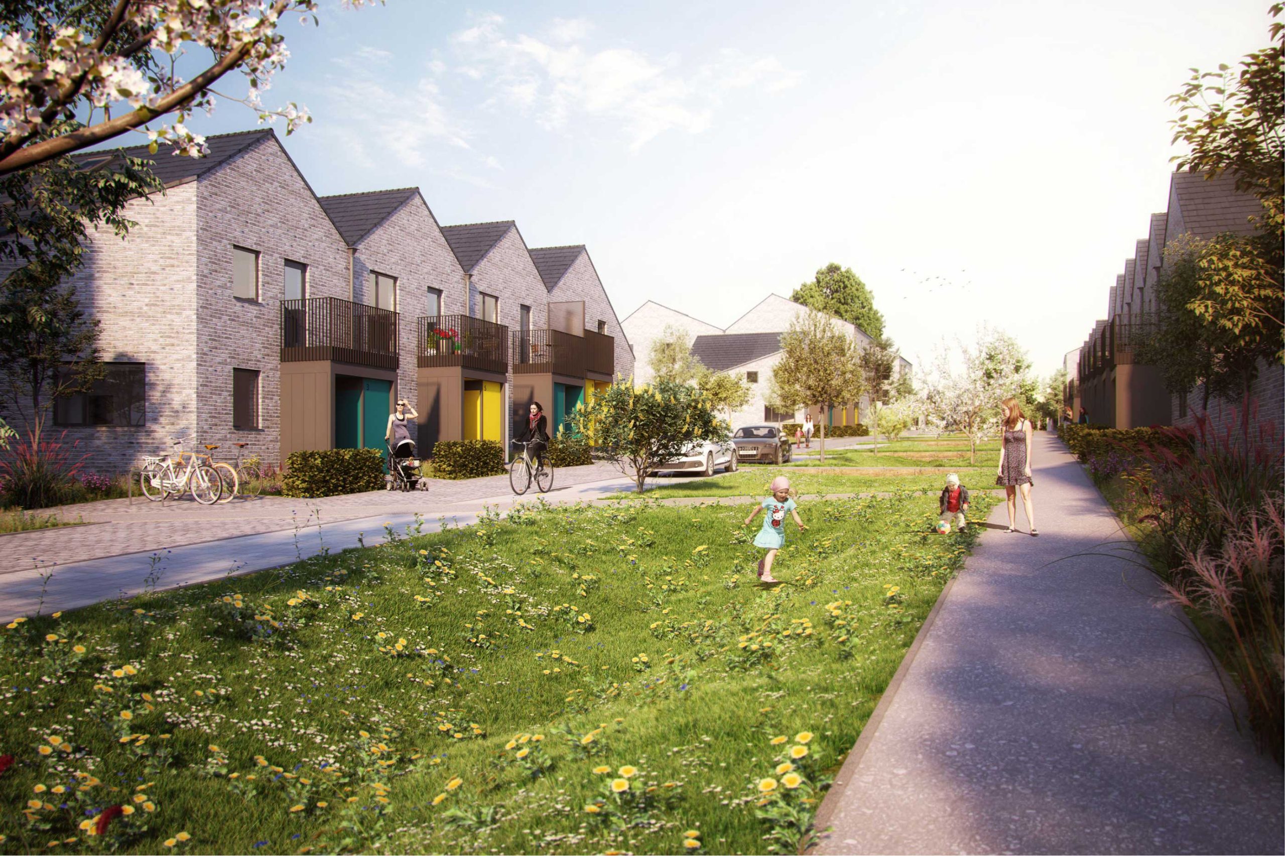
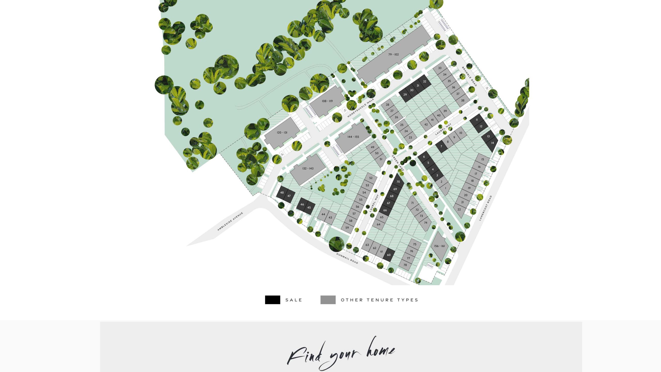
Introducing Elderberry Walk, a prestigious ensemble of homes nestled in a serene woodland surrounding near Bristol, celebrated for its accolades in the industry. Despite its initial branding, the leading investment fund recognised the need for a transformation, seeking a more befitting representation.
Entrusted with this vital mission, I was commissioned to revitalise the brand and craft a captivating digital journey that would elevate the sales process. Our strategic vision centred around highlighting the core proposition – a harmonious interplay between nature and its inhabitants. Emphasising this seamless integration, we envisioned Elderberry Walk as an immersive environment, where residents coexist in perfect harmony with the surrounding natural splendour.
To encapsulate this essence, we meticulously curated a sophisticated and design-led brand, mirroring the very essence of living and flourishing at Elderberry Walk. Our new identity beautifully captures the captivating experience that awaits prospective homeowners amidst the tranquil woodland, creating a lasting impression that resonates with their desire for a harmonious and enriched lifestyle.
Brand audit / Brand Strategy / Brand Toolkit / Brand identity / Website / Drone film
Buyer’s packs


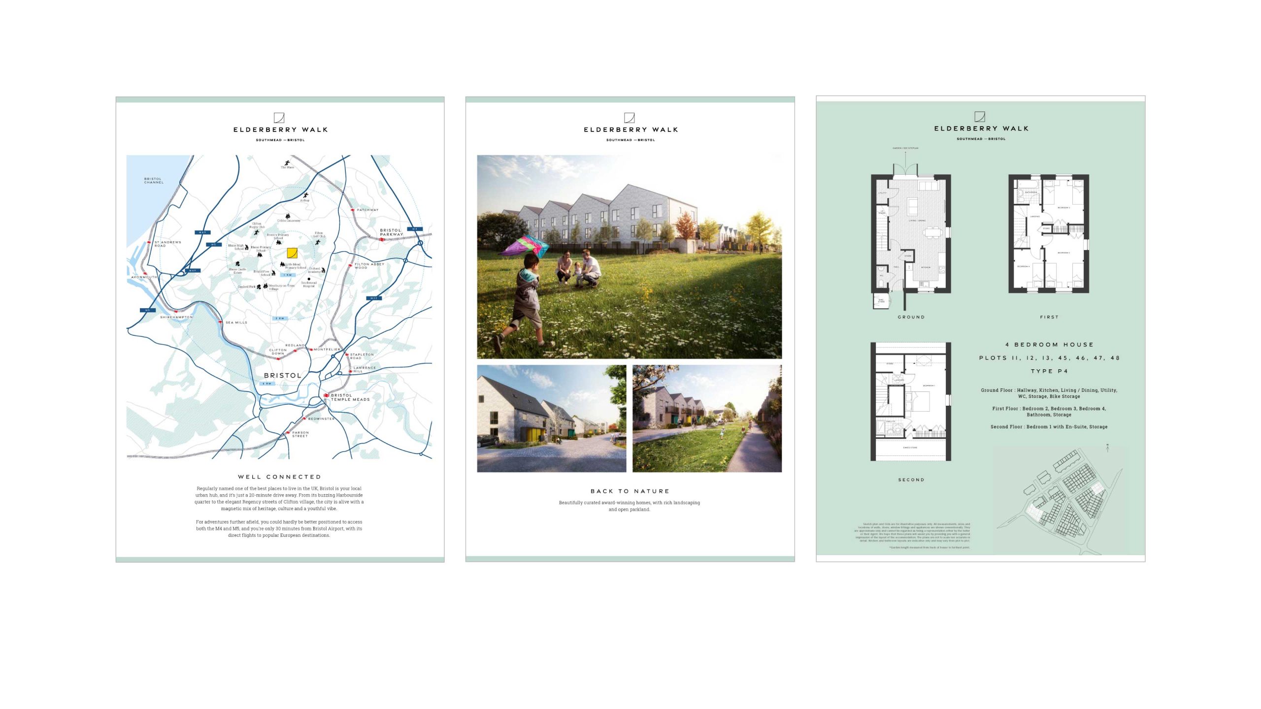
What you have delivered for us is a seriously impressive site. Thank you.
JACK GREENHALF – DEVELOPMENT MANAGER, CHEYNE CAPITAL
Discreet Luxury Living
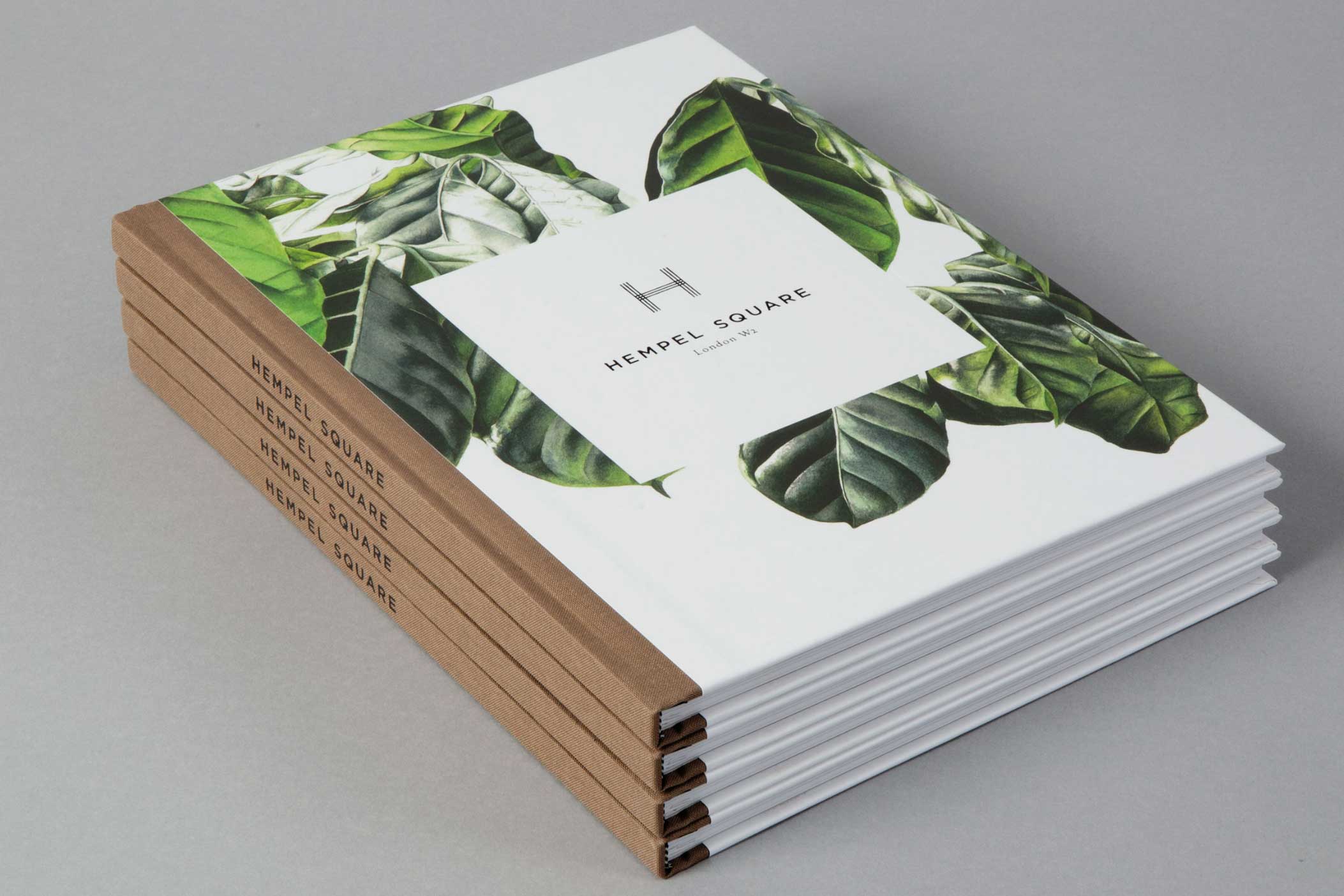
The Hempel Collection – British Land
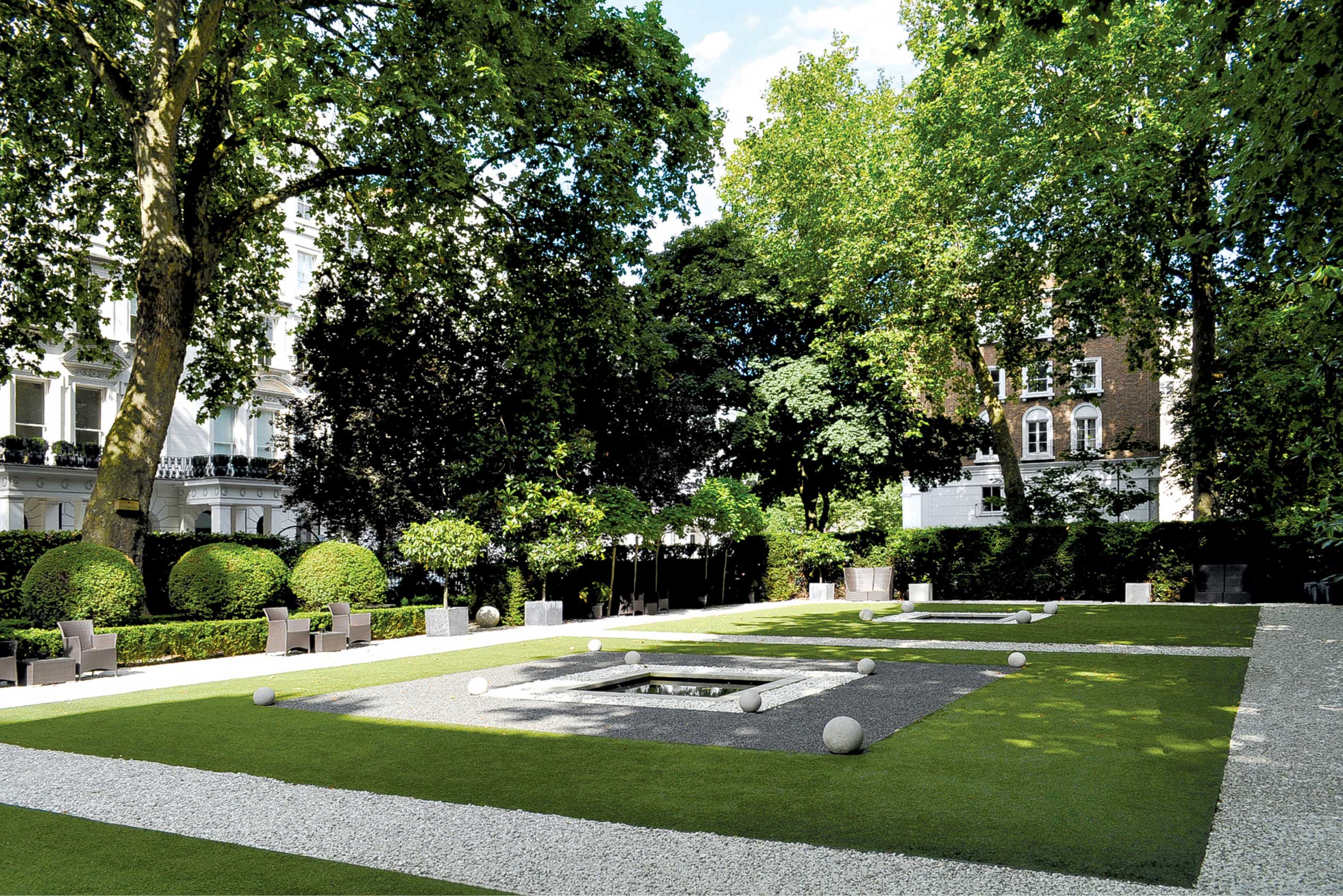
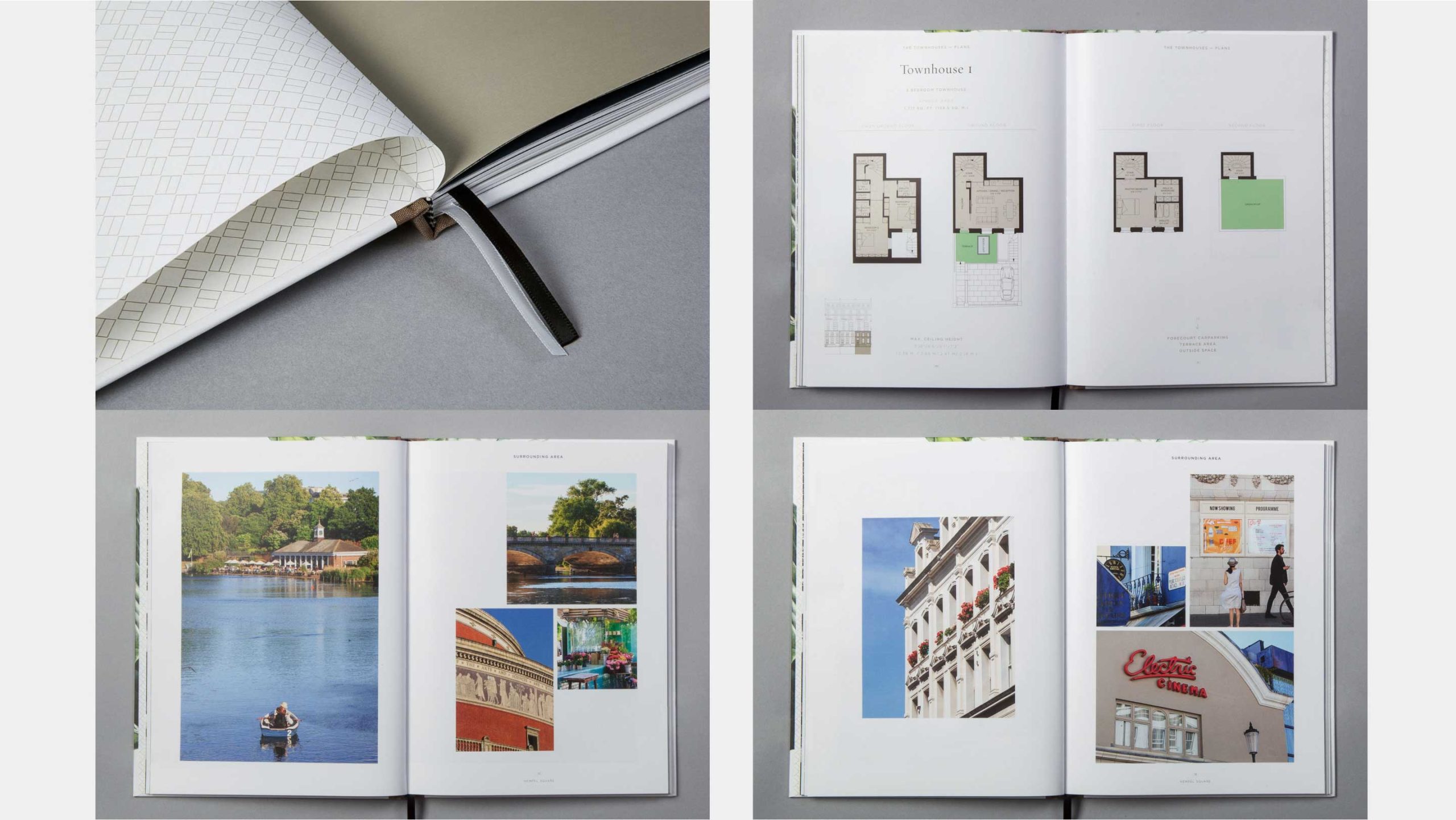
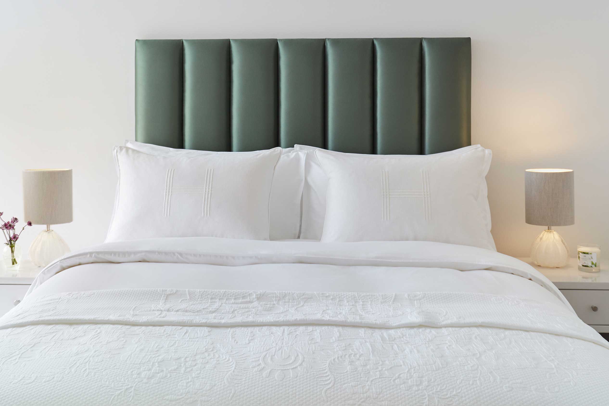
The create a unique brand for the meticulously redevelopment of Anouska Hempel’s renowned Bayswater hotel, into an exclusive collection of private residences, each with access to a beautiful private garden.
The strategy was to create a collection of names under the master brand, which gave the marketing the flexibility it required for the various bespoke offerings and the phased roll out.
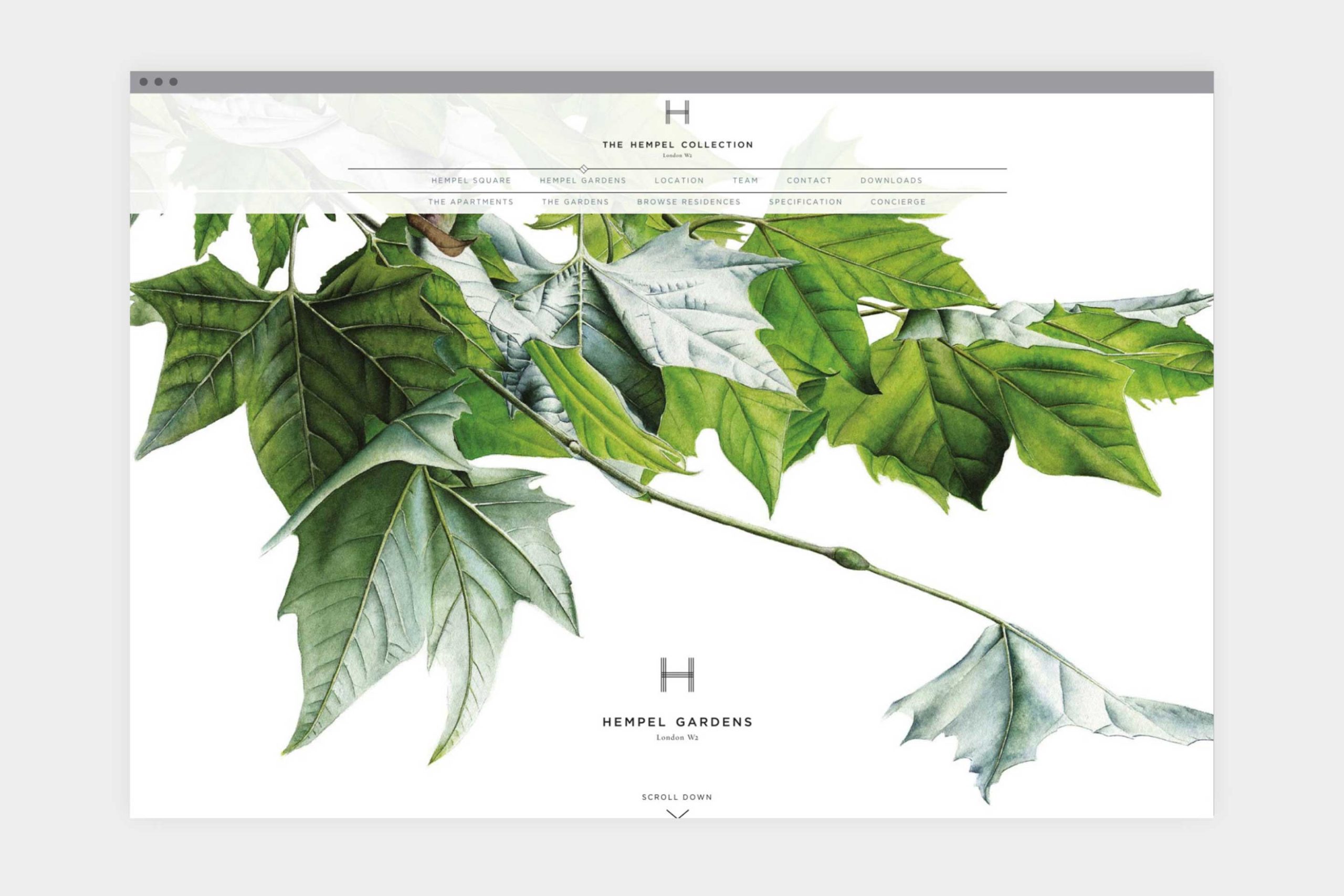
A private gated garden in London is such a unique and privileged benefit. This was heroed this in the graphic language through a bespoke botanical illustration, which made a perfect complement to the contemporary brandmark. As a digital first brand, several pre-completion marketing films were created to highlight the craftsmanship behind the redevelopment, enticing discerning individuals with a glimpse of the refined luxury that awaits them.
advertising / art direction / Brand Strategy / Brand Toolkit / brand identity / films / email campaigns / Overseas and UK marketing suites / PR /pre+post-completion campaigns / site signage / websites
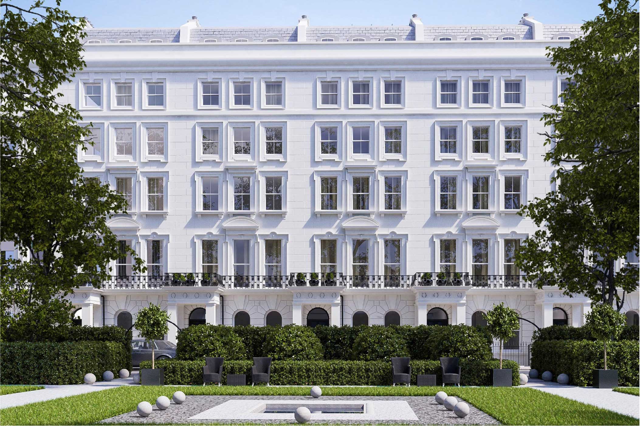
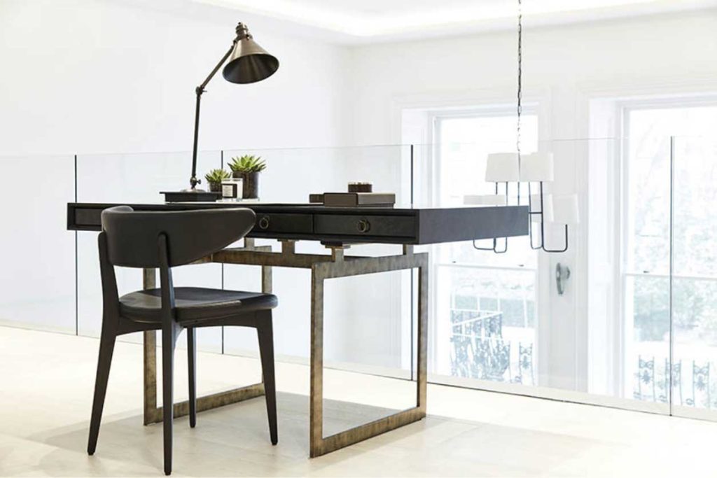
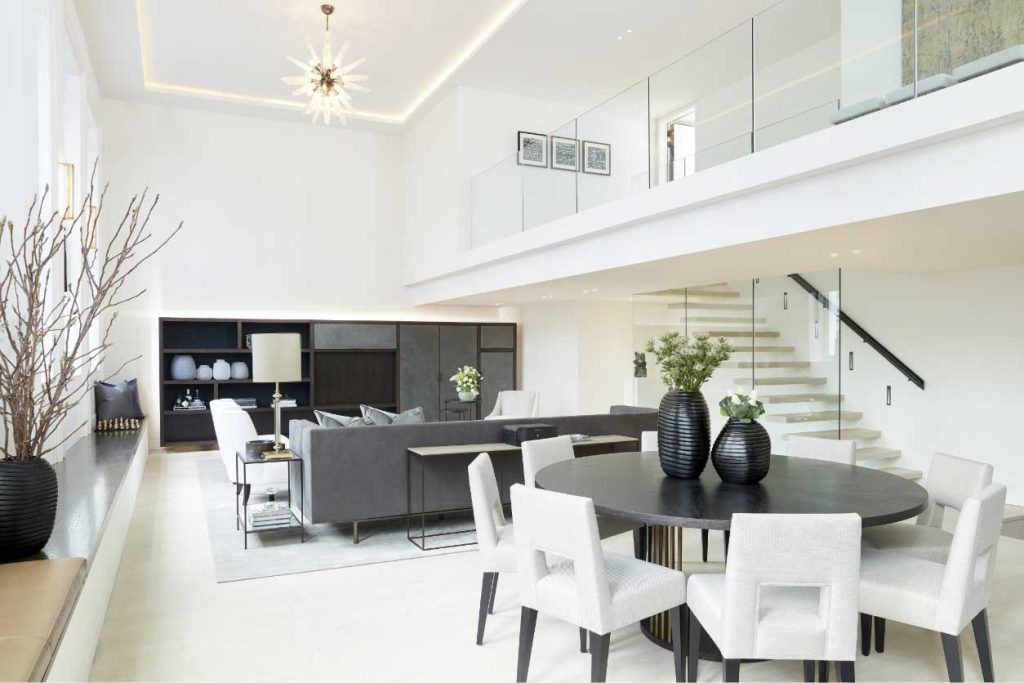
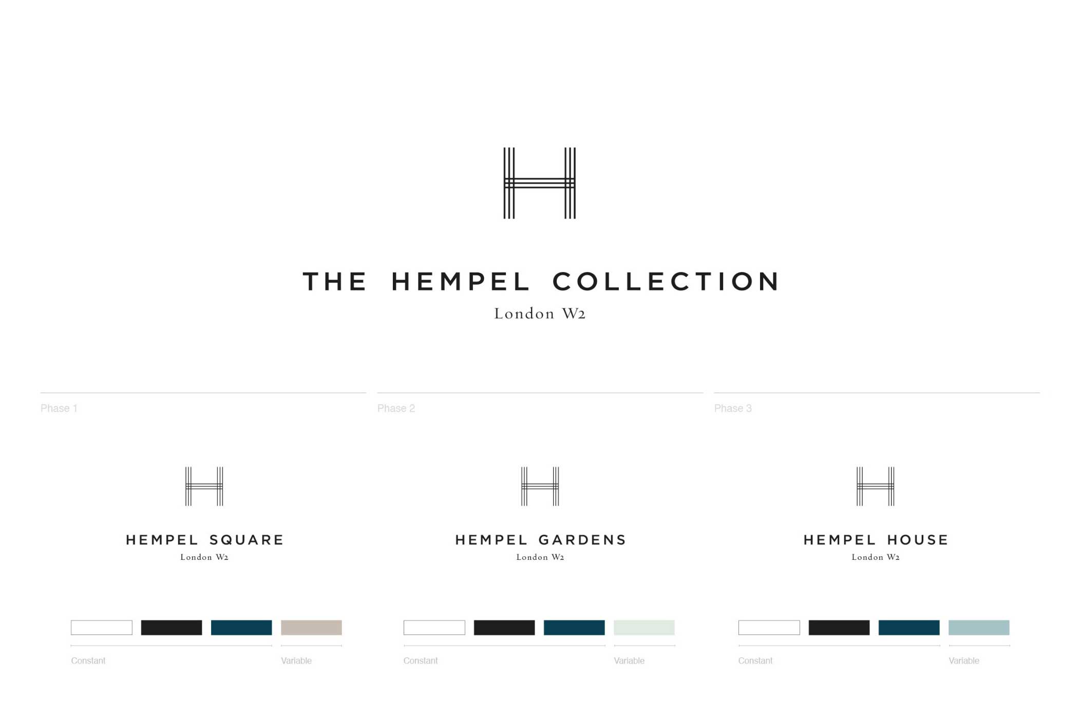


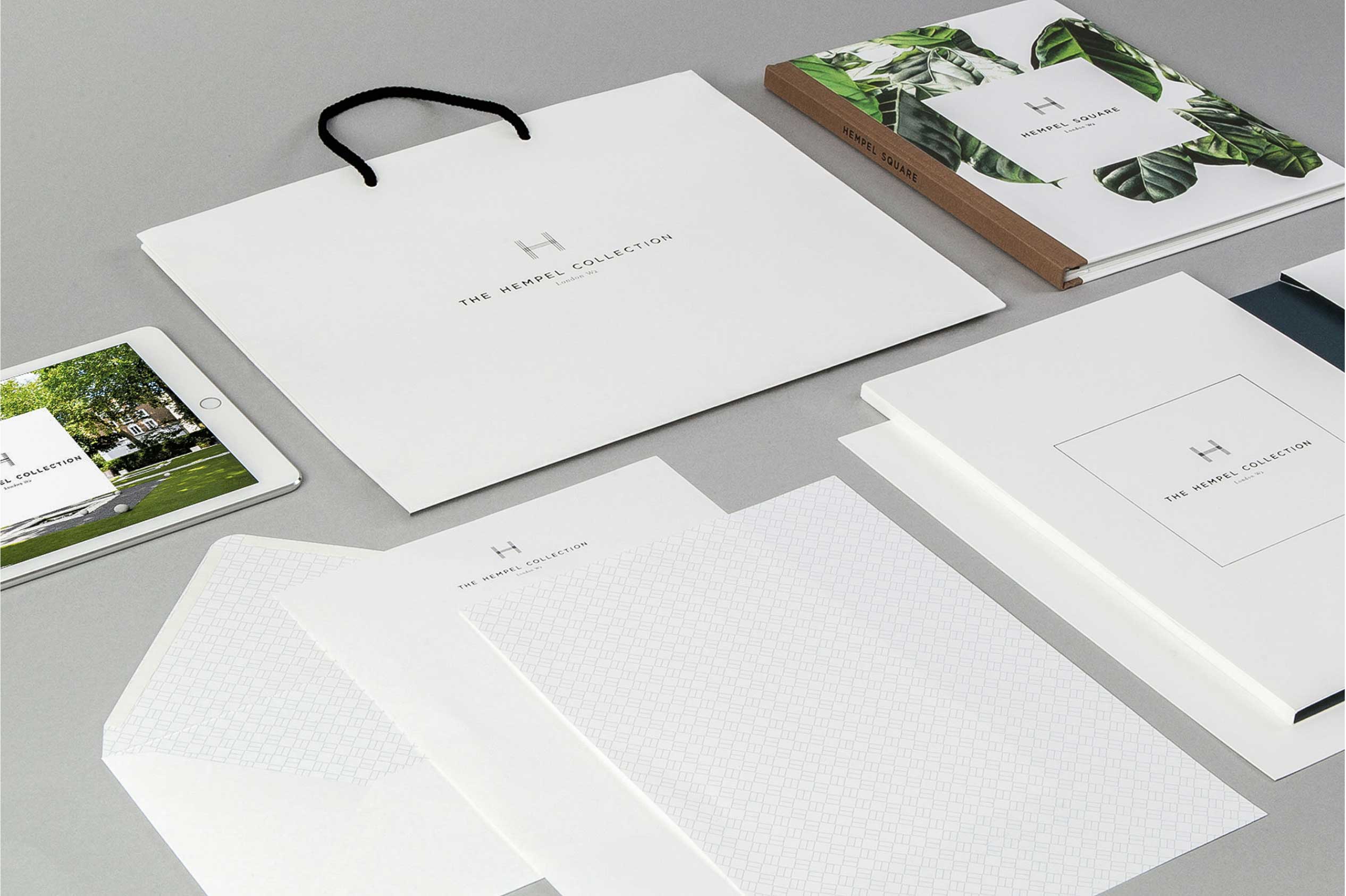
You have been a valued partner and should be incredibly proud of what has been achieved by your unswerving commitment to high quality design and innovative thinking.
Hilary FORRESTER – Marketing Director, British Land
Redefining Modern Luxury Living
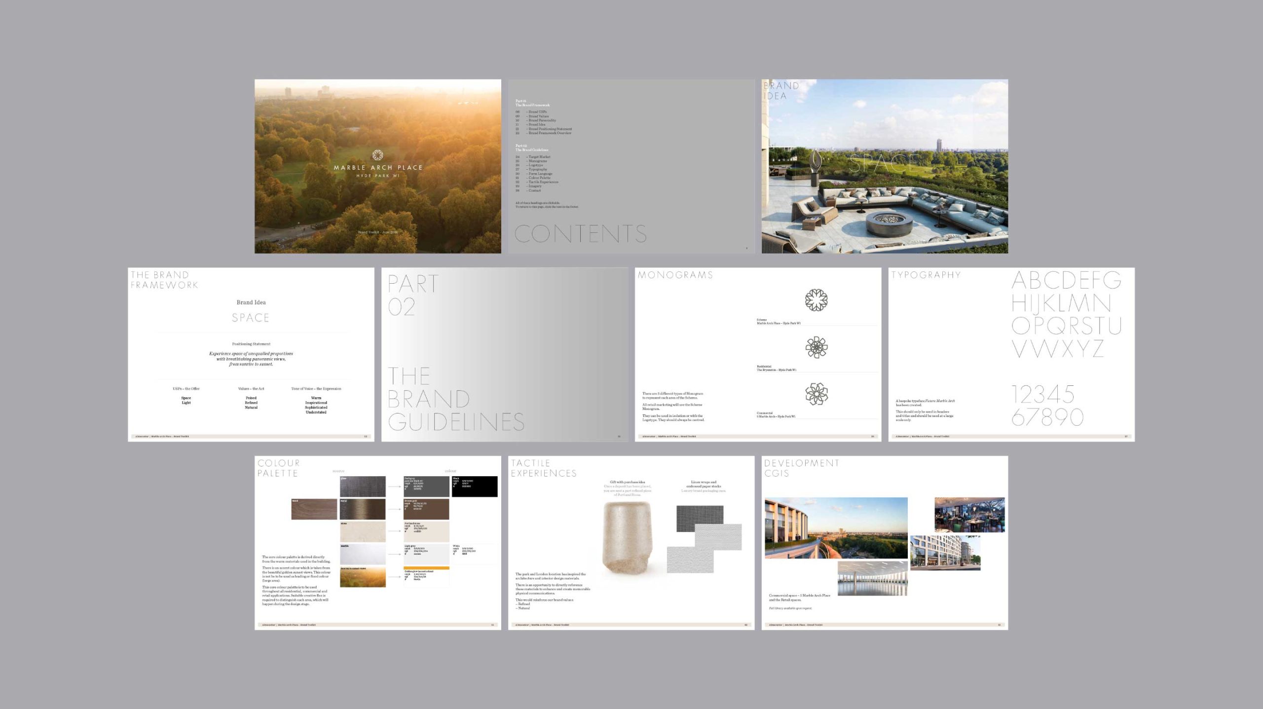
The Bryanston – Almacantar
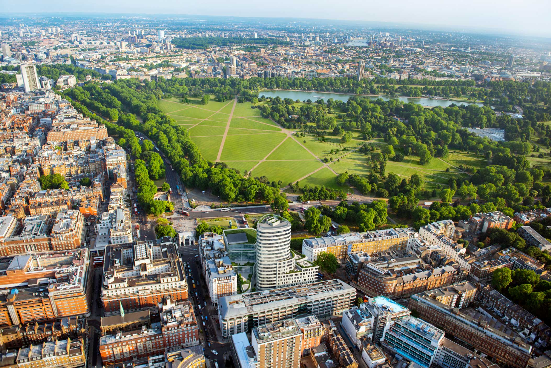
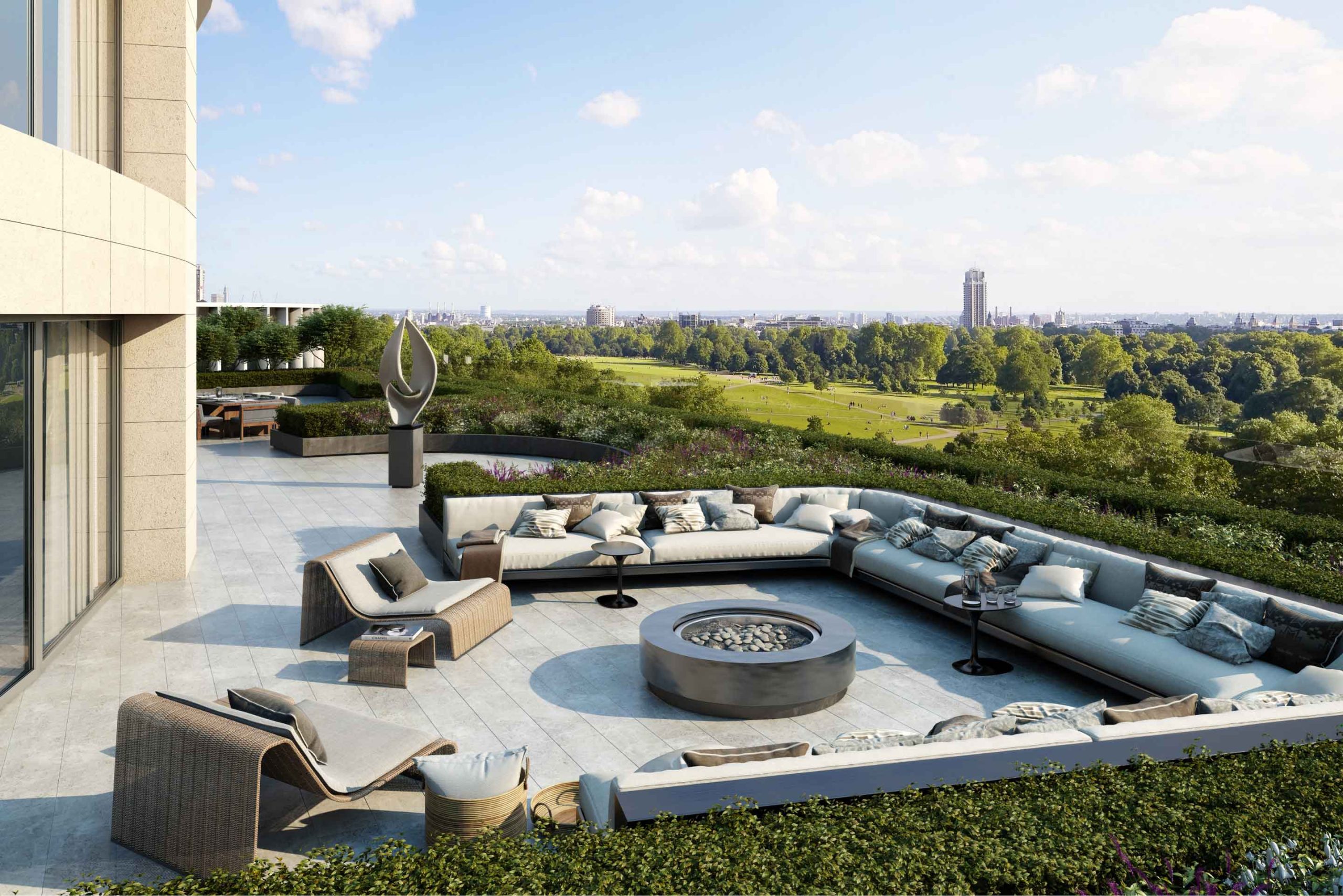
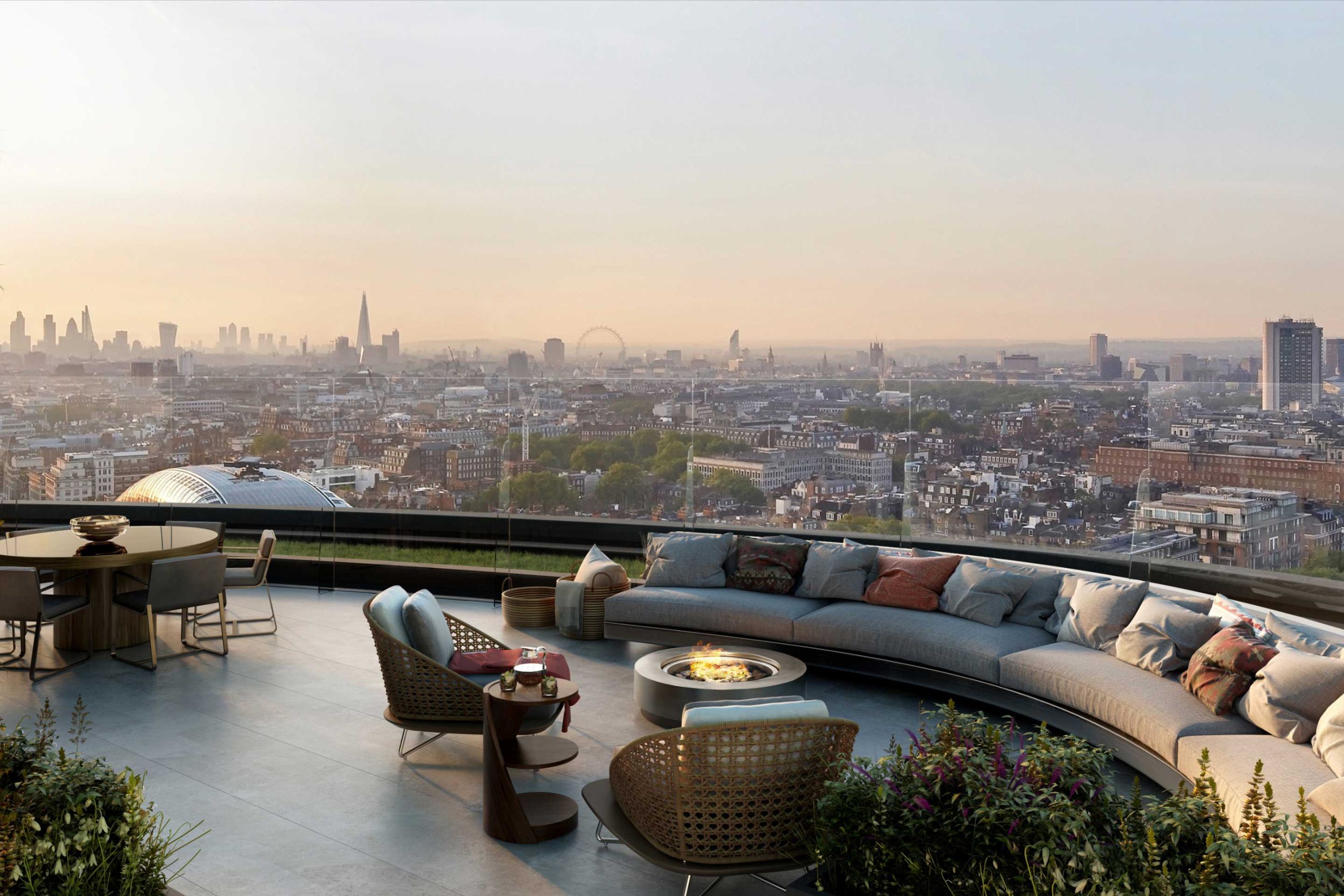
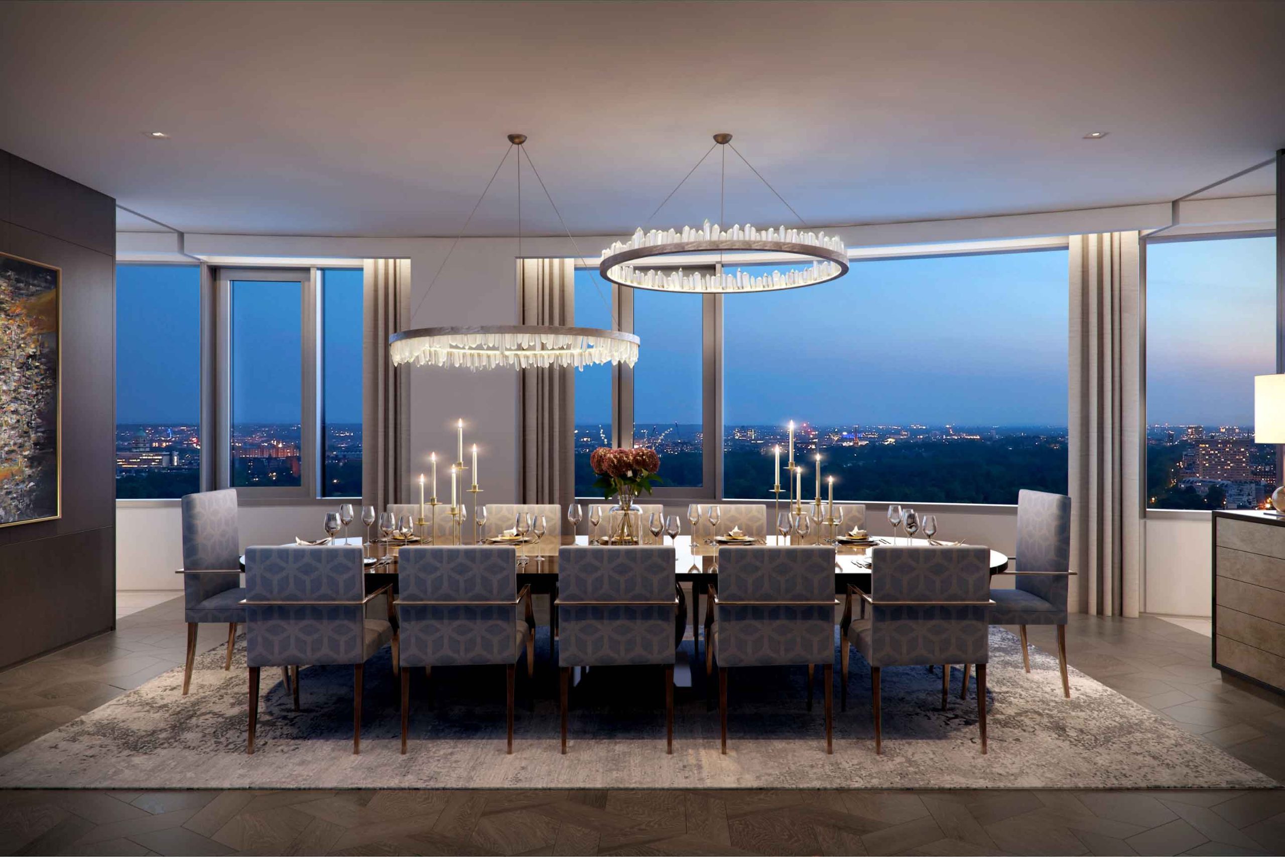
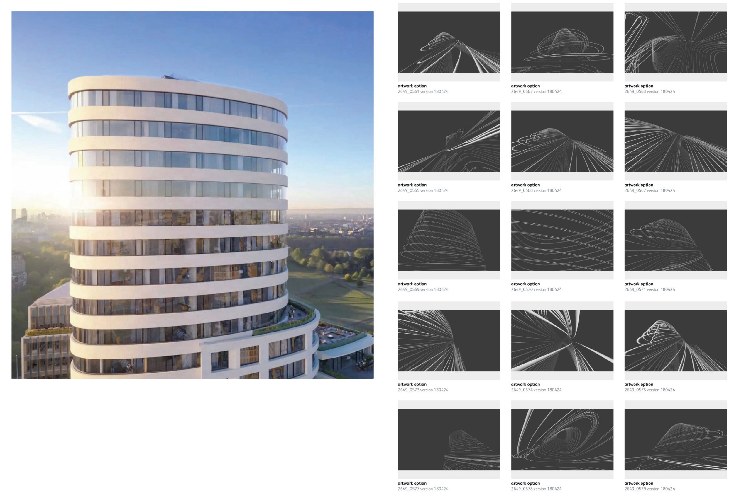
The Bryanston is a luxury residential development overlooking Hyde Park, envisioned by the esteemed architect Rafael Viñoly. This prestigious development encompasses an 18-story residential tower, boasting breathtaking panoramic views of Hyde Park. To distinguish it from conventional luxury property marketing, the challenge lay in unveiling its impending arrival with a fresh and innovative perspective.
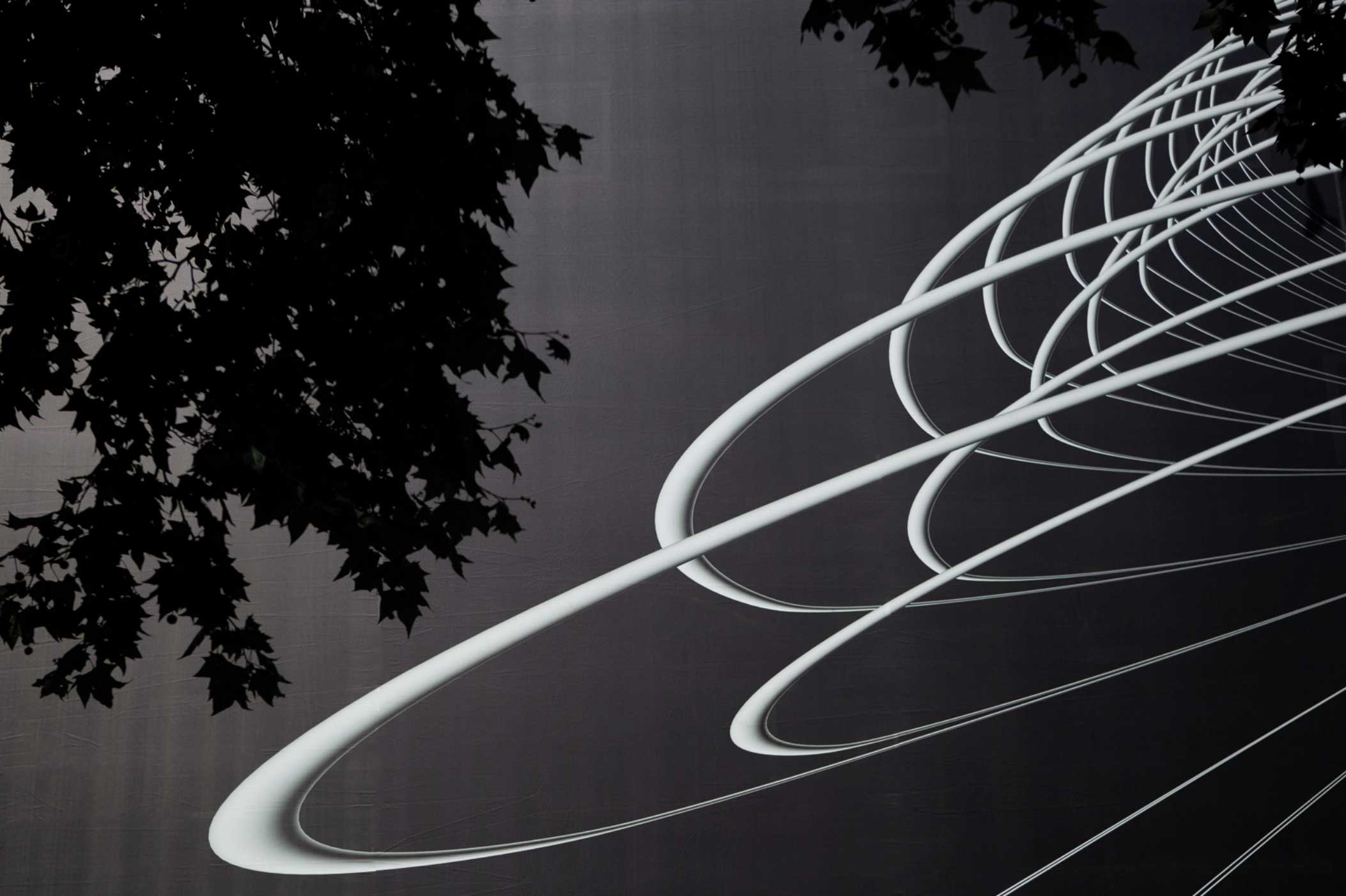
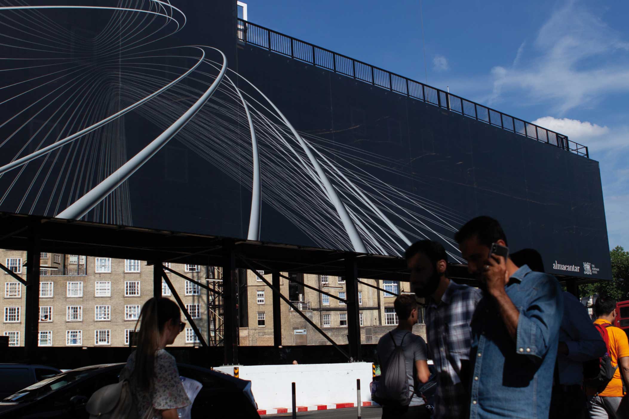
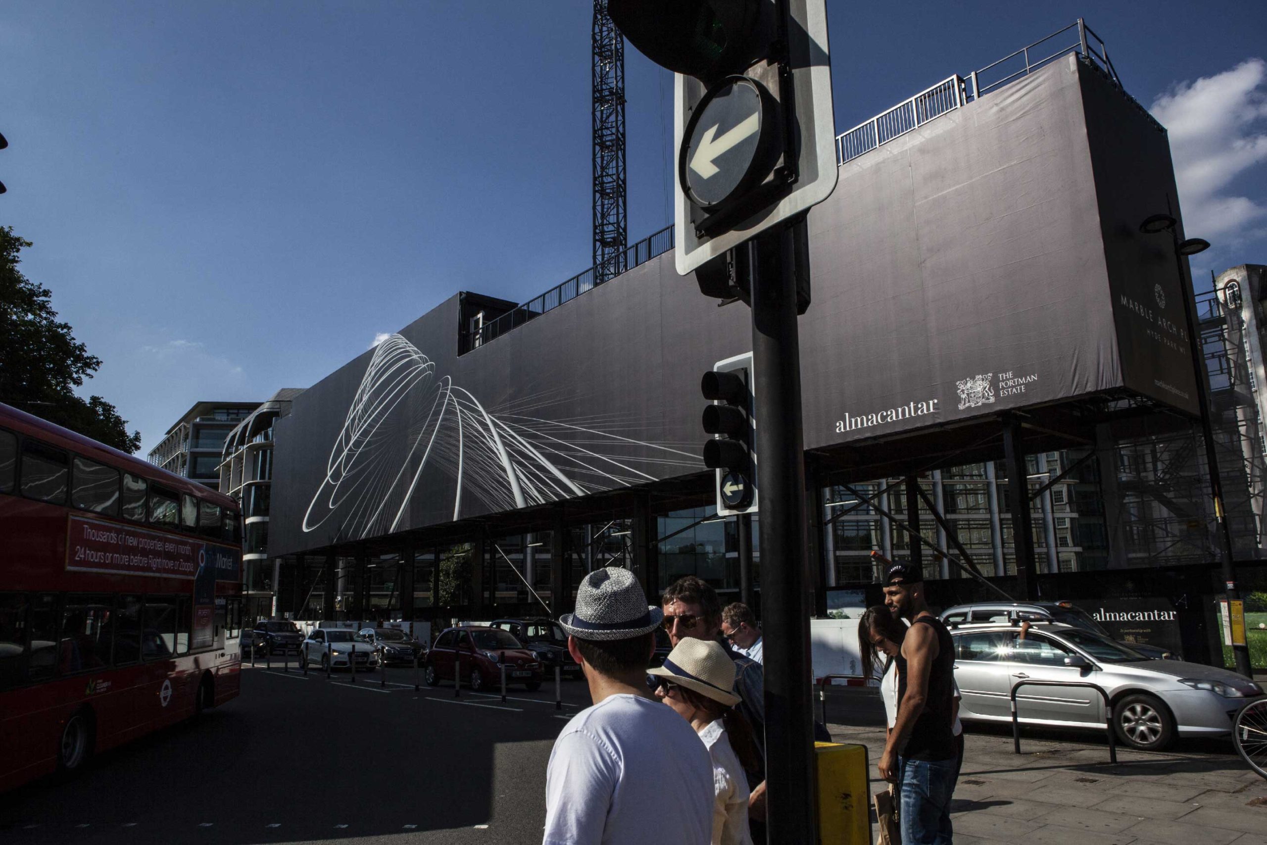
The key lay in the unrivalled 360-degree vistas, bestowed by the extraordinary curved architecture. This presented a remarkable opportunity to captivate the younger Ultra High Net Worth Individuals (UHNWI) – individuals with an affinity for the worlds of art and fashion – through a daring and audacious approach. Embracing the building’s wireframe structure, an array of extreme camera angles was explored, giving birth to a dynamic and avant-garde visual language.
With this unconventional yet alluring presentation, the Bryanston effortlessly entices the most discerning clientele, offering not just a residence, but an artistic and visionary lifestyle experience.
Brand toolkit / gantry wrap / press packs / social media films
