
Journey beyond the ordinary
Vertu x Bentley
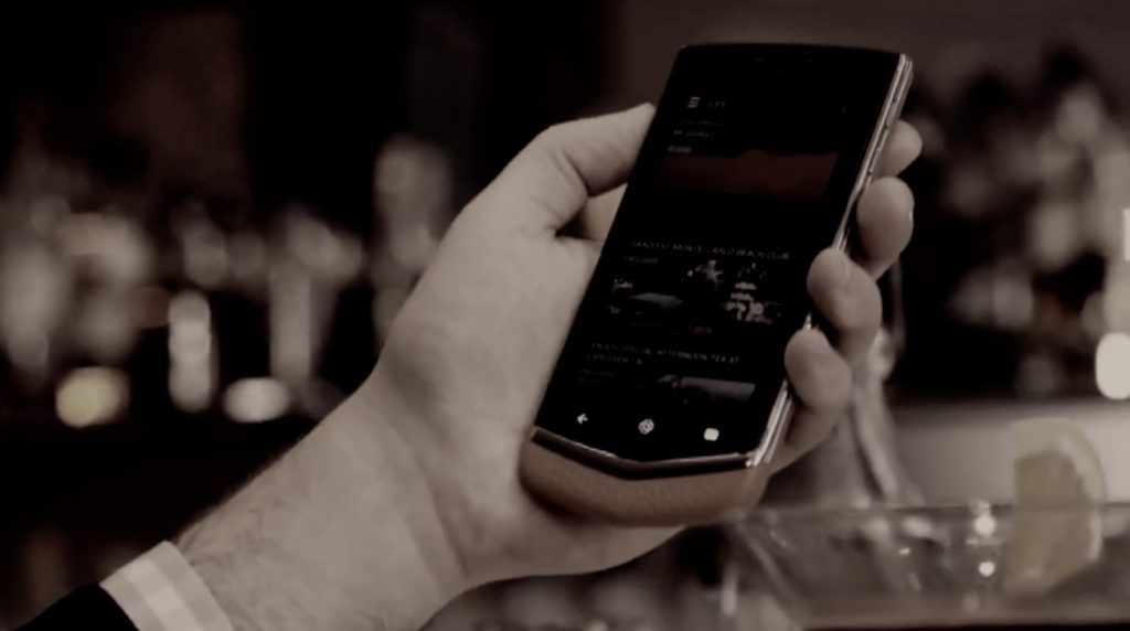
Having already worked for Vertu, they invited me to propose a film concept for the launch of their new Bentley Signature Touch handset. A collaboration with the luxury car brand, where buyers get a choice leather colours and 16 stitching options and a Bentley app, which gives access to exclusive content and events.
Vertu’s vision is the become regarded as the leading luxury mobile phone brand in the world and this film was an opportunity to reach a wider audience than it’s usual customer base.
Objectives for the film were, it needed to connect in an emotional and luxurious way, whilst portraying contemporary elegance and luxury performance materials
‘Journey beyond the ordinary – in a Bentley you arrive, in every sense of the word’. And with Vertu, you gain access to the world’s most exclusive destinations, at the touch of a button. The concept captured moments of arrival. Aesthetically warm, rich and deeply emotive. (All footage is existing.)
Film title sequences / Festival Posters




Camberwell’s Creative Class
Wyndham studios – Fabrica
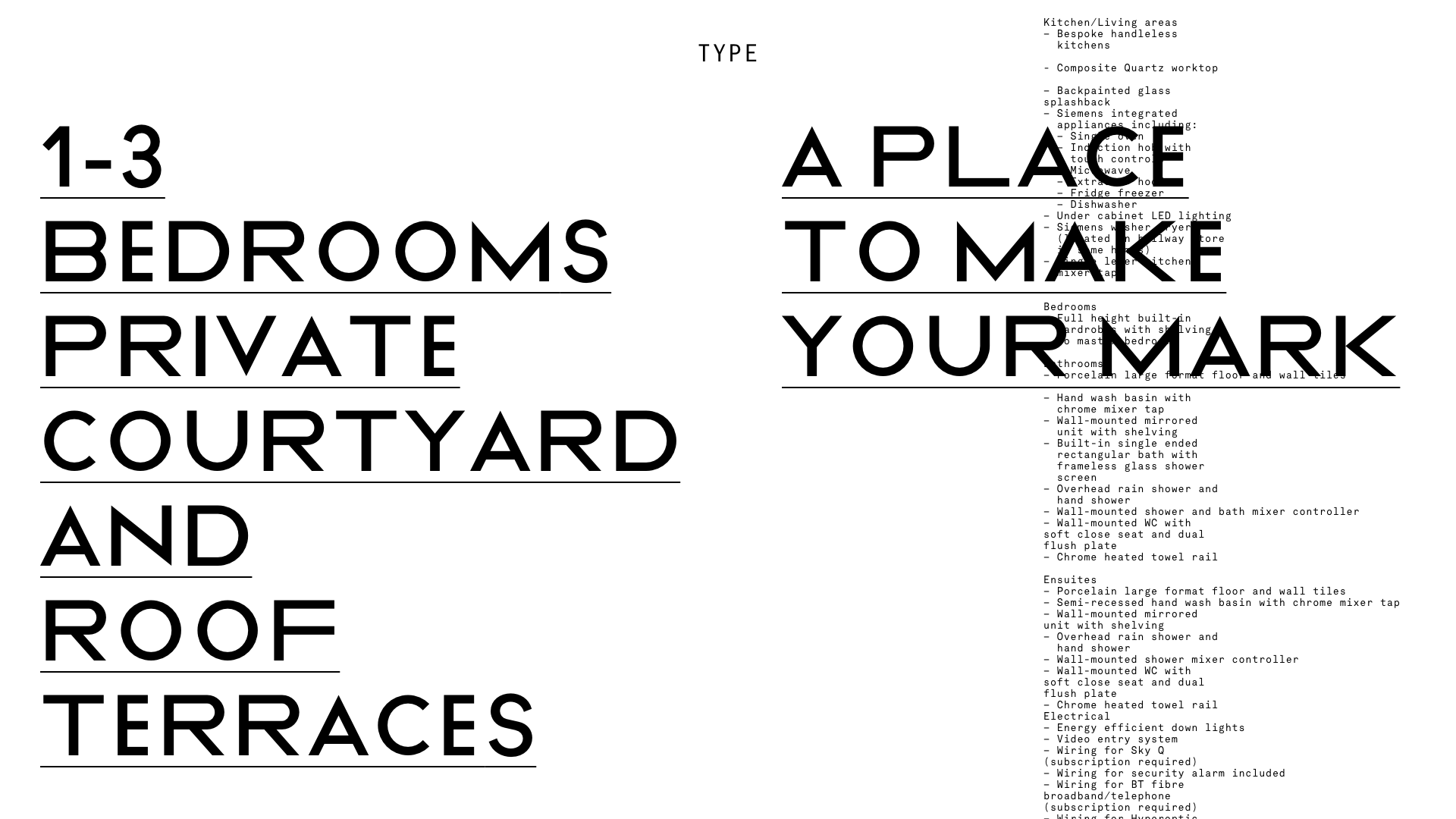
Located in Camberwell, South East London, offers 59 apartments with rooftop terraces and stunning city views. The development was late to market, so needed to distinguish itself from the competition.
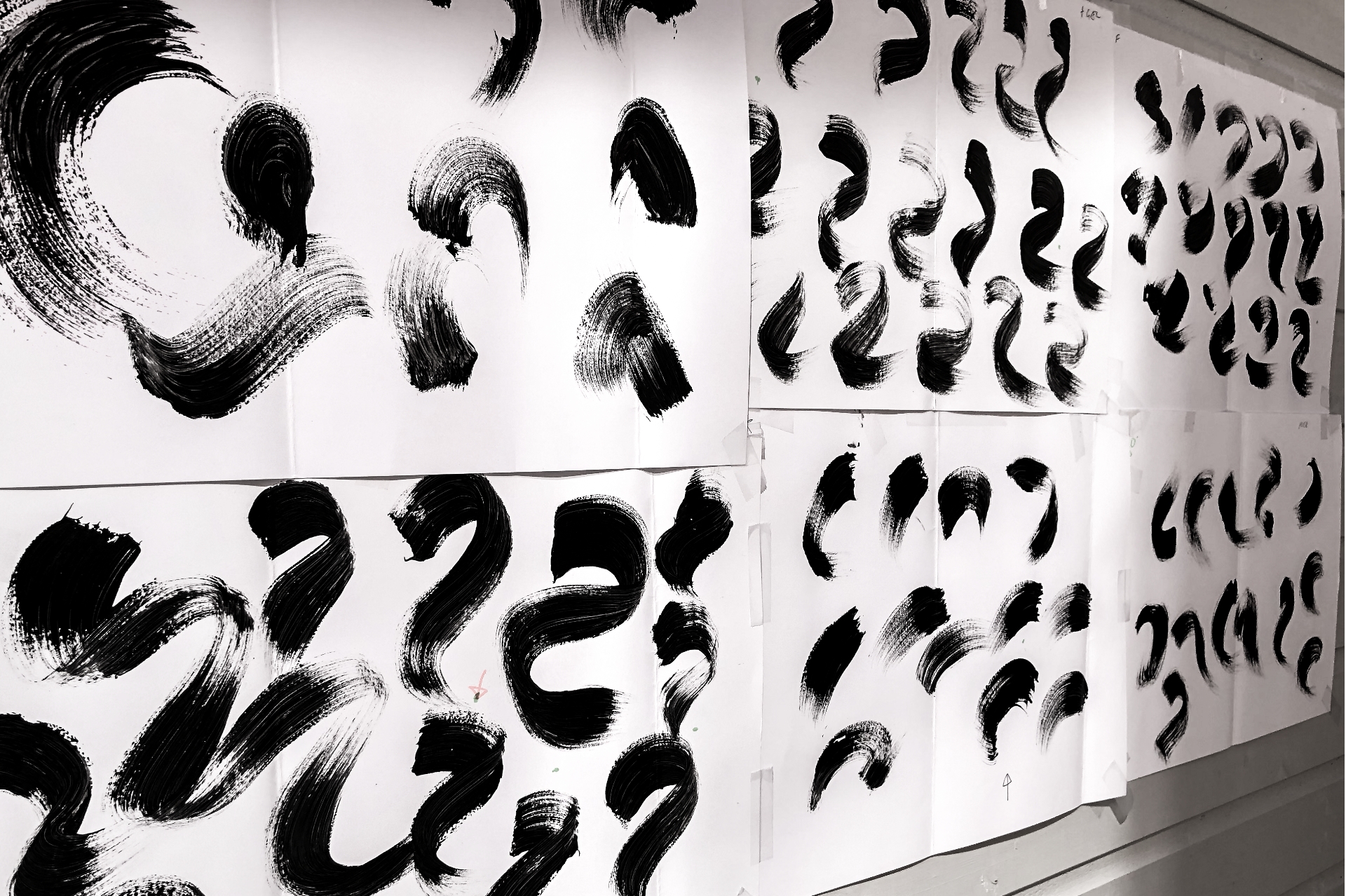
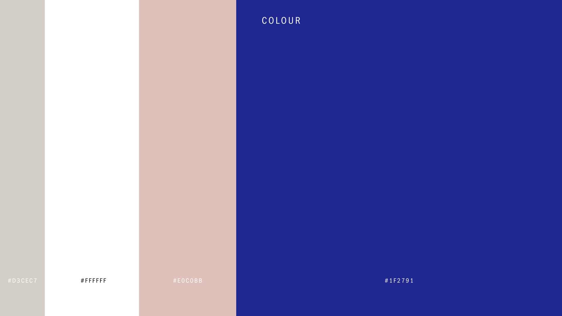
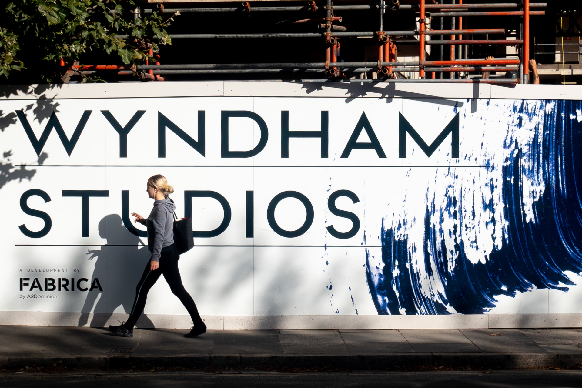
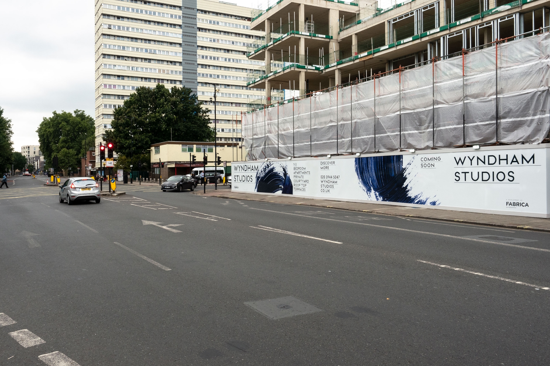
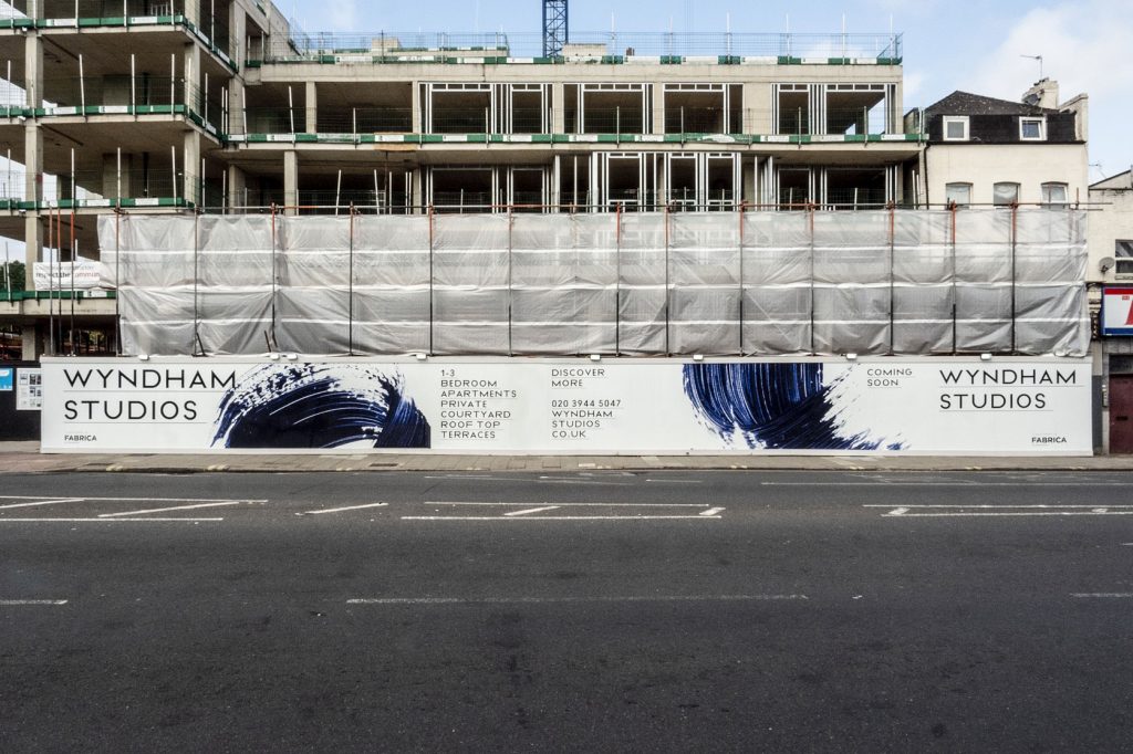
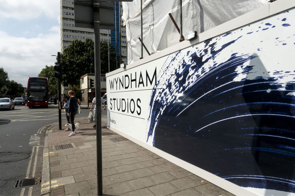
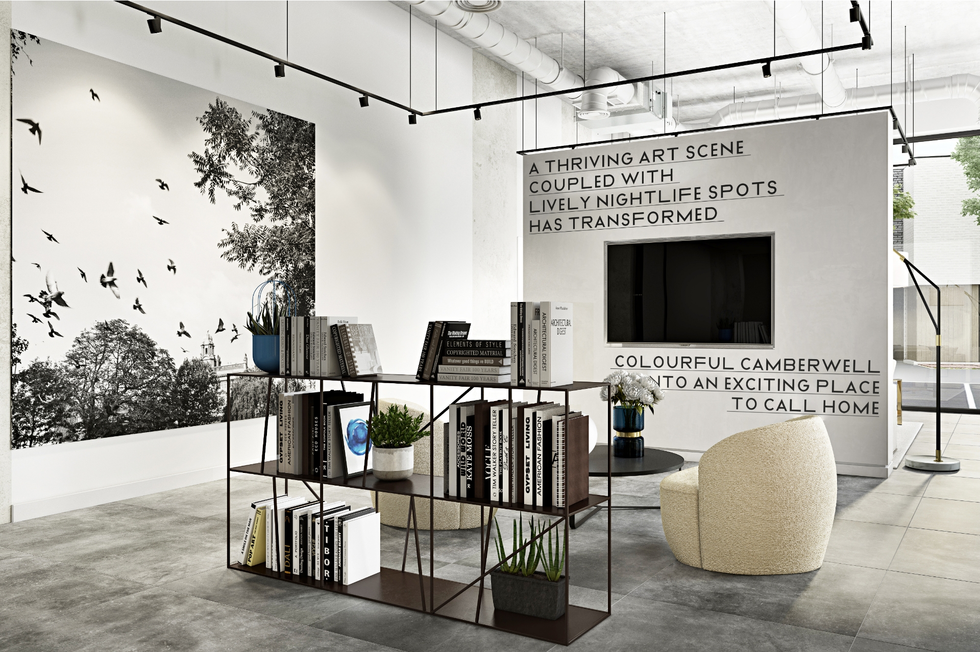
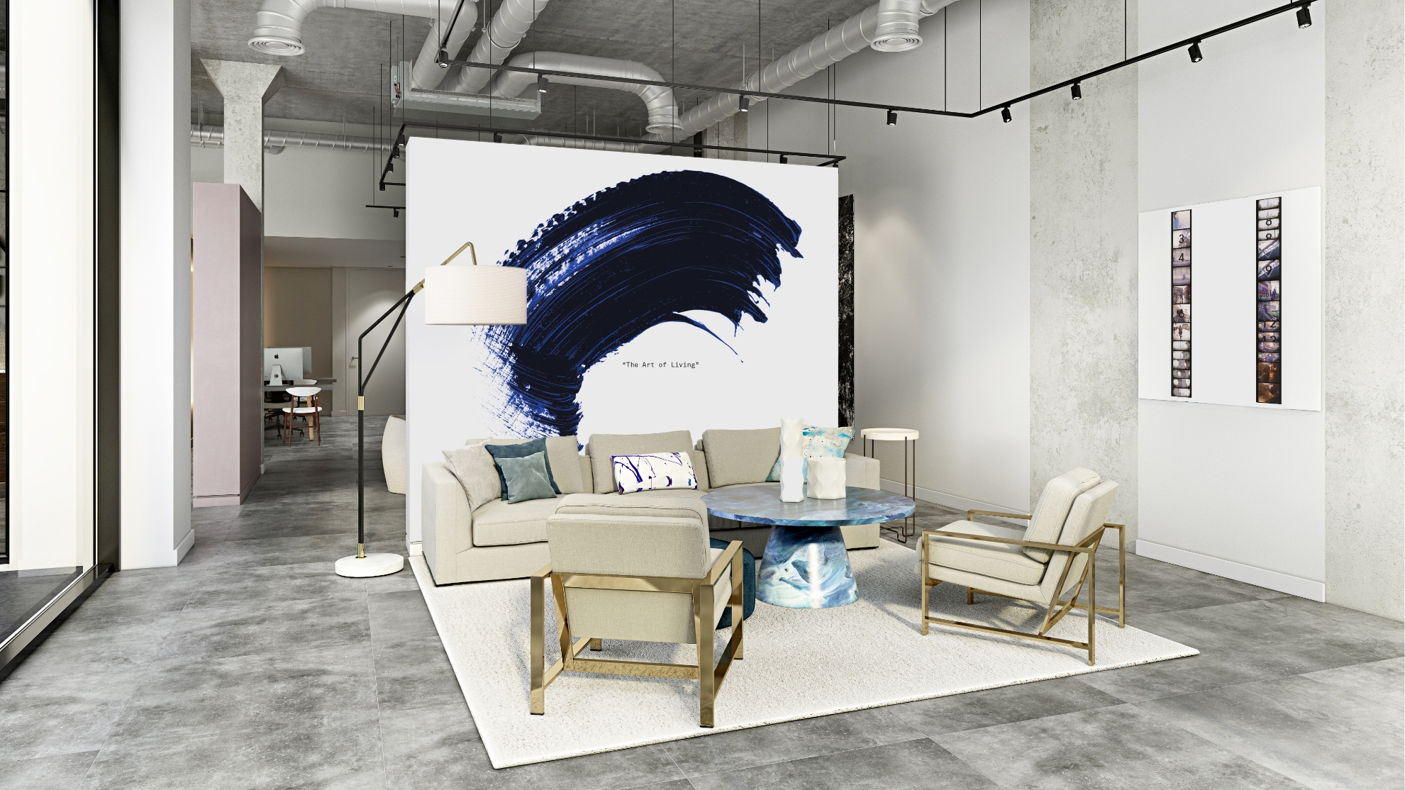
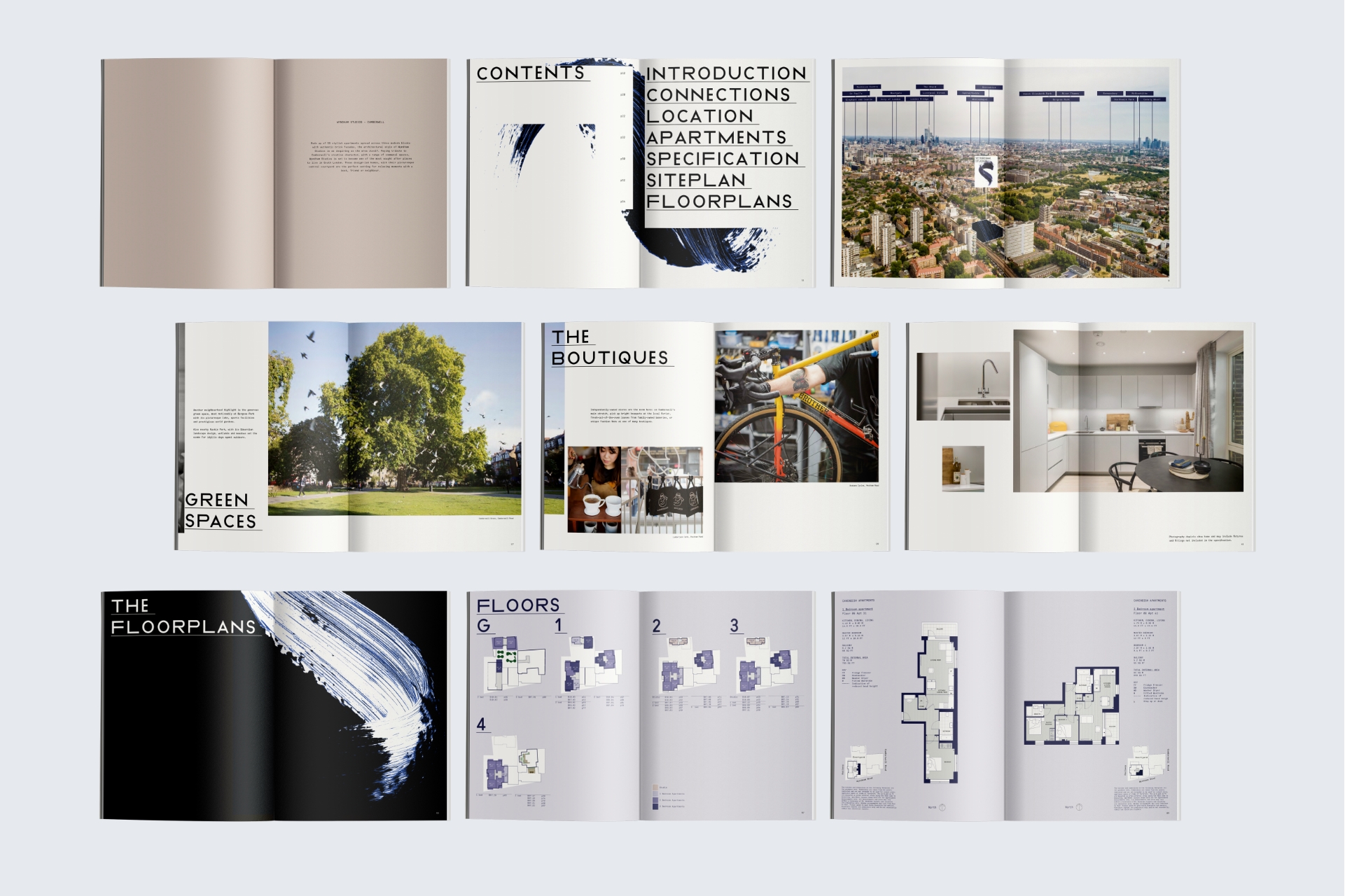
Camberwell is a thriving neighbourhood, celebrated for its dynamic fashion, art, and design scenes. To set itself apart, the development embraced a bold approach, employing striking typography and expressive Yves Klein blue brushmarks across pre and post-completion materials. This genuine brand identity was further accentuated through a captivating ‘digital Super 8’ aesthetic, seamlessly woven into the marketing and social media films, showcasing the essence of this unique community
brand strategy / brand toolkit / brochure / hoarding / marketing film / marketing suite / social media / virtual tour film






I have to say, everything looks absolutely fantastic! Thank you so much for your amazing design skills.
Sancia Cicciarelli – Head of Marketing